Die Anleitung zu Bootstrap Alert
1. Bootstrap Alert
Alert ist ein eingebautes Interface-Element vom Bootstrap . Es ist ein Seite-raum, der eine Nachricht (message) anzeigt. Die Nachricht kann eine Information oder eine Fehlerwarnung sein ... (info, warning, danger,..).
Anders als Model zeigt Alert wie ein Fenster an. Das ist ein Raum auf die Seite aber es gibt vielleicht eine Button "x" , damit Sie den Raum schließen können.
Anders als Model zeigt Alert wie ein Fenster an. Das ist ein Raum auf die Seite aber es gibt vielleicht eine Button "x" , damit Sie den Raum schließen können.

alert-example.html
<!DOCTYPE html>
<html>
   <head>
      <meta charset="utf-8">
      <title>Alert Example</title>
      <link rel="stylesheet" href="https://maxcdn.bootstrapcdn.com/bootstrap/4.0.0/css/bootstrap.min.css">
   </head>
   <body>
      <div class="container mt-3">

         <div class="alert alert-info">
            <strong>Hi Tran!</strong> Welcome back!
            <button type="button" class="close" data-dismiss="alert" aria-label="Close">x</button>
         </div>


         <h4>Bootstrap Tutorials</h4>
         <ul>
            <li>Bootstrap Buttons</li>
            <li>Bootstrap Form Groups</li>
         </ul>
      </div>

      <script src="https://code.jquery.com/jquery-3.2.1.slim.min.js"></script>
      <script src="https://cdnjs.cloudflare.com/ajax/libs/popper.js/1.12.9/umd/popper.min.js"></script>
      <script src="https://maxcdn.bootstrapcdn.com/bootstrap/4.0.0/js/bootstrap.min.js"></script>

   </body>
</html>
Verwenden Sie die Klasse .alert in der Verbindung mit einer der Klasse .alert-info, .alert-warning, .alert-danger, .. um ein Ihrer Kontext entsprechendes Alert zu erstellen.
<div class="alert alert-primary">.alert-primary</div>
<div class="alert alert-secondary">.alert-secondary</div>
<div class="alert alert-success">.alert-success</div>
<div class="alert alert-danger">.alert-danger</div>
<div class="alert alert-warning">.alert-warning</div>
<div class="alert alert-info">.alert-info</div>
<div class="alert alert-dark">.alert-dark</div>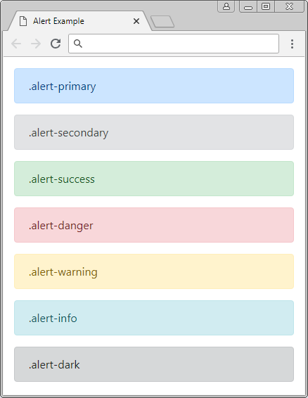
.alert-link
Wahrscheinlich innerhalb eines Alert verwenden Sie die Tags <a>, sollen Sie die Klasse .alert-link für diesen Tag. Die Klasse .alert-link wird die Farbe für den Tag <a> einstellen um zur Kontext vom Alert zu eignen.
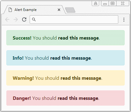
.alert-link
<div class="alert alert-success">
   <strong>Success!</strong> You should <a href="#" class="alert-link">read this message</a>.
</div>
<div class="alert alert-info">
   <strong>Info!</strong> You should <a href="#" class="alert-link">read this message</a>.
</div>
<div class="alert alert-warning">
   <strong>Warning!</strong> You should <a href="#" class="alert-link">read this message</a>.
</div>
<div class="alert alert-danger">
   <strong>Danger!</strong> You should <a href="#" class="alert-link">read this message</a>.
</div>
2. Alert mit der Button Close (Schließen)
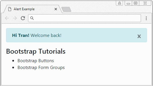
Um ein verschließbares Alert (closable) zu erstellen, brauchen Sie die Klasse .alert-dismissible für Alert verwenden und die Attribute: class="close" data-dismiss="alert" für den Schließen Button einfügen. Der Schließen Button liegt oben rechts vom Alert, wenn der Benutzer auf diesen Button klickt, wird Alert verstecken.
closing-alert-example.html
<!DOCTYPE html>
<html>
<head>
<meta charset="utf-8">
<title>Alert Example</title>
<link rel="stylesheet" href="https://maxcdn.bootstrapcdn.com/bootstrap/4.0.0/css/bootstrap.min.css">
</head>
<body>
<div class="container mt-3">
<div class="alert alert-info alert-dismissible">
<strong>Hi Tran!</strong> Welcome back!
<button type="button" class="close" data-dismiss="alert" aria-label="Close">×</button>
</div>
<h4>Bootstrap Tutorials</h4>
<ul>
<li>Bootstrap Buttons</li>
<li>Bootstrap Form Groups</li>
</ul>
</div>
<script src="https://code.jquery.com/jquery-3.2.1.slim.min.js"></script>
<script src="https://cdnjs.cloudflare.com/ajax/libs/popper.js/1.12.9/umd/popper.min.js"></script>
<script src="https://maxcdn.bootstrapcdn.com/bootstrap/4.0.0/js/bootstrap.min.js"></script>
</body>Class/Attribute | Die Bezeichnung |
.alert-dismissible | Sie können diese Klasse nicht brauchen. Denn sie wirkt darauf nicht aus, Alert schließen oder nicht kann. Aber es hilft bei der Einstellung von padding für .close. |
data-dismiss="alert" | Das Attribut braucht zur Button (x) eingefügt werden, Bootstrap registriert automatisch die Behandlungsfunktion für das Event. Wenn der Benutzer auf Button (x) klickt, wird Alert versteckt werden. |
3. Alert anpassen
Sie können ein benutzerdefiniertes Alert mit der komplizierten HTML Inhalt erstellen. Bitte erinern Sie, dass Bootstrap eine Klasse .alert-heading anbieten um für "Heading" vom Alert anzuwenden.
.alert-heading
<div class="alert alert-success" role="alert">
   <h4 class="alert-heading">Well done!</h4>
   <p>Aww yeah, you successfully read this important alert message.
      This example text is going to run a bit longer
       so that you can see how spacing within an alert works with this kind of content.
   </p>
   <hr>
   <p class="mb-0">Whenever you need to,
       be sure to use margin utilities to keep things nice and tidy.</p>
</div>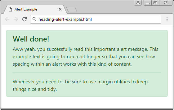
Anleitungen Bootstrap
- Die Anleitung zu Bootstrap Jumbotron
- Die Anleitung zu Bootstrap Dropdown
- Die Anleitung zu Bootstrap Alert
- Die Anleitung zu Bootstrap Button
- Die Anleitung zu Bootstrap Button Group
- Die Anleitung zu Bootstrap Popover (Tooltip)
- Die Anleitung zu Bootstrap Spinner
- Einführung in Bootstrap
- Die Anleitung zu Bootstrap Grid System
- Die Anleitung zu Bootstrap Card
- Die Anleitung zu Bootstrap Container
- Die Anleitung zu Bootstrap Nav, Tab, Pill
- Die Anleitung zu Bootstrap NavBar
- Die Anleitung zu Bootstrap Table
- Die Anleitung zu Bootstrap Modal
- Die Anleitung zu Bootstrap Form
- Die Anleitung zu Bootstrap Pagination
- Die Anleitung zu Bootstrap Badge
- Die Anleitung zu Bootstrap Input Group
- Die Anleitung zu Bootstrap List Group
- Die Anleitung zu Bootstrap ProgressBar
- Die Anleitung zu Bootstrap Collapse und Accordion
- Die Anleitung zu Bootstrap Scrollspy
- Die Anleitung zu Bootstrap Breadcrumb
- Die Anleitung zu Bootstrap Carousel
- Die Anleitung zu Bootstrap Spacing Utility
- Die Anleitung zu Bootstrap Border Utility
- Die Anleitung zu Bootstrap Color Utility
- Die Anleitung zu Bootstrap Text Utility
- Die Anleitung zu Bootstrap Sizing Utility
- Die Anleitung zu Bootstrap Position Utility
- Die Anleitung zu Bootstrap Flex Utility
- Die Anleitung zu Bootstrap Display Utility
- Die Anleitung zu Bootstrap Visibility Utility
- Die Anleitung zu Bootstrap Embed Utility
Show More