Die Anleitung zu Bootstrap Carousel
1. Bootstrap Carousel
Carousel (Karussel) ist so gleich wie ein Slidershow. Es zeigt die drehenden Inhalten wie Fotos, Text, ... an. Carousel vom Bootstrap wird nach CSS und ein bisschen Javascript gebaut.
Folgend ist es die Illustrator vom Carousel. Es zeigt einige Fotos drehend an.
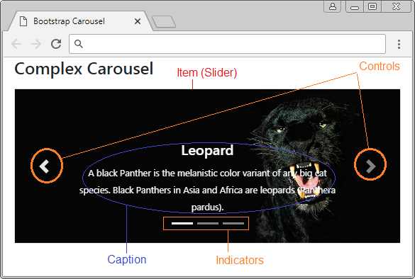
Ein volles Carousel hat die Struktur als die folgende Illustrator:
Ein meist einfaches Carousel fasst nutt die Item (Slider) um und die Inhalt eines Slider ist ein Foto. Es fasst die Controls nicht um und hat keine Indicators.
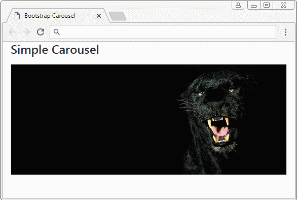
simple-carousel-example.html
<!DOCTYPE html>
<html>
   <head>
      <meta charset="utf-8">
      <title>Bootstrap Carousel</title>
      <link rel="stylesheet" href="https://stackpath.bootstrapcdn.com/bootstrap/4.1.1/css/bootstrap.min.css">
   </head>
   <body>
      <div class="container">
         <h4 class="mb-3">Simple Carousel</h4>
         <div id="myCarousel" class="carousel slide border" data-ride="carousel">
            <div class="carousel-inner">
               <div class="carousel-item active">
                  <img class="d-block w-100" src="../images/carousel-img-1.jpg" alt="Panther">
               </div>
               <div class="carousel-item">
                  <img class="d-block w-100" src="../images/carousel-img-2.jpg" alt="Black Cat">
               </div>
               <div class="carousel-item">
                  <img class="d-block w-100" src="../images/carousel-img-3.jpg" alt="Lion">
               </div>
            </div>
         </div>
      </div>
      <script src="https://code.jquery.com/jquery-3.3.1.slim.min.js"></script>
      <script src="https://cdnjs.cloudflare.com/ajax/libs/popper.js/1.14.3/umd/popper.min.js"></script>
      <script src="https://stackpath.bootstrapcdn.com/bootstrap/4.1.1/js/bootstrap.min.js"></script>
   </body>
</html>
2. Carousel mit Controls
Ein normales Carousel hat die Button "Next" und "Previous" damit der Benutzer auf einen nächsten Slider springen oder auf einen vorherigen Slider rückkehren kann. Sie werden die Controls genannt.
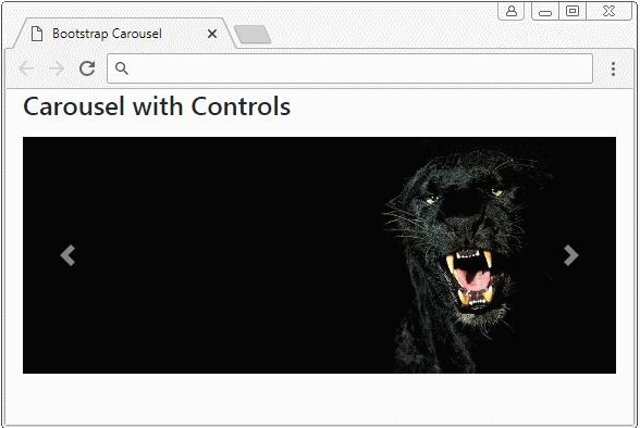
Carousel with Control
<div id="myCarousel" class="carousel slide border" data-ride="carousel">
<div class="carousel-inner">
<div class="carousel-item active">
<img class="d-block w-100" src="../images/carousel-img-1.jpg" alt="Leopard">
</div>
<div class="carousel-item">
<img class="d-block w-100" src="../images/carousel-img-2.jpg" alt="Cat">
</div>
<div class="carousel-item">
<img class="d-block w-100" src="../images/carousel-img-3.jpg" alt="Lion">
</div>
</div>
<!-- Controls -->
<a class="carousel-control-prev" href="#myCarousel" role="button" data-slide="prev">
<span class="carousel-control-prev-icon" aria-hidden="true"></span>
<span class="sr-only">Previous</span>
</a>
<a class="carousel-control-next" href="#myCarousel" role="button" data-slide="next">
<span class="carousel-control-next-icon" aria-hidden="true"></span>
<span class="sr-only">Next</span>
</a>
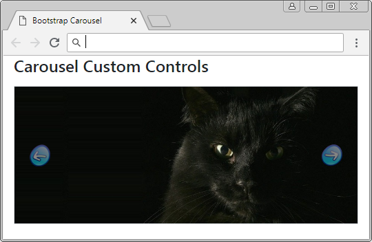
</div>Das Beispiel von der Anpassung Controls:
Custom Controls
.carousel-control-prev-icon {
     background-image: url(../images/previous-32.png);
     width: 32px;
     height: 32px;
}
 .carousel-control-next-icon {
     background-image: url(../images/next-32.png);
     width: 32px;
     height: 32px;
}
3. Carousel mit Indicators
Indicators wie Shortcut hilft dem Benutzer, auf einem bestimmen Item (Slider) in die Liste von Item vom Carousel zu springen. Achtung: Die Item im Carousel werden die Index ab 0 (0, 1, 2,..) numeriert
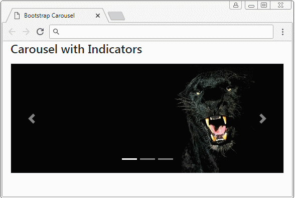
Carousel Indicators
<div id="myCarousel" class="carousel slide border" data-ride="carousel">
   <!-- Indicators -->
   <ol class="carousel-indicators">
      <li data-target="#myCarousel" data-slide-to="0" class="active"></li>
      <li data-target="#myCarousel" data-slide-to="1"></li>
      <li data-target="#myCarousel" data-slide-to="2"></li>
   </ol>

   ...

</div>
Carousel Indicators
<div id="myCarousel" class="carousel slide border" data-ride="carousel">
   <!-- Indicators -->
   <ol class="carousel-indicators">
      <li data-target="#myCarousel" data-slide-to="0" class="active"></li>
      <li data-target="#myCarousel" data-slide-to="1"></li>
      <li data-target="#myCarousel" data-slide-to="2"></li>
   </ol>
   <div class="carousel-inner">
      <div class="carousel-item active">
         <img class="d-block w-100" src="../images/carousel-img-1.jpg" alt="Leopard">
      </div>
      <div class="carousel-item">
         <img class="d-block w-100" src="../images/carousel-img-2.jpg" alt="Cat">
      </div>
      <div class="carousel-item">
         <img class="d-block w-100" src="../images/carousel-img-3.jpg" alt="Lion">
      </div>
   </div>
   <!-- Controls -->
   <a class="carousel-control-prev" href="#myCarousel" role="button" data-slide="prev">
     <span class="carousel-control-prev-icon" aria-hidden="true"></span>
     <span class="sr-only">Previous</span>
   </a>
   <a class="carousel-control-next" href="#myCarousel" role="button" data-slide="next">
     <span class="carousel-control-next-icon" aria-hidden="true"></span>
     <span class="sr-only">Next</span>
   </a>
</div>
Folgend ist es die Beispiele von der Anpassung Indicators.(Customization)
Custom Indicators (1)
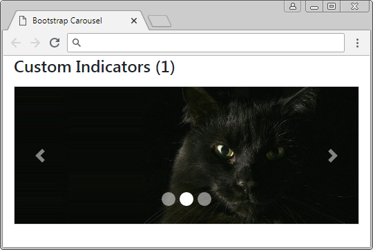
Custom Indicators (1)
.carousel-indicators li {
  width: 20px;
  height: 20px;
  border-radius: 100%;
}
Custom Indicators (2)
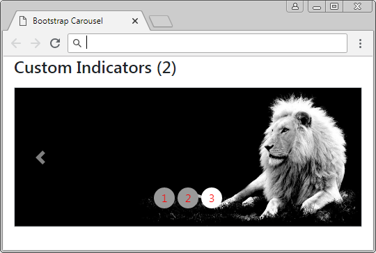
Custom Indicators (2)
.carousel-indicators li {
     text-indent: 0px;
     text-align: center;
     color: red;
     margin: 0 2px;
     width: 30px;
     height: 30px;
     border: none;
     border-radius: 100%;
     line-height: 30px;
     background-color: #999;
     transition: all 0.25s ease;
}
 .carousel-indicators .active, .hover {
     margin: 0 2px;
     width: 30px;
     height: 30px;
     background-color: #337ab7;
}
Custom Indicators (2)
<div id="myCarousel" class="carousel slide border" data-ride="carousel">
   <ol class="carousel-indicators">
      <li data-target="#myCarousel" data-slide-to="0" class="active">1</li>
      <li data-target="#myCarousel" data-slide-to="1">2</li>
      <li data-target="#myCarousel" data-slide-to="2">3</li>
   </ol>
   <div class="carousel-inner">
      <div class="carousel-item active">
         <img class="d-block w-100" src="../images/carousel-img-1.jpg" alt="Panther">
      </div>
      <div class="carousel-item">
         <img class="d-block w-100" src="../images/carousel-img-2.jpg" alt="Black Cat">
      </div>
      <div class="carousel-item">
         <img class="d-block w-100" src="../images/carousel-img-3.jpg" alt="Lion">
      </div>
   </div>
   <a class="carousel-control-prev" href="#myCarousel" role="button" data-slide="prev">
   <span class="carousel-control-prev-icon" aria-hidden="true"></span>
   <span class="sr-only">Previous</span>
   </a>
   <a class="carousel-control-next" href="#myCarousel" role="button" data-slide="next">
   <span class="carousel-control-next-icon" aria-hidden="true"></span>
   <span class="sr-only">Next</span>
   </a>
</div>
Custom Indicators (3)
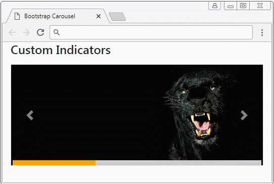
Cutom Indicators (3)
.carousel-indicators {
position: absolute;
bottom: 0;
margin: 0;
left: 0;
right: 0;
width: auto;
}
.carousel-indicators li, .carousel-indicators li.active {
float: left;
width: 33%;
height: 10px;
margin: 0;
border-radius: 0;
border: 0;
background: #ccc;
}
.carousel-indicators li.active {
background: orange;
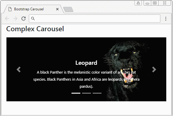
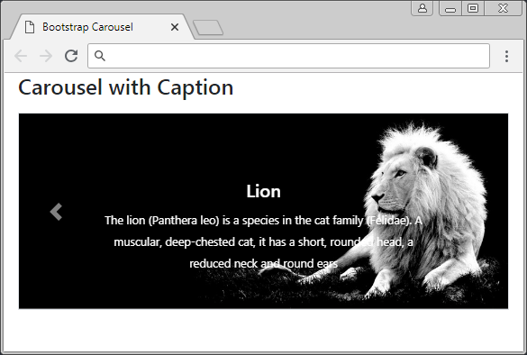
}4. Carousel mit Untertitel (Caption)
Für jeden Slider können Sie den Untertitel (Caption) für ihn einfügen. Das wird durch das Einwickeln von Ihrem Untertitel ins Tag <div class="carousel-caption"> leicht gemacht.
Carousel Item with Caption!
<div class="carousel-item">
   <img class="d-block w-100" src="../images/carousel-img-2.jpg" alt="Cat">

   <!--Caption here -->
   <div class="carousel-caption">
      <h5>Black Cat</h5>
      <small>
      A black cat is a domestic cat with black fur that may be a mixed or specific breed
      </small>
   </div>

</div>
Carousel with caption
<div id="myCarousel" class="carousel slide border" data-ride="carousel">
<div class="carousel-inner">
<div class="carousel-item active">
<img class="d-block w-100" src="../images/carousel-img-1.jpg" alt="Leopard">
<div class="carousel-caption">
<h5>Leopard</h5>
<small>
A black Panther is the melanistic color variant of any big cat species.
Black Panthers in Asia and Africa are leopards (Panthera pardus).
</small>
</div>
</div>
<div class="carousel-item">
<img class="d-block w-100" src="../images/carousel-img-2.jpg" alt="Cat">
<div class="carousel-caption">
<h5>Black Cat</h5>
<small>
A black cat is a domestic cat with black fur that may be a mixed or specific breed
</small>
</div>
</div>
<div class="carousel-item">
<img class="d-block w-100" src="../images/carousel-img-3.jpg" alt="Lion">
<div class="carousel-caption">
<h5>Lion</h5>
<small>
The lion (Panthera leo) is a species in the cat family (Felidae).
A muscular, deep-chested cat, it has a short, rounded head, a reduced neck and round ears
</small>
</div>
</div>
</div>
<a class="carousel-control-prev" href="#myCarousel" role="button" data-slide="prev">
<span class="carousel-control-prev-icon" aria-hidden="true"></span>
<span class="sr-only">Previous</span>
</a>
<a class="carousel-control-next" href="#myCarousel" role="button" data-slide="next">
<span class="carousel-control-next-icon" aria-hidden="true"></span>
<span class="sr-only">Next</span>
</a>
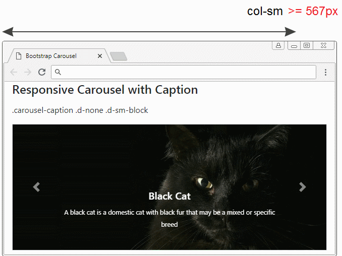
</div>Die Untertitel werden für die Geräte mit der größen Bildschirmsbreite angezeigt. Und für die Geräten mit der kleinen Bildschirmsbreite können Sie sie verstecken. Das kann mit der Unterstützung der Klasse .d-(sm|md|lg|xl)-block, .d-none durchgeführt werden.
Die Klasse | Die Bezeichnung |
.d-sm-block .d-none | Caption wird anzeigen wenn die Breite vom Carousel >= 567px ist. Umgekehrt wird es versteckt . |
.d-md-block .d-none | Caption wird anzeigen wenn die Breite vom Carousel >= 768px ist. Umgekehrt wird es versteckt . |
.d-lg-block .d-none | Caption wird anzeigen wenn die Breite vom Carousel >= 992px ist. Umgekehrt wird es versteckt . |
.d-xl-block .d-none | Caption wird anzeigen wenn die Breite vom Carousel >= 1200px ist. Umgekehrt wird es versteckt . |
carousel-responsive-caption-example.html
<!DOCTYPE html>
<html>
<head>
<meta charset="utf-8">
<title>Bootstrap Carousel</title>
<link rel="stylesheet" href="https://stackpath.bootstrapcdn.com/bootstrap/4.1.1/css/bootstrap.min.css">
</head>
<body>
<div class="container-fluid">
<h4 class="mb-3">Responsive Carousel with Caption</h4>
<p>.carousel-caption .d-none .d-sm-block</p>
<div id="myCarousel" class="carousel slide border" data-ride="carousel">
<div class="carousel-inner">
<div class="carousel-item active">
<img class="d-block w-100" src="../images/carousel-img-1.jpg" alt="Leopard">
<div class="carousel-caption d-none d-sm-block">
<h5>Leopard</h5>
<small>
A black Panther is the melanistic color variant of any big cat species.
Black Panthers in Asia and Africa are leopards (Panthera pardus).
</small>
</div>
</div>
<div class="carousel-item">
<img class="d-block w-100" src="../images/carousel-img-2.jpg" alt="Cat">
<div class="carousel-caption d-none d-sm-block">
<h5>Black Cat</h5>
<small>
A black cat is a domestic cat with black fur that may be a mixed or specific breed
</small>
</div>
</div>
<div class="carousel-item">
<img class="d-block w-100" src="../images/carousel-img-3.jpg" alt="Lion">
<div class="carousel-caption d-none d-sm-block">
<h5>Lion</h5>
<small>
The lion (Panthera leo) is a species in the cat family (Felidae).
A muscular, deep-chested cat, it has a short, rounded head,
a reduced neck and round ears
</small>
</div>
</div>
</div>
<a class="carousel-control-prev" href="#myCarousel" role="button" data-slide="prev">
<span class="carousel-control-prev-icon" aria-hidden="true"></span>
<span class="sr-only">Previous</span>
</a>
<a class="carousel-control-next" href="#myCarousel" role="button" data-slide="next">
<span class="carousel-control-next-icon" aria-hidden="true"></span>
<span class="sr-only">Next</span>
</a>
</div>
</div>
<script src="https://code.jquery.com/jquery-3.3.1.slim.min.js"></script>
<script src="https://cdnjs.cloudflare.com/ajax/libs/popper.js/1.14.3/umd/popper.min.js"></script>
<script src="https://stackpath.bootstrapcdn.com/bootstrap/4.1.1/js/bootstrap.min.js"></script>
</body>
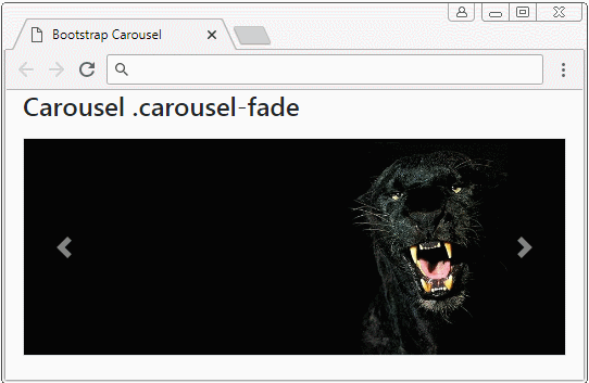
</html>5. Das Effekt (Effect)
Fügen Sie die Klasse .carousel-fade für Carousel ein, sehen Sie das Effekt fade (verschmiert) wenn Carousel aus einem Slider zu anderem Slider wandelt.
.carousel-fade
<div id="myCarousel" class="carousel carousel-fade slide border" data-ride="carousel">
   <div class="carousel-inner">
      <div class="carousel-item active">
         <img class="d-block w-100" src="../images/carousel-img-1.jpg" alt="Leopard">
      </div>
      <div class="carousel-item">
         <img class="d-block w-100" src="../images/carousel-img-2.jpg" alt="Cat">
      </div>
      <div class="carousel-item">
         <img class="d-block w-100" src="../images/carousel-img-3.jpg" alt="Lion">
      </div>
   </div>
   <!-- Controls -->
   <a class="carousel-control-prev" href="#myCarousel" role="button" data-slide="prev">
   <span class="carousel-control-prev-icon" aria-hidden="true"></span>
   <span class="sr-only">Previous</span>
   </a>
   <a class="carousel-control-next" href="#myCarousel" role="button" data-slide="next">
   <span class="carousel-control-next-icon" aria-hidden="true"></span>
   <span class="sr-only">Next</span>
   </a>
</div>Anleitungen Bootstrap
- Die Anleitung zu Bootstrap Jumbotron
- Die Anleitung zu Bootstrap Dropdown
- Die Anleitung zu Bootstrap Alert
- Die Anleitung zu Bootstrap Button
- Die Anleitung zu Bootstrap Button Group
- Die Anleitung zu Bootstrap Popover (Tooltip)
- Die Anleitung zu Bootstrap Spinner
- Einführung in Bootstrap
- Die Anleitung zu Bootstrap Grid System
- Die Anleitung zu Bootstrap Card
- Die Anleitung zu Bootstrap Container
- Die Anleitung zu Bootstrap Nav, Tab, Pill
- Die Anleitung zu Bootstrap NavBar
- Die Anleitung zu Bootstrap Table
- Die Anleitung zu Bootstrap Modal
- Die Anleitung zu Bootstrap Form
- Die Anleitung zu Bootstrap Pagination
- Die Anleitung zu Bootstrap Badge
- Die Anleitung zu Bootstrap Input Group
- Die Anleitung zu Bootstrap List Group
- Die Anleitung zu Bootstrap ProgressBar
- Die Anleitung zu Bootstrap Collapse und Accordion
- Die Anleitung zu Bootstrap Scrollspy
- Die Anleitung zu Bootstrap Breadcrumb
- Die Anleitung zu Bootstrap Carousel
- Die Anleitung zu Bootstrap Spacing Utility
- Die Anleitung zu Bootstrap Border Utility
- Die Anleitung zu Bootstrap Color Utility
- Die Anleitung zu Bootstrap Text Utility
- Die Anleitung zu Bootstrap Sizing Utility
- Die Anleitung zu Bootstrap Position Utility
- Die Anleitung zu Bootstrap Flex Utility
- Die Anleitung zu Bootstrap Display Utility
- Die Anleitung zu Bootstrap Visibility Utility
- Die Anleitung zu Bootstrap Embed Utility
Show More