Die Anleitung zu Bootstrap Embed Utility
1. Bootstrap Embed
Manchmal brauchen Sie eine Medien Inhalt in der Seite HTML einbetten, z.B Video, PDF,... Sie kann allen Geräten mit der unterschiedlichen Breite nicht entsprechen. Deshalb gibt Bootstrap die Utility Klasse um dieses Problem zu lösen.
<object> / PDF ...
Das ist ein einfaches Beispiel, in dem wir <object> verwenden um eine File PDF in die Seite HTML einzubetten, aber das PDF Anzeigen Fenster entspricht das Viewport des Browser nicht.
object-pdf-non-responsive-example.html
<!DOCTYPE html>
<html>
   <head>
      <meta charset="utf-8">
      <title>HTML object PDF</title>
   </head>
   <body>
      <h3 class="mb-3">Non-Responsive object PDF</h3>

      <object data="example.pdf" type="application/pdf" internalinstanceid="9" title="">
         <p>
            Your browser isn't supporting embedded pdf files.
            You can download the file
            <a href="example.pdf">here</a>.
         </p>
      </object>

   </body>
</html>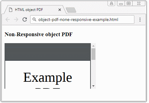
<iframe> / video ...
Und ein anderes einfaches Beispiel für die Verwendung vom <iframe> um ein Video auf die Seite HTML anzuzeigen. Auch wie das Beispiel über PDF oben ist das angezeigte Vide nicht kompatibel mit den unterschiedlichen Geräten
iframe-non-responsive-example.html
<!DOCTYPE html>
<html>
   <head>
      <meta charset="utf-8">
      <title>HTML iframe</title>
   </head>
   <body>
      <h3 class="mb-3">Non-Responsive iframe</h3>

      <iframe
         src="https://www.youtube.com/embed/zpOULjyy-n8?rel=0" allowfullscreen>
      </iframe>

   </body>
</html>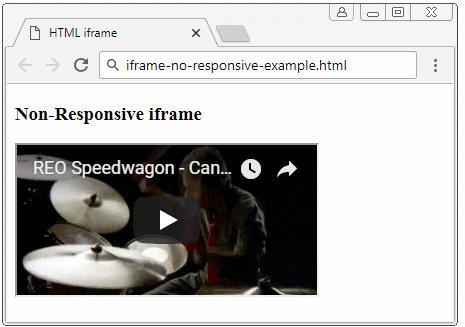
Und das ist die Maßnahme vom Bootstrap:
- <iframe>/<object>/.. durch <div class="embed-responsive embed-responsive-*by*"> einwickelt (wrap). Darin: (*) ist eine Zahl. Ich werde es in Detailiert wie folgend erklären.
- Die Klasse .embed-responsive-item für <iframe>/<object>/... anwenden
<!-- object/ PDF ... -->
<div class="embed-responsive embed-responsive-16by9">
   <object class="embed-responsive-item" data="example.pdf"
      type="application/pdf" internalinstanceid="9" title="">
      <p>
         Your browser isn't supporting embedded pdf files. You can download the file
         <a href="example.pdf">here</a>
      </p>
   </object>
</div>

<!-- iframe/ Video ... -->
<div class="embed-responsive embed-responsive-16by9">
   <iframe class="embed-responsive-item"
      src="https://www.youtube.com/embed/zpOULjyy-n8?rel=0" allowfullscreen>
   </iframe>
</div>
Und das Ergebnis ist eigentich nicht zu schlecht.
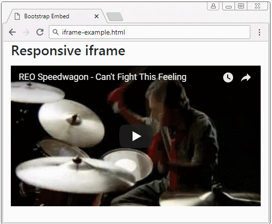
iframe-example.html
<!DOCTYPE html>
<html>
   <head>
      <meta charset="utf-8">
      <title>Bootstrap Embed</title>
      <link rel="stylesheet" href="https://stackpath.bootstrapcdn.com/bootstrap/4.1.1/css/bootstrap.min.css">
   </head>
   <body>
      <h3 class="mb-3">Responsive iframe</h3>

      <div class="embed-responsive embed-responsive-16by9">
         <iframe class="embed-responsive-item"
            src="https://www.youtube.com/embed/zpOULjyy-n8?rel=0" allowfullscreen>
         </iframe>
      </div>

      <script src="https://code.jquery.com/jquery-3.3.1.slim.min.js"></script>
      <script src="https://cdnjs.cloudflare.com/ajax/libs/popper.js/1.14.3/umd/popper.min.js"></script>
      <script src="https://stackpath.bootstrapcdn.com/bootstrap/4.1.1/js/bootstrap.min.js"></script>
   </body>
</html>
.embed-responsive-*by*
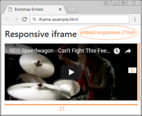
Es gibt einige vom Bootstrap eingebauten Klasse um das Verhältnis zwischen die Breite und die Höhe vom media einzustellen.
- embed-responsive-21by9
- embed-responsive-16by9
- embed-responsive-4by3
- embed-responsive-1by1
.embed-responsive-*by*
<!-- 21:9 aspect ratio -->
<div class="embed-responsive embed-responsive-21by9">
   <iframe class="embed-responsive-item" src="..."></iframe>
</div>

<!-- 16:9 aspect ratio -->
<div class="embed-responsive embed-responsive-16by9">
   <iframe class="embed-responsive-item" src="..."></iframe>
</div>

<!-- 4:3 aspect ratio -->
<div class="embed-responsive embed-responsive-4by3">
   <iframe class="embed-responsive-item" src="..."></iframe>
</div>

<!-- 1:1 aspect ratio -->
<div class="embed-responsive embed-responsive-1by1">
   <iframe class="embed-responsive-item" src="..."></iframe>
</div>
2. Custom .embed-responsive-*by*
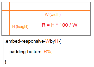
Sie können eine anpassende Klasse .embed-responsive-*by* machen, z.B .embed-responsive-5by4.
.embed-responsive-5by4
.embed-responsive-5by4 {
  padding-bottom: 80.0%;
}
Die allgemeine Formel:
210:297 ist das Verhaltnis zwischen die Breite und die Höhe von einem A4 Papier. Und Sie können die Klasse .embed-responsive-210by297 wie folgend definieren:
.embed-responsive-210by297
.embed-responsive-210by297 {
  padding-bottom: 141.42%;
}
object-pdf-responsive-example
<style>
   .embed-responsive-210by297 {
   padding-bottom: 141.42%;
   }
</style>

<div class="embed-responsive embed-responsive-210by297">
<object class="embed-responsive-item" data="example.pdf"
   type="application/pdf" internalinstanceid="9" title="">
   <p>
      Your browser isn't supporting embedded pdf files. You can download the file
      <a href="example.pdf">here</a>.
   </p>
</object>
</div
Anleitungen Bootstrap
- Die Anleitung zu Bootstrap Jumbotron
- Die Anleitung zu Bootstrap Dropdown
- Die Anleitung zu Bootstrap Alert
- Die Anleitung zu Bootstrap Button
- Die Anleitung zu Bootstrap Button Group
- Die Anleitung zu Bootstrap Popover (Tooltip)
- Die Anleitung zu Bootstrap Spinner
- Einführung in Bootstrap
- Die Anleitung zu Bootstrap Grid System
- Die Anleitung zu Bootstrap Card
- Die Anleitung zu Bootstrap Container
- Die Anleitung zu Bootstrap Nav, Tab, Pill
- Die Anleitung zu Bootstrap NavBar
- Die Anleitung zu Bootstrap Table
- Die Anleitung zu Bootstrap Modal
- Die Anleitung zu Bootstrap Form
- Die Anleitung zu Bootstrap Pagination
- Die Anleitung zu Bootstrap Badge
- Die Anleitung zu Bootstrap Input Group
- Die Anleitung zu Bootstrap List Group
- Die Anleitung zu Bootstrap ProgressBar
- Die Anleitung zu Bootstrap Collapse und Accordion
- Die Anleitung zu Bootstrap Scrollspy
- Die Anleitung zu Bootstrap Breadcrumb
- Die Anleitung zu Bootstrap Carousel
- Die Anleitung zu Bootstrap Spacing Utility
- Die Anleitung zu Bootstrap Border Utility
- Die Anleitung zu Bootstrap Color Utility
- Die Anleitung zu Bootstrap Text Utility
- Die Anleitung zu Bootstrap Sizing Utility
- Die Anleitung zu Bootstrap Position Utility
- Die Anleitung zu Bootstrap Flex Utility
- Die Anleitung zu Bootstrap Display Utility
- Die Anleitung zu Bootstrap Visibility Utility
- Die Anleitung zu Bootstrap Embed Utility
Show More