Die Anleitung zu Bootstrap Position Utility
1. Die Überblick von Bootstrap Position
Bootstrap baut einige Utility-Klasse ein um die Position für Element einzustellen:
- .position-static
- .position-relative
- .position-absolute
- .position-fixed
- .position-sticky
Statt der Verwendung der Klasse oben können Sie das folgende Css property verwenden um ein gleiches Ergebnis zu schaffen:
- style="position:static"
- style="position:relative"
- style="position:absolute"
- style="position:fixed"
- style="position:sticky"
Außerdem gibt es auch einige sehr nutzlichen Klasse, dass Sie ihr Zweck leicht verstehen kann:
- .fixed-top
- .fixed-bottom
- .sticky-top
2. Class .position-static
Die Elemente im HTML wird nach Default static gestellt (Positioned static), d.h wird seine Position nach dem normalen Grundsatz der Seite bestimmt. Es wird durch Css property: left, right, top, bottom nicht ausgewirkt wenn Sie beabsichtigen, für es einzustellen.
Notizen: Statt der Verwendung der Klasse .position-static vom Bootstrap, können Sie Css property (position: static) verwenden um das ähnliche Ergebnis zu schaffen
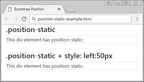
positon-static-example
<div class= "container-fluid">
   <h4>.position-static</h4>
   <div class="position-static border">
      This div element has position: static;
   </div>
   <br>
   <h4>.position-static + style: left:50px</h4>
   <div class="position-static border" style="left:50px">
      This div element has position: static;
   </div>
</div>
3. Class .position-relative
Ein Element, das die Klasse .position-relative angewendet wird, ist so ähnlich wie es wird Css property (postion: relative) angewendet. D.h es wird ziemlich relativ positioniert (positioned relative) als seine normale Stelle. Anders gesagt, Sie können Css property (left, right, top, bottom) verwenden um die rechte, linke, oben, unten Position aus seiner normalen Stelle.
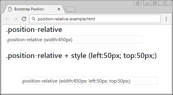
position-relative-example.html
<div class= "container-fluid">
   <h4>.position-relative</h4>
   <div class="position-relative border" style="width:450px;">
      .position-relative (width:450px)
   </div>
   <br>
   <h4>.position-relative + style (left:50px; top:50px;)</h4>
   <div class="position-relative border" style="left:50px; top:50px; width:450px;">
      .position-relative (width:450px; left:50px; top:50px;)
   </div>
</div>
4. Class .position-fixed
Ein Element, das die Klasse .position-fixed angewendet wird, ist so gleich wie es wird die Klasse Css property (position: fixed) angewendet. D.h es wird relativ positioniert (positioned relative) als Viewport des Browser.
In das folgende Beispiel wird ein Element in unten und rechts vom Viewport festgelegt
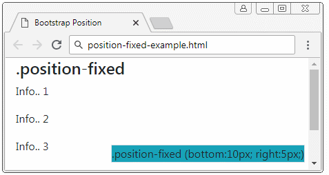
position-fixed-example
<div class= "container-fluid">
   <h4>.position-fixed</h4>
   <div class="position-fixed border bg-info" style="bottom:10px; right:5px;">
      .position-fixed (bottom:10px; right:5px;)
   </div>
   <p>Info.. 1</p>
   <p>Info.. 2</p>
   <p>Info.. 3</p>
   <p>Info.. 4</p>
   <p>Info.. 5</p>
</div>
Eine besondere Eigenschaft vom Element mit {position: fixed} ist, dass Sie seine 4 Rände mit 4 Rände des Viewport vom Browser verankern können. In dieser Situation wenn die Größe vom viewport ändert, wird die Größe auch entsprechend ändern. Es ist wie folgend
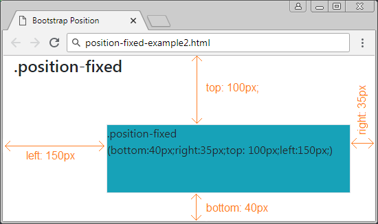
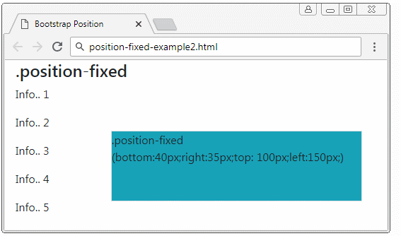
position-fixed-example2
<div class= "container-fluid">
   <h4>.position-fixed</h4>

   <div class="position-fixed border bg-info"
      style="bottom:40px;right:35px;top: 100px;left:150px;">
      .position-fixed <br>

      (bottom:40px;right:35px;top: 100px;left:150px;)
   </div>

   <p>Info.. 1</p>
   <p>Info.. 2</p>
   <p>Info.. 3</p>
   <p>Info.. 4</p>
   <p>Info.. 5</p>
</div>
5. Class .position-absolute
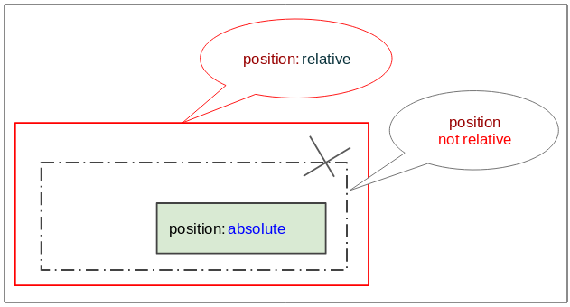
Das die Klasse .position-absolute (die absolute Position) angewendete Element wird nach seinem nächsten Vorfahren-Elemente (Vater, Großvater..), das {position: relative} hat. Sobald es findet, wird es die relative Position mit dem Element einstellen. Wenn nicht, wird es die relative Position mit dem Viewport des Browser.
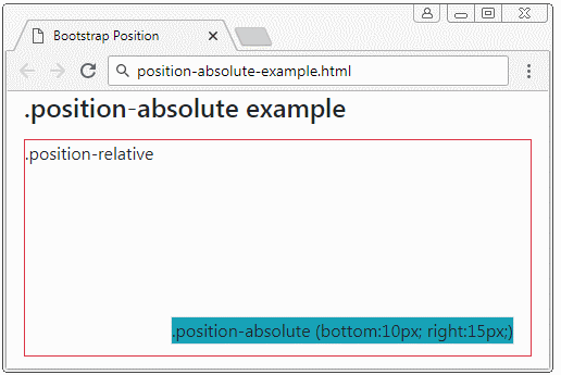
position-absolute-example
<div class= "container-fluid">
   <h4 class="mb-3">.position-absolute example</h4>

   <div class="position-relative border border-danger" style="height:200px;">
      .position-relative

      <div class="position-absolute border bg-info" style="bottom:10px; right:15px;">
         .position-absolute (bottom:10px; right:15px;)
      </div>

   </div>

</div>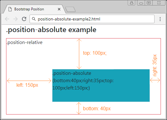
position-absolute-example2
<div class= "container-fluid">
   <h4 class="mb-3">.position-absolute example</h4>

   <div class="position-relative border border-danger" style="height:250px;">
      .position-relative
      <div class="position-absolute border bg-info"
         style="bottom:40px;right:35px;top: 100px;left:150px;">
         .position-absolute (bottom:40px;right:35px;top: 100px;left:150px;)
      </div>
   </div>

</div>
6. Class .position-sticky
Ein Element, die die Klasse .position-sticky angewendet wird, ist so gleich wie es wird Css property (position: sticky) angewendet. Seine Position basiert auf die Scoll Position des Benutzer.
Das Element Sticky wird aus "relative" zum "fixed" umwandelt oder umgekehrt nach der Scoll Position des Benutzer.
Achtung: Der Browser IE/Edge von der Version 15 oder älter unterstützt {position: sticky} nicht.
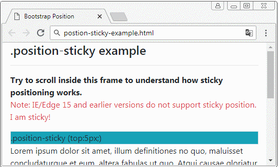
position-sticky-example.html
<!DOCTYPE html>
<html>
   <head>
      <meta charset="utf-8">
      <title>Bootstrap Position</title>
      <link rel="stylesheet" href="https://stackpath.bootstrapcdn.com/bootstrap/4.1.1/css/bootstrap.min.css">
   </head>
   <body>
      <div class= "container-fluid">
         <h4 class="mb-3">.position-sticky example</h4>
         <hr>
         <b>Try to scroll inside this frame to understand how sticky positioning works.</b>
         <p class="text-danger">
            Note: IE/Edge 15 and earlier versions do not support sticky position.
            I am sticky!
         </p>
         <div class="position-sticky border bg-info" style="top:5px;">
            .position-sticky (top:5px;)
         </div>

         <p>
            Lorem ipsum dolor sit amet, illum definitiones no quo, maluisset concludaturque et eum,
            altera fabulas ut quo. Atqui causae gloriatur ius te, id agam omnis evertitur eum.
            Affert laboramus repudiandae nec et. Inciderint efficiantur his ad. Eum no molestiae voluptatibus.
         </p>
      </div>
      <script src="https://code.jquery.com/jquery-3.3.1.slim.min.js"></script>
      <script src="https://cdnjs.cloudflare.com/ajax/libs/popper.js/1.14.3/umd/popper.min.js"></script>
      <script src="https://stackpath.bootstrapcdn.com/bootstrap/4.1.1/js/bootstrap.min.js"></script>
   </body>
</html>
7. Class .fixed-top, fixed-bottom, .sticky-top
Die Klasse .fixed-top wird für Element angewendet um es im oben vom Viewport des Browser festzulegen. (die Erklärung im .position-fixed sehen)
.fixed-top (Bootstrap code)
.fixed-top {
    position: fixed;
    top: 0;
    right: 0;
    left: 0;
    z-index: 1030;
}
Die Klasse .fixed-bottom wird für Element angewendet um es oben vom Viewport des Browser festzulegen. (Die Erklärung im .position-fixed sehen)
.fixed-bottom (Bootstrap Code)
.fixed-bottom {
    position: fixed;
    right: 0;
    bottom: 0;
    left: 0;
    z-index: 1030;
}
.sticky-top
Die Klasse .sticky-top ist ziemlich gleich wie .position-sticky, Sie können die Erklärung im .position-sticky sehen.
.sticky-top (Bootstrap Code)
.sticky-top {
    position: -webkit-sticky; /* Safari Browser */
    position: sticky;
    top: 0;
    z-index: 1020;
}
Anleitungen Bootstrap
- Die Anleitung zu Bootstrap Jumbotron
- Die Anleitung zu Bootstrap Dropdown
- Die Anleitung zu Bootstrap Alert
- Die Anleitung zu Bootstrap Button
- Die Anleitung zu Bootstrap Button Group
- Die Anleitung zu Bootstrap Popover (Tooltip)
- Die Anleitung zu Bootstrap Spinner
- Einführung in Bootstrap
- Die Anleitung zu Bootstrap Grid System
- Die Anleitung zu Bootstrap Card
- Die Anleitung zu Bootstrap Container
- Die Anleitung zu Bootstrap Nav, Tab, Pill
- Die Anleitung zu Bootstrap NavBar
- Die Anleitung zu Bootstrap Table
- Die Anleitung zu Bootstrap Modal
- Die Anleitung zu Bootstrap Form
- Die Anleitung zu Bootstrap Pagination
- Die Anleitung zu Bootstrap Badge
- Die Anleitung zu Bootstrap Input Group
- Die Anleitung zu Bootstrap List Group
- Die Anleitung zu Bootstrap ProgressBar
- Die Anleitung zu Bootstrap Collapse und Accordion
- Die Anleitung zu Bootstrap Scrollspy
- Die Anleitung zu Bootstrap Breadcrumb
- Die Anleitung zu Bootstrap Carousel
- Die Anleitung zu Bootstrap Spacing Utility
- Die Anleitung zu Bootstrap Border Utility
- Die Anleitung zu Bootstrap Color Utility
- Die Anleitung zu Bootstrap Text Utility
- Die Anleitung zu Bootstrap Sizing Utility
- Die Anleitung zu Bootstrap Position Utility
- Die Anleitung zu Bootstrap Flex Utility
- Die Anleitung zu Bootstrap Display Utility
- Die Anleitung zu Bootstrap Visibility Utility
- Die Anleitung zu Bootstrap Embed Utility
Show More