Die Anleitung zu Flutter Scaffold
1. Scaffold
Die Klasse Scaffold ist ein erweiterbares Widget, das den verfügbaren Platz oder den Bildschirm ausfüllt. Es bietet eine API zum Anzeigen der wichtigsten Widgets der Anwendung wie Drawer, SnackBar, Bottom-Sheet, FloatingActionButton, AppBar, BottomNavigationBar usw
Scaffold Constructor:
Scaffold constructor
const Scaffold({
  Key key,
  PreferredSizeWidget appBar,
  Widget body,
  Widget floatingActionButton,
  FloatingActionButtonLocation floatingActionButtonLocation,
  FloatingActionButtonAnimator floatingActionButtonAnimator,
  List<Widget> persistentFooterButtons,
  Widget drawer,
  Widget endDrawer,
  Widget bottomNavigationBar,
  Widget bottomSheet,
  Color backgroundColor,
  bool resizeToAvoidBottomPadding,
  bool resizeToAvoidBottomInset,
  bool primary: true,
  DragStartBehavior drawerDragStartBehavior:   DragStartBehavior.down
})
2. Examples
main.dart (ex1)
import 'package:flutter/material.dart';

void main() {
  runApp(MyApp());
}

class MyApp extends StatelessWidget {
  // This widget is the root of your application.
  @override
  Widget build(BuildContext context) {
    return MaterialApp(
      title: 'o7planning.org',
      debugShowCheckedModeBanner: false,
      theme: ThemeData(
        primarySwatch: Colors.blue,
        visualDensity: VisualDensity.adaptivePlatformDensity,
      ),
      home: MyHomePage(title: 'Flutter Scaffold Example'),
    );
  }
}

class MyHomePage extends StatelessWidget {
  MyHomePage({Key key, this.title}) : super(key: key);
  final String title;

  @override
  Widget build(BuildContext context) {
    return Scaffold(
      appBar: AppBar(
        title: Text(this.title),
      ),
      body: Center(
          child:
          Text (
            'Hello World',
          )
      ),
    );
  }
}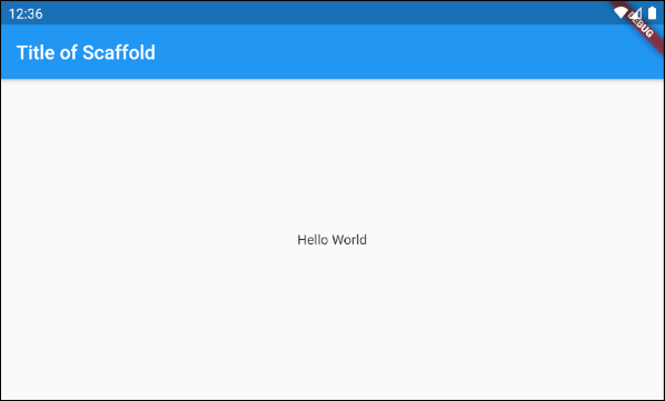
In diesem Beispiel haben wir ein Scaffold mit zwei Parameter appBar und body.
Scaffold (appBar + body)
// Create a Scaffold with 2 parameters: appBar, body.
Scaffold(
  appBar: AppBar(
    title: Text('Flutter Scaffold Example'),
  ),
  body: Center(
      child:
      Text(
        'Hello World',
      )
  ),
);3. floatingActionButton
floatingActionButton ist ein Button, die zu Oberfläche vom body schwebt. Standardmäßig wird es in der unteren rechten Ecke des Bildschirm angezeigt. Sie können den Speicherort über das Property floatingActionButtonLocation.
Widget floatingActionButton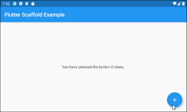
main.dart (floatingActionButton ex1)
import 'package:flutter/material.dart';

void main() => runApp(MyApp());

// This Widget is the main application widget.
class MyApp extends StatelessWidget {
  @override
  Widget build(BuildContext context) {
    return MaterialApp(
      title: "o7planning.org",
      debugShowCheckedModeBanner: false,
      theme: ThemeData(
        primarySwatch: Colors.blue,
        visualDensity: VisualDensity.adaptivePlatformDensity,
      ),
      home: MyHomePage(),
    );
  }
}

class MyHomePage extends StatefulWidget {
  MyHomePage({Key key}) : super(key: key);

  @override
  MyHomePageState createState() => MyHomePageState();
}

class MyHomePageState extends State<MyHomePage> {
  int _count = 0;

  Widget build(BuildContext context) {
    return Scaffold(
      appBar: AppBar(
        title:  Text('Flutter Scaffold Example'),
      ),
      body: Center(
          child: Text('You have pressed the button $_count times.')
      ),
      floatingActionButton: FloatingActionButton(
        onPressed: ()  {
          setState(() => this._count++);
        },
        tooltip: 'Increment Counter',
        child: const Icon(Icons.add),
      ),
    );
  }
}- Die Anleitung zu Flutter FloatingActionButton
4. floatingActionButtonLocation
Das Property floatingActionButtonLocation wird verwendet um die angezeigte Position von floatingActionButton anzugeben. Sein Standardwert ist FloatingActionButtonLocation.endFloat.
FloatingActionButtonLocation floatingActionButtonLocationZum Beispiel:
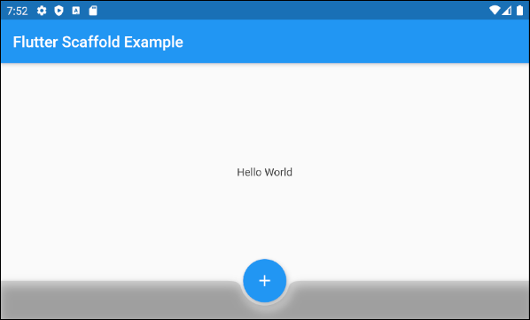
Scaffold (floatingActionButtonLocation ex1)
Scaffold(
  appBar: AppBar(
    title:  Text('Flutter Scaffold Example'),
  ),
  body: Center(
      child: Text('Hello World')
  ),
  bottomNavigationBar: BottomAppBar(
    shape: CircularNotchedRectangle(),
    color: Colors.black12,
    child: Container(
      height: 50.0,
    ),
  ),
  floatingActionButton: FloatingActionButton(
    onPressed: () {},
    tooltip: 'Increment Counter',
    child: Icon(Icons.add),
  ),
  floatingActionButtonLocation: FloatingActionButtonLocation.centerDocked,
);
Mit dieser Klasse FloatingActionButtonLocation können Sie die angezeigte Position von FloatingActionButton definieren. Hier sind einige vordefinierte Positionen als statische Konstanten dieser Klasse:
- FloatingActionButtonLocation.centerDocked
- FloatingActionButtonLocation.centerFloat
- FloatingActionButtonLocation.centerTop
- FloatingActionButtonLocation.endDocked
- FloatingActionButtonLocation.endFloat
- FloatingActionButtonLocation.endTop
- FloatingActionButtonLocation.miniCenterDocked
- FloatingActionButtonLocation.miniCenterFloat
- FloatingActionButtonLocation.miniCenterTop
- FloatingActionButtonLocation.miniEndDocked
- FloatingActionButtonLocation.miniEndFloat
- FloatingActionButtonLocation.miniEndTo
- FloatingActionButtonLocation.miniStartDocked
- FloatingActionButtonLocation.miniStartFloat
- FloatingActionButtonLocation.miniStartTop
- FloatingActionButtonLocation.startDocked
- FloatingActionButtonLocation.startFloat
- FloatingActionButtonLocation.startTop
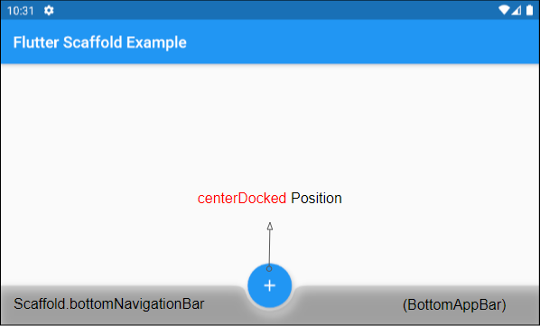
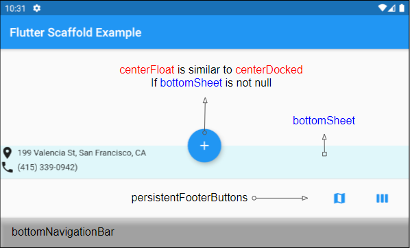
*Docked
Mit den Konstanten startDocked, centerDocked, endDocked, miniStartDocked, miniCenterDocked, miniEndDocked kann Scaffold.floatingActionButton auf der Oberfläche des Scaffold.body angezeigt werden, sodass die Mitte der Button am oberen Rand von Scaffold.bottomSheet oder Scaffold.persistentFooterButtons oder Scaffold.bottomNavigationBar (In einer solchen Reihenfolge der Priorität)
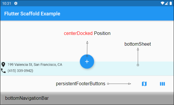
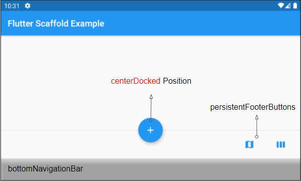
Wenn Scaffold.bottomSheet und Scaffold.persistentFooterButtonsnull sind, und Scaffold.bottomNavigationBar ein Objekt BottomAppBar ist, wird Scaffold.floatingActionButton eine Kerbe auf die Oberfläche von Scaffold.bottomNavigationBar erzeugen.
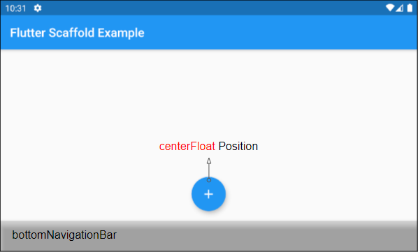
*Float
Mit den Konstants startFloat, centerFloat, endFloat, miniStartFloat, miniCenterFloat, miniEndFloat kann Scaffold.floatingActionButton oben angezeigt werden, ohne dass die beiden anderen Widgets: Scaffold.persistentFooterButtons und Scaffold.bottomNavigationBar überlappen.
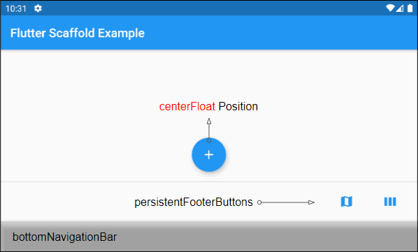
Wenn Scaffold.bottomSheet nicht null ist, wird die Mitte von Scaffold.floatingActionButton am oberen Rand von Scaffold.bottomSheet ausgerichtet.
*Top
Mit den Konstanten startTop, centerTop, endTop, miniStartTop, miniCenterTop, miniEndTop kann Scaffold.floatingActionButton direkt unter der oberen Symbolleiste angezeigt werden, sodass die Mitte der Button am unteren Rand der Symbolbar ausgerichtet ist .
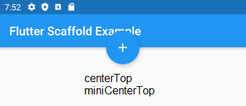
mini*
Die Konstanten mit dem Präfix "mini" machen den Scaffold.floatingActionButton etwas kleiner als gewöhnlich, was der Einstellung FloatingActionButton.mini = true entspricht.
5. floatingActionButtonAnimator
Das Property floatingActionButtonAnimator wird verwendet, um animierte Effekte für den FloatingActionButton zu erstellen.
FloatingActionButtonAnimator floatingActionButtonAnimator6. drawer
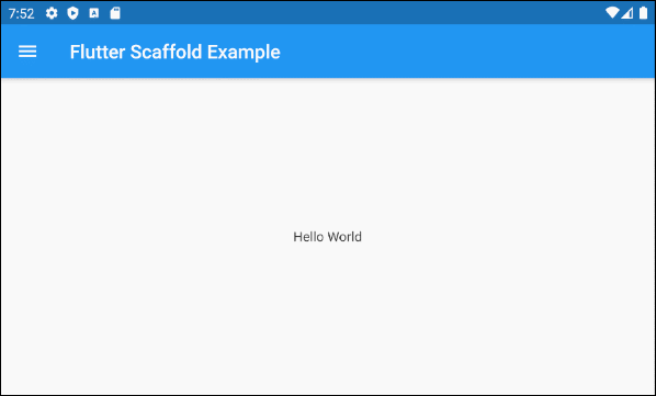
drawer ist ein Panel, das auf der linken Seite des body angezeigt (If textDirection = TextDirection.ltr). Es ist normalerweise auf Mobilgeräten versteckt, daher müssen Sie von links nach rechts wischen, damit es angezeigt wird.
Widget drawerIn einigen Situation kann AppBar.leading oder AppBar.actions automatisch eine Button hinzugefügt werden, damit der Benutzer die drawer schnell öffnen kann. Das wird im folgenden Artikel klar erläutert
Zum Beispiel:
main.dart (drawer)
import 'package:flutter/material.dart';

void main() {
  runApp(MyApp());
}

class MyApp extends StatelessWidget {
  // This widget is the root of your application.
  @override
  Widget build(BuildContext context) {
    return MaterialApp(
      title: 'Title of Application',
      theme: ThemeData(
        primarySwatch: Colors.blue,
        visualDensity: VisualDensity.adaptivePlatformDensity,
      ),
      home: MyHomePage(title: 'Flutter Scaffold Example'),
    );
  }
}

class MyHomePage extends StatelessWidget {
  MyHomePage({Key key, this.title}) : super(key: key);
  final String title;

  @override
  Widget build(BuildContext context) {
    return Scaffold (
      appBar: AppBar(
        title: Text(this.title),
      ),
      body: Center(
          child:
          Text(
            'Hello World',
          )
      ),
      drawer: Drawer(
        child: ListView(
          children: const <Widget> [
            DrawerHeader(
              decoration: BoxDecoration(
                color: Colors.green,
              ),
              child: Text(
                'Hello World',
                style: TextStyle(
                  color: Colors.green,
                  fontSize: 24,
                ),
              ),
            ),
            ListTile(
              title: Text('Gallery'),
            ),
            ListTile(
              title: Text('Slideshow'),
            ),
          ],
        ),
      ),
    );
  }
}- Die Anleitung zu Flutter Drawer
7. endDrawer
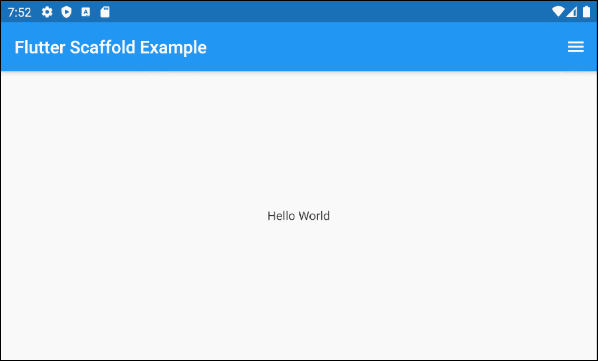
endDrawer ist ein Panel, der auf den rechten Seite vom body angezeigt wird (If textDirection = TextDirection.ltr).Es ist normalerweise auf Mobilgeräten versteckt, daher müssen Sie von rechts nach links wischen, damit es angezeigt wird.
Widget endDrawerIn einigen Situation kann AppBar.leading oder AppBar.actions automatische einen drawer hinzugefügt werden, damit der Benutzer den drawer schnell öffnen kann. Dies wird im folgenden Artikel klar erläutert:
zum Beispiel:
main.dart (endDrawer ex1)
import 'package:flutter/material.dart';

void main() {
  runApp(MyApp());
}

class MyApp extends StatelessWidget {
  @override
  Widget build(BuildContext context) {
    return MaterialApp(
      title: 'o7planning.org',
      debugShowCheckedModeBanner: false,
      theme: ThemeData(
        primarySwatch: Colors.blue,
        visualDensity: VisualDensity.adaptivePlatformDensity,
      ),
      home: MyHomePage(title: 'Flutter Scaffold Example'),
    );
  }
}

class MyHomePage extends StatelessWidget {
  MyHomePage({Key key, this.title}) : super(key: key);
  final String title;

  @override
  Widget build(BuildContext context) {
    return Scaffold (
      appBar: AppBar(
        title: Text(this.title),
      ),
      body: Center(
          child:
          Text(
            'Hello World',
          )
      ),
      endDrawer: Drawer(
        child: ListView(
          children: const <Widget> [
            DrawerHeader(
              decoration: BoxDecoration(
                color: Colors.green,
              ),
              child: Text(
                'Hello World',
                style: TextStyle(
                  color: Colors.green,
                  fontSize: 24,
                ),
              ),
            ),
            ListTile(
              title: Text('Gallery'),
            ),
            ListTile(
              title: Text('Slideshow'),
            ),
          ],
        ),
      ),
    );
  }
}- Die Anleitung zu Flutter Drawer
9. bottomNavigationBar
bottomNavigationBar ist eine Navigationsleiste, die am unteren Rand von Scaffold angezeigt wird. In den meisten Anwendungsfällen handelt sich um ein Objekt BottomAppBar oder BottomNativationBar.
Widget bottomNavigationBar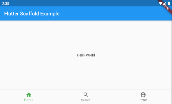
Scaffold (buttomNavigationBar)
import 'package:flutter/material.dart';

void main() {
  runApp(MyApp());
}

class MyApp extends StatelessWidget {
  // This widget is the root of your application.
  @override
  Widget build(BuildContext context) {
    return MaterialApp(
      title: 'Title of Application',
      theme: ThemeData(
        primarySwatch: Colors.blue,
        visualDensity: VisualDensity.adaptivePlatformDensity,
      ),
      home: MyHomePage(title: 'Flutter Scaffold Example'),
    );
  }
}

class MyHomePage extends StatelessWidget {
  MyHomePage({Key key, this.title}) : super(key: key);
  final String title;

  @override
  Widget build(BuildContext context) {
    return Scaffold(
      appBar: AppBar(
        title: Text(this.title),
      ),
      body: Center(
          child: Text('Hello World')
      ),
      bottomNavigationBar : BottomNavigationBar(
          currentIndex : 0,
          fixedColor  : Colors.green,
          items : [
            BottomNavigationBarItem(
              title  : Text("Home"),
              icon  : Icon(Icons.home),
            ),
            BottomNavigationBarItem(
              title : Text("Search"),
              icon  : Icon(Icons.search),
            ),
            BottomNavigationBarItem(
              title  : Text("Profile"),
              icon  : Icon(Icons.account_circle),
            ),
          ],
          onTap  : (int indexOfItem) {

          }),
    );
  }
}10. persistentFooterButtons
persistentFooterButtons ist eine Liste von Button, die in eine ButtonBar eingeschlossen und am unteren Rand vom Scaffold angezeigt werden. Sie werden dauerhalft angezeigt, auch wenn der Benutzer body von Scaffold scrollt. In den meisten Anwendungsfällen handelt es sich um TextButton.
List<Widget> persistentFooterButtonsZ.B: Ein Scaffold mit persistentFooterButtons und ohne bottomNavigationBar:
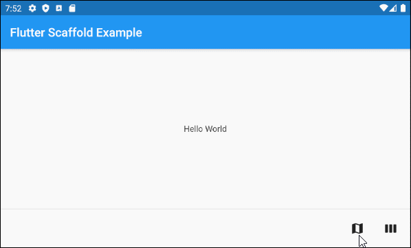
persistentFooterButtons (ex1)
Scaffold(
    appBar: AppBar(
      title:  Text('Flutter Scaffold Example'),
    ),
    body: Center(
        child: Text('Hello World')
    ),
    persistentFooterButtons :  [
      TextButton.icon(icon: Icon(Icons.map), label: Text(""), onPressed: () {}),
      TextButton.icon(icon: Icon(Icons.view_week), label: Text(""), onPressed: () {}),
    ]
)
Z.B: Ein Scaffold mit persistentFooterButtons und bottomNavigationBar:
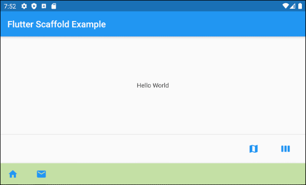
persistentFooterButtons (ex2)
Scaffold(
    appBar: AppBar(
      title:  Text('Flutter Scaffold Example'),
    ),
    body: Center(
        child: Text('Hello World')
    ),
    persistentFooterButtons :  [
      TextButton.icon(icon: Icon(Icons.map), label: Text(""), onPressed: () {}),
      TextButton.icon(icon: Icon(Icons.view_week), label: Text(""), onPressed: () {}),
    ],
    bottomNavigationBar: BottomAppBar(
      color: Colors.lightGreen[200],
      child: new Row(
        mainAxisSize: MainAxisSize.max,
        mainAxisAlignment: MainAxisAlignment.start,
        children: <Widget>[
          TextButton.icon(icon: Icon(Icons.home), label: Text(""), onPressed: () {},),
          TextButton.icon(icon: Icon(Icons.email), label: Text(""), onPressed: () {},),
        ],
      ),
    )
)11. bottomSheet
bottomSheet zeigt zusätzliche Informationen zum Hauptinhalt der Anwendung an. Es wird dauerhalft am unteren Rand von Scaffold angezeigt, auch wenn der Benutzer mit anderen Teilen der Anwendung interagiert.
Widget bottomSheetObwohl sich das bottomSheet am unteren Rand vom Scaffold befindet, steht es immer noch vor den persistentFooterButtons und bottomNavigationBar.
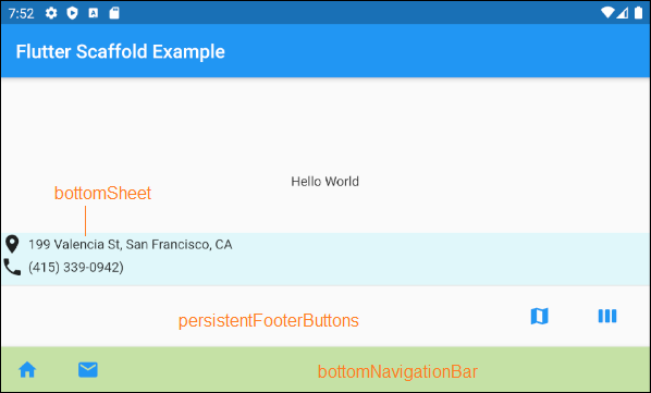
bottomSheet (ex1)
Scaffold(
    appBar: AppBar(
      title:  Text('Flutter Scaffold Example'),
    ),
    body: Center(
        child: Text('Hello World')
    ),
    bottomSheet: Container(
        height: 55,
        color: Colors.cyan[50],
        child:Column    (
          children: [
            Row (
              children: [
                Icon(Icons.place),
                SizedBox(width:5, height:5),
                Text("199 Valencia St, San Francisco, CA")
              ],
            ),
            Row (
              children: [
                Icon(Icons.phone),
                SizedBox(width:5, height:5),
                Text("(415) 339-0942)")
              ],
            )
          ],
        )
    ),
    persistentFooterButtons :  [
      TextButton.icon(icon: Icon(Icons.map), label: Text(""), onPressed: () {}),
      TextButton.icon(icon: Icon(Icons.view_week), label: Text(""), onPressed: () {}),
    ],
    bottomNavigationBar: BottomAppBar(
      color: Colors.lightGreen[200],
      child: new Row(
        mainAxisSize: MainAxisSize.max,
        mainAxisAlignment: MainAxisAlignment.start,
        children: <Widget>[
          TextButton.icon(icon: Icon(Icons.home), label: Text(""), onPressed: () {},),
          TextButton.icon(icon: Icon(Icons.email), label: Text(""), onPressed: () {},),
        ],
      ),
    )
)
ScaffoldState.showButtonSheet()
Mit der Methode ScaffoldState.showBottomSheet() wird bei Bedar das bottomSheet für Scaffold erstellt und angezeigt. Der Benutzer kann das bottomSheet schließen, um Platz für die Anwendung zu sparen.
main.dart (bottomSheet ex2)
import 'package:flutter/material.dart';
void main() => runApp(MyApp());
// This Widget is the main application widget.
class MyApp extends StatelessWidget {
@override
Widget build(BuildContext context) {
return MaterialApp(
title: "o7planning.org",
debugShowCheckedModeBanner: false,
theme: ThemeData(
primarySwatch: Colors.blue,
visualDensity: VisualDensity.adaptivePlatformDensity,
),
home: MyHomePage(),
);
}
}
class MyHomePage extends StatefulWidget {
MyHomePage({Key key}) : super(key: key);
@override
MyHomePageState createState() => MyHomePageState();
}
class MyHomePageState extends State<MyHomePage> {
Widget build(BuildContext context) {
return Scaffold(
appBar: AppBar(
title: Text('Flutter Scaffold Example'),
),
body: Center(
child: Center(
child: Builder ( // The Builder return a ElevatedButton
// We need a context of Scaffold
builder: (BuildContext ctxOfScaffold) {
return ElevatedButton(
onPressed: () {
this._showMyBottomSheet(ctxOfScaffold);
},
child: Icon(Icons.add),
);
},
)
),
),
floatingActionButton: Builder ( // The Builder return a FloatingActionButton
// We need a context of Scaffold
builder: (BuildContext ctxOfScaffold) {
return FloatingActionButton(
onPressed: () {
this._showMyBottomSheet(ctxOfScaffold);
},
tooltip: 'Increment Counter',
child: Icon(Icons.add),
);
},
),
bottomNavigationBar: BottomAppBar(
color: Colors.lightGreen[200],
child: new Row(
mainAxisSize: MainAxisSize.max,
mainAxisAlignment: MainAxisAlignment.start,
children: <Widget>[
TextButton.icon(icon: Icon(Icons.home), label: Text(""), onPressed: () {},),
TextButton.icon(icon: Icon(Icons.email), label: Text(""), onPressed: () {},),
],
),
)
);
}
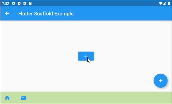
// We need a context object of Scaffold to draw Scaffold.bottomSheet.
void _showMyBottomSheet(BuildContext ctxOfScaffold) { // context of Scaffold.
// ScaffoldState.showBottomSheet:
Scaffold.of(ctxOfScaffold).showBottomSheet<void>(
(BuildContext context) {
return Container(
height: 200,
color: Colors.amber,
child: Center(
child: Column(
mainAxisAlignment: MainAxisAlignment.center,
mainAxisSize: MainAxisSize.min,
children: <Widget>[
const Text('BottomSheet'),
ElevatedButton(
child: Text('Close BottomSheet'),
onPressed: () => Navigator.pop(context),
)
],
),
),
);
},
);
}
}showModalBottomSheet()
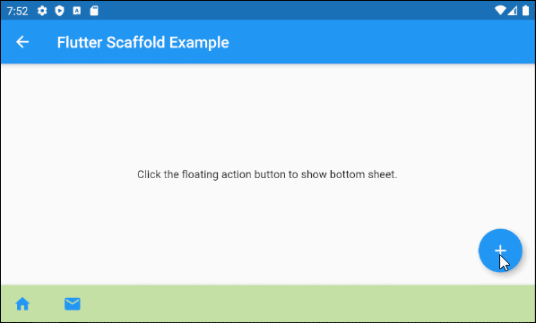
Mit der Funktion showModalBottomSheet() wird ein Dialog erstellt und angezeigt, das ein bottom-sheet enthält, das über allen anderen Elementen der Anwendung schwebt. Der Benutzer muss es schlißen, wenn er mit den Elementen darunter interagieren möchte.
main.dart (bottomSheet ex3)
import 'package:flutter/material.dart';

void main() => runApp(MyApp());

class MyApp extends StatelessWidget {
  @override
  Widget build(BuildContext context) {
    return MaterialApp(
      title: 'o7planning.org',
      debugShowCheckedModeBanner: false,
      theme: ThemeData(
        primarySwatch: Colors.blue,
      ),
      home: MyHomePage(title: 'Flutter Scaffold Example'),
    );
  }
}

class MyHomePage extends StatefulWidget {
  MyHomePage({Key key, this.title}) : super(key: key);

  final String title;

  @override
  MyHomePageState createState() => MyHomePageState();
}

class MyHomePageState extends State<MyHomePage> {

  @override
  Widget build(BuildContext context) {
    return Scaffold(
        appBar: AppBar(
          title: Text(widget.title),
        ),
        body: Center(
          child: Column(
            mainAxisAlignment: MainAxisAlignment.center,
            children: <Widget>[
              Text(
                'Click the floating action button to show bottom sheet.',
              ),
            ],
          ),
        ),
        floatingActionButton: FloatingActionButton(
          onPressed:() =>  _showMyBottomSheet(context),
          child: Icon(Icons.add),
        ),
        bottomNavigationBar: BottomAppBar(
          color: Colors.lightGreen[200],
          child: new Row(
            mainAxisSize: MainAxisSize.max,
            mainAxisAlignment: MainAxisAlignment.start,
            children: <Widget>[
              TextButton.icon(icon: Icon(Icons.home), label: Text(""), onPressed: () {},),
              TextButton.icon(icon: Icon(Icons.email), label: Text(""), onPressed: () {},),
            ],
          ),
        )
    );
  }


  void _showMyBottomSheet(BuildContext context) {
    // Call showModalBottomSheet(), this function open a Dialog
    // and return Future object.
    showModalBottomSheet (
        context: context,
        builder: (ctx) {
          return Container(
            height: MediaQuery.of(context).size.height  * 0.4,
            child: Center(
              child: Text("Welcome to o7planning.org!"),
            ),
          );
        }
    );
  }
}12. backgroundColor
Das Property backgroundColor wird benutzt um die Hintergrundsfarbe von Scaffold festzulegen.
Color backgroundColorZum Beispiel:
backgroundColor (ex1)
Scaffold(
  appBar: AppBar(
    title:  Text('Flutter Scaffold Example'),
  ),
  body: Center(
      child: Text('Hello World')
  ),
  backgroundColor: Colors.greenAccent,
)Anleitungen Flutter
- Die Anleitung zu Flutter Column
- Die Anleitung zu Flutter Stack
- Die Anleitung zu Flutter IndexedStack
- Die Anleitung zu Flutter Spacer
- Die Anleitung zu Flutter Expanded
- Die Anleitung zu Flutter SizedBox
- Die Anleitung zu Flutter Tween
- Installieren Sie das Flutter SDK unter Windows
- Installieren Sie das Flutter Plugin für Android Studio
- Erstellen Sie Ihre erste Flutter-Anwendung - Hello Flutter
- Die Anleitung zu Flutter Scaffold
- Die Anleitung zu Flutter AppBar
- Die Anleitung zu Flutter BottomAppBar
- Die Anleitung zu Flutter TextButton
- Die Anleitung zu Flutter ElevatedButton
- Die Anleitung zu Flutter EdgeInsetsGeometry
- Die Anleitung zu Flutter EdgeInsets
- Die Anleitung zu Flutter CircularProgressIndicator
- Die Anleitung zu Flutter LinearProgressIndicator
- Die Anleitung zu Flutter Center
- Die Anleitung zu Flutter Align
- Die Anleitung zu Flutter Row
- Die Anleitung zu Flutter SplashScreen
- Die Anleitung zu Flutter Alignment
- Die Anleitung zu Flutter Positioned
- Die Anleitung zu Flutter SimpleDialog
- Die Anleitung zu Flutter AlertDialog
- Die Anleitung zu Flutter Navigation und Routing
- Die Anleitung zu Flutter TabBar
- Die Anleitung zu Flutter Banner
- Die Anleitung zu Flutter BottomNavigationBar
- Die Anleitung zu Flutter FancyBottomNavigation
- Die Anleitung zu Flutter Card
- Die Anleitung zu Flutter Border
- Die Anleitung zu Flutter ContinuousRectangleBorder
- Die Anleitung zu Flutter RoundedRectangleBorder
- Die Anleitung zu Flutter CircleBorder
- Die Anleitung zu Flutter StadiumBorder
- Die Anleitung zu Flutter Container
- Die Anleitung zu Flutter RotatedBox
- Die Anleitung zu Flutter CircleAvatar
- Die Anleitung zu Flutter IconButton
- Die Anleitung zu Flutter FlatButton
- Die Anleitung zu Flutter SnackBar
Show More