Die Anleitung zu Flutter BottomAppBar
1. BottomAppBar
Ein unteres Menü ist ein traditioneller Stil von der Anwendungen iOS. In Flutter können Sie es mit BottomAppBar machen. Außerdem verfügt BottomAppBar über eine praktische Funktion, mit der Sie einen FloatingActionButton anhängen können.
BottomAppBar Constructor:
BottomAppBar constructor
const BottomAppBar(
    {Key key,
    Color color,
    double elevation,
    NotchedShape shape,
    Clip clipBehavior: Clip.none,
    double notchMargin: 4.0,
    Widget child}
)
BottomAppBar wird normalerweise in einem Scaffold über das Property AppBar.bottomNavigationBar platziert und am unteren Rand des Scaffold angezeigt.
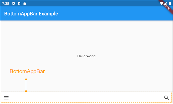
2. child
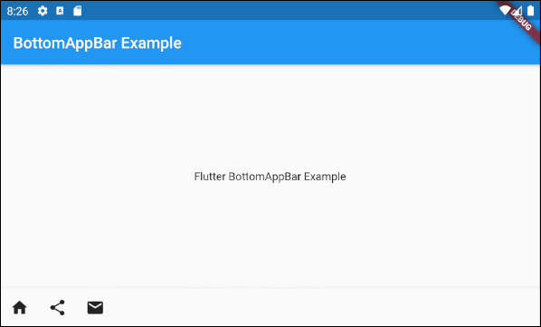
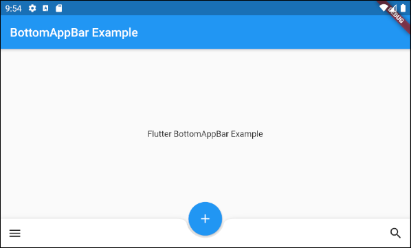
child ist die wichtigste Property von BottomAppBar. In den meisten Situation handelt es sich um eine Row, und dieses Objekt Row enthält ein oder mehrere untergeordneten Widget wie IconButton, PopupMenuButton...
Widget childZum Beispiel: Ein BottomAppBar mit der action als IconButton, PopupMenuButton.
main.dart (child - ex1)
import 'package:flutter/material.dart';
void main() {
runApp(MyApp());
}
class MyApp extends StatelessWidget {
// This widget is the root of your application.
@override
Widget build(BuildContext context) {
return MaterialApp(
title: 'Title of Application',
theme: ThemeData(
primarySwatch: Colors.blue,
visualDensity: VisualDensity.adaptivePlatformDensity,
),
home: MyHomePage(),
);
}
}
class MyHomePage extends StatelessWidget {
MyHomePage({Key key}) : super(key: key);
@override
Widget build(BuildContext context) {
return Scaffold(
appBar: AppBar(
title: Text("BottomAppBar Example"),
),
body: Center(
child: Text(
'Flutter BottomAppBar Example',
)
),
bottomNavigationBar: BottomAppBar(
child: new Row(
mainAxisSize: MainAxisSize.max,
mainAxisAlignment: MainAxisAlignment.start,
children: <Widget>[
IconButton(icon: Icon(Icons.home), onPressed: () {},),
PopupMenuButton(
icon: Icon(Icons.share),
itemBuilder: (context) => [
PopupMenuItem(
value: 1,
child: Text("Facebook"),
),
PopupMenuItem(
value: 2,
child: Text("Instagram"),
),
],
),
IconButton(icon: Icon(Icons.email), onPressed: () {},),
],
),
)
);
}
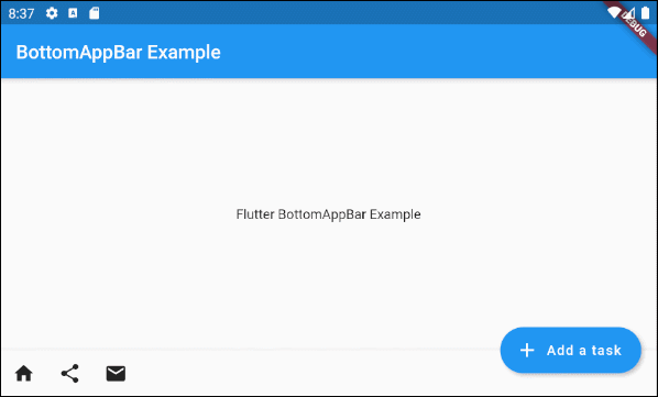
}Um das obige Beispiel zu erweitern, fügen wir einen FloatingActionButton an die rechte Seite von BottomAppBar.
main.dart (child ex2)
import 'package:flutter/material.dart';
void main() {
runApp(MyApp());
}
class MyApp extends StatelessWidget {
// This widget is the root of your application.
@override
Widget build(BuildContext context) {
return MaterialApp(
title: 'Title of Application',
theme: ThemeData(
primarySwatch: Colors.blue,
visualDensity: VisualDensity.adaptivePlatformDensity,
),
home: MyHomePage(),
);
}
}
class MyHomePage extends StatelessWidget {
MyHomePage({Key key}) : super(key: key);
@override
Widget build(BuildContext context) {
return Scaffold(
appBar: AppBar(
title: Text("BottomAppBar Example"),
),
body: Center(
child: Text(
'Flutter BottomAppBar Example',
)
),
floatingActionButton: FloatingActionButton.extended (
elevation: 4.0,
icon: const Icon(Icons.add),
label: const Text('Add a task'),
onPressed: () {},
),
floatingActionButtonLocation: FloatingActionButtonLocation.endDocked,
bottomNavigationBar: BottomAppBar(
child: new Row(
mainAxisSize: MainAxisSize.max,
mainAxisAlignment: MainAxisAlignment.start,
children: <Widget>[
IconButton(icon: Icon(Icons.home), onPressed: () {},),
PopupMenuButton(
icon: Icon(Icons.share),
itemBuilder: (context) => [
PopupMenuItem(
value: 1,
child: Text("Facebook"),
),
PopupMenuItem(
value: 2,
child: Text("Instagram"),
),
],
),
IconButton(icon: Icon(Icons.email), onPressed: () {},),
],
),
)
);
}
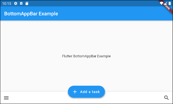
}Zum Beispiel: Ein BottomAppBar mit FloatingActionButton wird ins Zentrum verankert.

main.dart (child ex3)
import 'package:flutter/material.dart';
void main() {
runApp(MyApp());
}
class MyApp extends StatelessWidget {
// This widget is the root of your application.
@override
Widget build(BuildContext context) {
return MaterialApp(
title: 'Title of Application',
theme: ThemeData(
primarySwatch: Colors.blue,
visualDensity: VisualDensity.adaptivePlatformDensity,
),
home: MyHomePage(),
);
}
}
class MyHomePage extends StatelessWidget {
MyHomePage({Key key}) : super(key: key);
@override
Widget build(BuildContext context) {
return Scaffold(
appBar: AppBar(
title: Text("BottomAppBar Example"),
),
body: Center(
child: Text(
'Flutter BottomAppBar Example',
)
),
floatingActionButton: FloatingActionButton(
onPressed: () { },
tooltip: 'Increment',
child: Icon(Icons.add),
elevation: 2.0,
),
floatingActionButtonLocation: FloatingActionButtonLocation.centerDocked,
bottomNavigationBar: BottomAppBar(
child: new Row(
mainAxisSize: MainAxisSize.max,
mainAxisAlignment: MainAxisAlignment.spaceBetween,
children: <Widget>[
IconButton(icon: Icon(Icons.menu), onPressed: () {},),
IconButton(icon: Icon(Icons.search), onPressed: () {},),
],
),
)
);
}
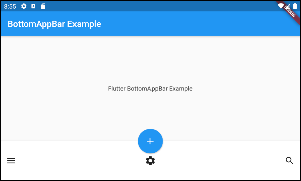
}Zum Beispiel: die Höhe von BottomAppBar anpassen:
main.dart (child ex4)
import 'package:flutter/material.dart';

void main() {
  runApp(MyApp());
}

class MyApp extends StatelessWidget {
  // This widget is the root of your application.
  @override
  Widget build(BuildContext context) {
    return MaterialApp(
      title: 'Title of Application',
      theme: ThemeData(
        primarySwatch: Colors.blue,
        visualDensity: VisualDensity.adaptivePlatformDensity,
      ),
      home: MyHomePage(),
    );
  }
}

class MyHomePage extends StatelessWidget {
  MyHomePage({Key key}) : super(key: key);

  @override
  Widget build(BuildContext context) {
    return Scaffold(
        appBar: AppBar(
          title: Text("BottomAppBar Example"),
        ),
        body: Center(
            child:  Text(
              'Flutter BottomAppBar Example',
            )
        ),
        floatingActionButton: FloatingActionButton(
          onPressed: () { },
          tooltip: 'Increment',
          child: Icon(Icons.add),
          elevation: 2.0,
        ),
        floatingActionButtonLocation: FloatingActionButtonLocation.centerDocked,
        bottomNavigationBar: BottomAppBar(
          child: Container(
            height: 90.0,
            child: new Row(
              mainAxisSize: MainAxisSize.max,
              mainAxisAlignment: MainAxisAlignment.spaceBetween,
              children: <Widget>[
                IconButton(icon: Icon(Icons.menu), onPressed: () {},),
                IconButton(icon: Icon(Icons.settings), onPressed: () {},),
                IconButton(icon: Icon(Icons.search), onPressed: () {},),
              ],
            ),
          )
        )
    );
  }
}
3. shape
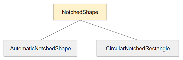
Der Property shape wird verwendet, um die Form der Kerbe (notch) zu definieren wenn FloatingActionButton auf einem BottomAppBar platziert wird.
NotchedShape shapeNotchedShape ist eine abstrakte Klasse mit zwei Unterklassen CircularNotchedRectangle und AutomaticNotchedShape.
- Mit der Klasse CircularNotchedRectangle können Sie eine kreisförmige Kerbe (notch) erstellen, die zu den kreisförmigen FloatingActionButton passt.
- Mit der Klasse AutomaticNotchedShape können Sie die benutzerdefinierte Kerben erstellen, die zu den verschiedenen Formen von FloatingActionButton passen.
- CircularNotchedRectangle
- AutomaticNotchedShape
Schauen Sie ein Beispiel für die Verwendung CircularNotchedRectangle an, um eine kreisförmige Kerbe (notch) zu erstellen:
main.dart (shape ex1)
import 'package:flutter/material.dart';

void main() {
  runApp(MyApp());
}

class MyApp extends StatelessWidget {
  // This widget is the root of your application.
  @override
  Widget build(BuildContext context) {
    return MaterialApp(
      title: 'Title of Application',
      theme: ThemeData(
        primarySwatch: Colors.blue,
        visualDensity: VisualDensity.adaptivePlatformDensity,
      ),
      home: MyHomePage(),
    );
  }
}

class MyHomePage extends StatelessWidget {
  MyHomePage({Key key}) : super(key: key);

  @override
  Widget build(BuildContext context) {
    return Scaffold(
        appBar: AppBar(
          title: Text("BottomAppBar Example"),
        ),
        body: Center(
            child:  Text(
              'Flutter BottomAppBar Example',
            )
        ),
        floatingActionButton: FloatingActionButton(
          onPressed: () { },
          tooltip: 'Increment',
          child: Icon(Icons.add),
          elevation: 2.0,
        ),
        floatingActionButtonLocation: FloatingActionButtonLocation.centerDocked,
        bottomNavigationBar: BottomAppBar(
          child: Row(
            mainAxisSize: MainAxisSize.max,
            mainAxisAlignment: MainAxisAlignment.spaceBetween,
            children: <Widget>[
              IconButton(icon: Icon(Icons.menu), onPressed: () {},),
              IconButton(icon: Icon(Icons.search), onPressed: () {},),
            ],
          ),
          shape: CircularNotchedRectangle(),
        )
    );
  }
}
Hinweis: Verwenden Sie das CircularNotchedRectangle nicht mit einem FloatingActionButton , der kein Kreis ist. Denn es bringt Sie ein unbefriedigendes Ergebnis:

Z.B: Verwenden Sie AutomaticNotchedShape mit einem Rechteck FloatingActionButton :
main.dart (shape ex3)
import 'package:flutter/material.dart';

void main() {
  runApp(MyApp());
}

class MyApp extends StatelessWidget {
  // This widget is the root of your application.
  @override
  Widget build(BuildContext context) {
    return MaterialApp(
      title: 'Title of Application',
      theme: ThemeData(
        primarySwatch: Colors.blue,
        visualDensity: VisualDensity.adaptivePlatformDensity,
      ),
      home: MyHomePage(),
    );
  }
}

class MyHomePage extends StatelessWidget {
  MyHomePage({Key key}) : super(key: key);

  @override
  Widget build(BuildContext context) {
    return Scaffold(
        appBar: AppBar(
          title: Text("BottomAppBar Example"),
        ),
        body: Center(
            child:  Text(
              'Flutter BottomAppBar Example',
            )
        ),
        floatingActionButton: FloatingActionButton.extended (
          elevation: 4.0,
          icon: const Icon(Icons.add),
          label: const Text('Add a task'),
          onPressed: () {},
        ),
        floatingActionButtonLocation: FloatingActionButtonLocation.centerDocked,
        bottomNavigationBar: BottomAppBar(
          child: Row(
            mainAxisSize: MainAxisSize.max,
            mainAxisAlignment: MainAxisAlignment.spaceBetween,
            children: <Widget>[
              IconButton(icon: Icon(Icons.menu), onPressed: () {},),
              IconButton(icon: Icon(Icons.search), onPressed: () {},),
            ],
          ),
          shape: AutomaticNotchedShape(
              RoundedRectangleBorder(),
              StadiumBorder(side: BorderSide())
          ),
        )
    );
  }
}
4. color
Die Property color wird benutzt um die Farbe von BottomAppBar festzulegen.
Color color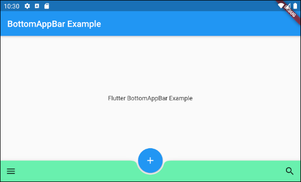
color (ex1)
BottomAppBar(
  child: Row(
    mainAxisSize: MainAxisSize.max,
    mainAxisAlignment: MainAxisAlignment.spaceBetween,
    children: <Widget>[
      IconButton(icon: Icon(Icons.menu), onPressed: () {},),
      IconButton(icon: Icon(Icons.search), onPressed: () {},),
    ],
  ),
  shape: CircularNotchedRectangle(),
  color: Colors.greenAccent
)Anleitungen Flutter
- Die Anleitung zu Flutter Column
- Die Anleitung zu Flutter Stack
- Die Anleitung zu Flutter IndexedStack
- Die Anleitung zu Flutter Spacer
- Die Anleitung zu Flutter Expanded
- Die Anleitung zu Flutter SizedBox
- Die Anleitung zu Flutter Tween
- Installieren Sie das Flutter SDK unter Windows
- Installieren Sie das Flutter Plugin für Android Studio
- Erstellen Sie Ihre erste Flutter-Anwendung - Hello Flutter
- Die Anleitung zu Flutter Scaffold
- Die Anleitung zu Flutter AppBar
- Die Anleitung zu Flutter BottomAppBar
- Die Anleitung zu Flutter TextButton
- Die Anleitung zu Flutter ElevatedButton
- Die Anleitung zu Flutter EdgeInsetsGeometry
- Die Anleitung zu Flutter EdgeInsets
- Die Anleitung zu Flutter CircularProgressIndicator
- Die Anleitung zu Flutter LinearProgressIndicator
- Die Anleitung zu Flutter Center
- Die Anleitung zu Flutter Align
- Die Anleitung zu Flutter Row
- Die Anleitung zu Flutter SplashScreen
- Die Anleitung zu Flutter Alignment
- Die Anleitung zu Flutter Positioned
- Die Anleitung zu Flutter SimpleDialog
- Die Anleitung zu Flutter AlertDialog
- Die Anleitung zu Flutter Navigation und Routing
- Die Anleitung zu Flutter TabBar
- Die Anleitung zu Flutter Banner
- Die Anleitung zu Flutter BottomNavigationBar
- Die Anleitung zu Flutter FancyBottomNavigation
- Die Anleitung zu Flutter Card
- Die Anleitung zu Flutter Border
- Die Anleitung zu Flutter ContinuousRectangleBorder
- Die Anleitung zu Flutter RoundedRectangleBorder
- Die Anleitung zu Flutter CircleBorder
- Die Anleitung zu Flutter StadiumBorder
- Die Anleitung zu Flutter Container
- Die Anleitung zu Flutter RotatedBox
- Die Anleitung zu Flutter CircleAvatar
- Die Anleitung zu Flutter IconButton
- Die Anleitung zu Flutter FlatButton
- Die Anleitung zu Flutter SnackBar
Show More