Die Anleitung zu Flutter CircularProgressIndicator
1. CircularProgressIndicator
CircularProgressIndicator ist eine Unterklasse von ProgressIndicator. Es wird eine kreisförmige Fortschrittsanzeige erstellt.
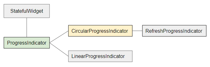
- LinearProgressIndicator
- ProgressIndicator
CircularProgressIndicator ist in zwei Typen unterteilt:
Determinate
Determinate (bestimmt): Ein Forschrittsanzeige, die dem Benutzer den Prozentsatz der abgeschlossenen Arbeit basierend auf dem Wert der Property value (im Bereich von 0 bis 1) anzeigt.
Indeterminate
Indeterminate (unbestimmt): Eine Fortschrittsanzeige, die weder den Prozentsatz der abgeschlossenen Arbeit noch die Endzeit angibt.
CircularProgressIndicator Constructor:
CircularProgressIndicator constructor
const CircularProgressIndicator(
    {Key key,
    double value,
    Color backgroundColor,
    Animation<Color> valueColor,
    double strokeWidth: 4.0,
    String semanticsLabel,
    String semanticsValue}
)
2. Example: Indeterminate
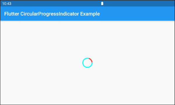
Beginnen wir mit dem einfachsten Beispiel: Ein CircularProgressIndicator simuliert einen aktiven Prozess, kennt aber nicht den Prozentsatz der abgeschlossenen Arbeit sowie die Endzeit.
main.dart (ex 1)
import 'package:flutter/material.dart';
void main() => runApp(MyApp());
class MyApp extends StatelessWidget {
@override
Widget build(BuildContext context) {
return MaterialApp(
title: 'o7planning.org',
debugShowCheckedModeBanner: false,
home: HomePage(),
);
}
}
class HomePage extends StatelessWidget {
@override
Widget build(BuildContext context) {
return Scaffold(
appBar: AppBar(
title: Text('Flutter CircularProgressIndicator Example'),
),
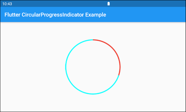
body: Center(
child: CircularProgressIndicator(
backgroundColor: Colors.cyanAccent,
valueColor: new AlwaysStoppedAnimation<Color>(Colors.red),
),
),
);
}
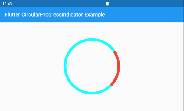
}Standardmäßig hat CircularProgressIndicator einen ziemlich kleinen Radius. Wenn Sie jedoch die Größe anpassen möchten, fügen Sie sie in eine SizedBox ein.
SizedBox(
  width: 200,
  height: 200,
  child: CircularProgressIndicator(
    strokeWidth: 10,
    backgroundColor: Colors.cyanAccent,
    valueColor: new AlwaysStoppedAnimation<Color>(Colors.red),
  ),
)Der Parameter valueColor wird verwendet, um eine Farbanimation für den Fortschritt von CircularProgressIndicator anzugeben, zum Beispiel:
valueColor: new AlwaysStoppedAnimation<Color>(Colors.red)AlwaysStoppedAnimation<Color> stoppt die Animation von CircularProgressIndicator wenn der Parameter value ein bestimmter Wert und nicht null ist.
SizedBox(
  width: 200,
  height: 200,
  child: CircularProgressIndicator(
    value: 0.3,
    backgroundColor: Colors.cyanAccent,
    valueColor: new AlwaysStoppedAnimation<Color>(Colors.red),
  ),
)
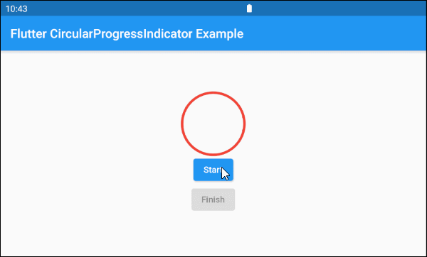
Basierend auf den oben genannten Funktionen der Parameter value und valueColor können Sie das Verhalten von CircularProgressIndicator steuern. Sehen wir uns ein Beispiel an:
main.dart (ex 1d)
import 'package:flutter/material.dart';

void main() => runApp(MyApp());

class MyApp extends StatelessWidget {
  @override
  Widget build(BuildContext context) {
    return MaterialApp(
      title: 'o7planning.org',
      debugShowCheckedModeBanner: false,
      home: HomePage(),
    );
  }
}

class HomePage extends StatefulWidget {

  @override
  State<StatefulWidget> createState() {
    return _HomePageState();
  }
}

class _HomePageState extends State<HomePage> {

  bool _working = false;

  void startWorking() async {
    this.setState(() {
      this._working = true;
    });
  }

  void finishWorking() {
    this.setState(() {
      this._working = false;
    });
  }

  @override
  Widget build(BuildContext context) {
    return Scaffold(
      appBar: AppBar(
        title: Text('Flutter CircularProgressIndicator Example'),
      ),
      body: Center(
          child:  Column (
              mainAxisAlignment: MainAxisAlignment.center,
              children:  [
                SizedBox(
                  width: 100,
                  height: 100,
                  child: CircularProgressIndicator(
                    value: this._working? null: 1,
                    backgroundColor: Colors.cyanAccent,
                    valueColor: new AlwaysStoppedAnimation<Color>(Colors.red),
                  ),
                ),
                ElevatedButton(
                    child: Text("Start"),
                    onPressed: this._working? null: () {
                      this.startWorking();
                    }
                ),
                ElevatedButton(
                    child: Text("Finish"),
                    onPressed: !this._working? null: () {
                      this.finishWorking();
                    }
                )
              ]
          )
      ),
    );
  }
}
3. Example: Determinate
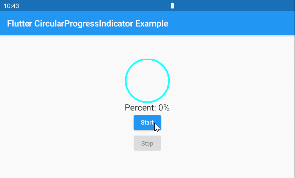
Im folgenden Beispiel wird CircularProgressIndicator verwendet um eine Fortschritt mit dem Prozentsatz der abgeschlossenen Arbeit anzuzeigen. Der Parameter value hat einen Wert von 0 bis 1.
main.dart (ex 2)
import 'package:flutter/material.dart';

void main() => runApp(MyApp());

class MyApp extends StatelessWidget {
  @override
  Widget build(BuildContext context) {
    return MaterialApp(
      title: 'o7planning.org',
      debugShowCheckedModeBanner: false,
      home: HomePage(),
    );
  }
}

class HomePage extends StatefulWidget {

  @override
  State<StatefulWidget> createState() {
    return _HomePageState();
  }
}

class _HomePageState extends State<HomePage> {

  double _value = 0;
  bool _working = false;

  void startWorking()  async {
    this.setState(() {
      this._working = true;
      this._value = 0;
    });
    for(int i = 0; i< 10; i++) {
      if(!this._working)  {
         break;
      }
      await Future.delayed(Duration(seconds: 1));
      this.setState(() {
        this._value += 0.1;
      });
    }
    this.setState(() {
      this._working = false;
    });
  }

  void stopWorking() {
    this.setState(() {
      this._working = false;
    });
  }

  @override
  Widget build(BuildContext context) {
    return Scaffold(
      appBar: AppBar(
        title: Text('Flutter CircularProgressIndicator Example'),
      ),
      body: Center(
          child:  Column (
              mainAxisAlignment: MainAxisAlignment.center,
              children:  [
                SizedBox(
                  width: 100,
                  height: 100,
                  child: CircularProgressIndicator(
                    value: this._value,
                    backgroundColor: Colors.cyanAccent,
                    valueColor: new AlwaysStoppedAnimation<Color>(Colors.red),
                  ),
                ),
                Text(
                  "Percent: " + (this._value * 100).round().toString()+ "%",
                  style: TextStyle(fontSize: 20),
                ),
                ElevatedButton(
                    child: Text("Start"),
                    onPressed: this._working? null: () {
                      this.startWorking();
                    }
                ),
                ElevatedButton(
                    child: Text("Stop"),
                    onPressed: !this._working? null: () {
                      this.stopWorking();
                    }
                )
              ]
          )
      ),
    );
  }
}
4. backgroundColor
backgroundColor wird verwendet, um die Hintergrundfarbe von CircularProgressIndicator festzulegen.
Color backgroundColor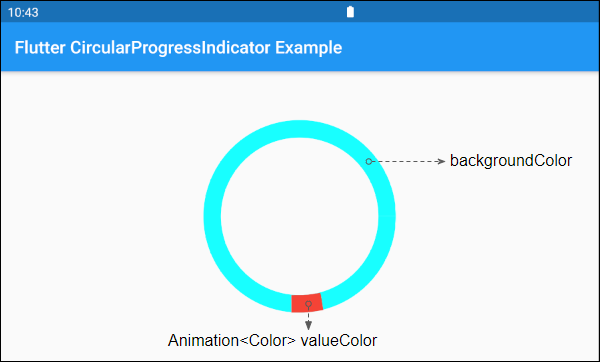
6. valueColor
valueColor wird verwendet, um eine Farbanimation für den Forschritt anzugeben.
Animation<Color> valueColor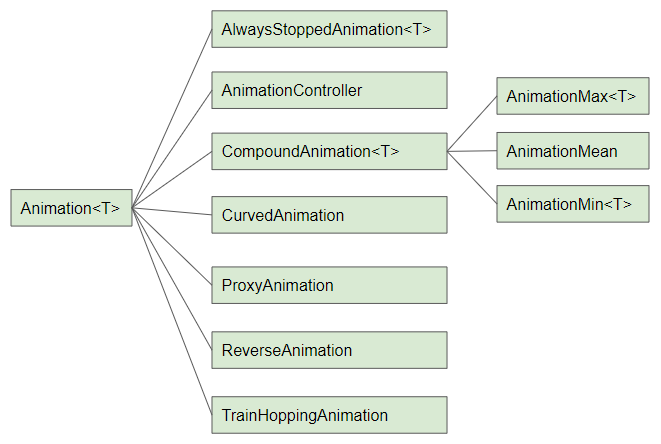
Zum Beispiel:
CircularProgressIndicator(
  strokeWidth: 20,
  backgroundColor: Colors.cyanAccent,
  valueColor: new AlwaysStoppedAnimation<Color>(Colors.red),
)- Die Anleitung zu Flutter Animation
7. strokeWidth
strokeWidth ist die Breite des Kreisstrichs. Der Standardwert beträgt 4 pixel.
double strokeWidth: 4.08. semanticsLabel
semanticsLabel wird verwendet, um die beabsichtigte Verwendung von CircularProgressIndicator zu beschreiben, das vollständig auf der Benutzeroberfläche verborgen ist und für Bildschirmleser für Blinde sinvoll ist.
String semanticsLabel9. semanticsValue
semanticsValue ist auf dem Bildschirm vollständig ausgeblendet. Das Ziel ist darin, Bildschirmlesern die Informationen über den aktuellen Forschritt zur Verfügung zu stellen.
Standardmäßig ist der Wert vom semanticsValue der Prozentsatz der abgeschlossenen Arbeit. Der Wert der Property value beträgt 0.3 , das bedeutet, dass der semanticsValue"30%" beträgt.
String semanticsValueVí dụ:
CircularProgressIndicator(
  value: this._value,
  backgroundColor: Colors.cyanAccent,
  valueColor: new AlwaysStoppedAnimation<Color>(Colors.red),
  semanticsLabel: "Downloading file abc.mp3",
  semanticsValue: "Percent " + (this._value * 100).toString() + "%",
)
Anleitungen Flutter
- Die Anleitung zu Flutter Column
- Die Anleitung zu Flutter Stack
- Die Anleitung zu Flutter IndexedStack
- Die Anleitung zu Flutter Spacer
- Die Anleitung zu Flutter Expanded
- Die Anleitung zu Flutter SizedBox
- Die Anleitung zu Flutter Tween
- Installieren Sie das Flutter SDK unter Windows
- Installieren Sie das Flutter Plugin für Android Studio
- Erstellen Sie Ihre erste Flutter-Anwendung - Hello Flutter
- Die Anleitung zu Flutter Scaffold
- Die Anleitung zu Flutter AppBar
- Die Anleitung zu Flutter BottomAppBar
- Die Anleitung zu Flutter TextButton
- Die Anleitung zu Flutter ElevatedButton
- Die Anleitung zu Flutter EdgeInsetsGeometry
- Die Anleitung zu Flutter EdgeInsets
- Die Anleitung zu Flutter CircularProgressIndicator
- Die Anleitung zu Flutter LinearProgressIndicator
- Die Anleitung zu Flutter Center
- Die Anleitung zu Flutter Align
- Die Anleitung zu Flutter Row
- Die Anleitung zu Flutter SplashScreen
- Die Anleitung zu Flutter Alignment
- Die Anleitung zu Flutter Positioned
- Die Anleitung zu Flutter SimpleDialog
- Die Anleitung zu Flutter AlertDialog
- Die Anleitung zu Flutter Navigation und Routing
- Die Anleitung zu Flutter TabBar
- Die Anleitung zu Flutter Banner
- Die Anleitung zu Flutter BottomNavigationBar
- Die Anleitung zu Flutter FancyBottomNavigation
- Die Anleitung zu Flutter Card
- Die Anleitung zu Flutter Border
- Die Anleitung zu Flutter ContinuousRectangleBorder
- Die Anleitung zu Flutter RoundedRectangleBorder
- Die Anleitung zu Flutter CircleBorder
- Die Anleitung zu Flutter StadiumBorder
- Die Anleitung zu Flutter Container
- Die Anleitung zu Flutter RotatedBox
- Die Anleitung zu Flutter CircleAvatar
- Die Anleitung zu Flutter IconButton
- Die Anleitung zu Flutter FlatButton
- Die Anleitung zu Flutter SnackBar
Show More