Die Anleitung zu Flutter TabBar
1. Flutter Tab
TAB ist ein Interface-Layout, das in verschiedenen Anwendungsframeworks häufig verwendet wird, und Flutter ist keine Ausnahme. Flutter bietet Ihnen eine einfache Möglichkeit, mit der Bibliothek Material ein TAB-Layout zu erstellen.
Grundsätzlich müssen Sie die folgenden Schritte ausführen, um ein Layout TAB in Flutter zu erstellen:
- Erstellen Sie TabController.
- Erstellen Sie TabBar.
- Erstellen Sie TabBarView.
TabController
Damit das Layout TAB funktioniert, müssen Sie die ausgewählten Tab mit ihrem Inhalt synchronisieren. Dies ist die Aufgabe von TabController.
Sie können einen TabController manuell erstellen oder ein vorhandenes Widget verwenden, das als DefaultTabController bezeichnet wird und einige allgemeinen Funktionen unterstützt.
TabController
DefaultTabController(
  // The number of tabs / content sections to display.
  length: 3,
  child: // Complete this code in the next step.
);
TabBar
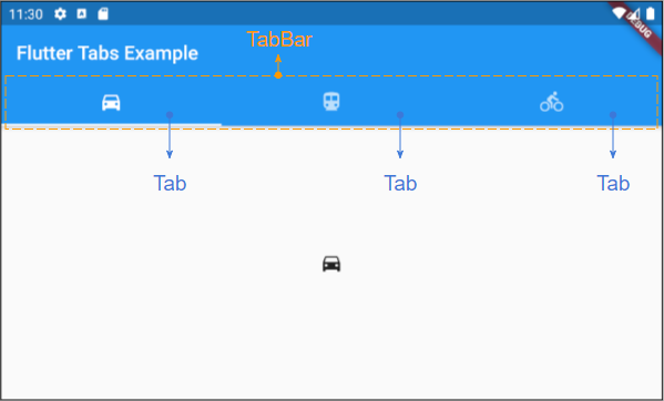
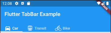
TabBar hilft Ihnen bei der Erstellung von Tab. Wie im folgenden Beispiel enthält eine TabBar drei Unter-Tab .
TabBar
DefaultTabController(
  length: 3,
  child: Scaffold(
    appBar: AppBar(
      bottom: TabBar(
        tabs: [
          Tab(icon: Icon(Icons.directions_car)),
          Tab(icon: Icon(Icons.directions_transit)),
          Tab(icon: Icon(Icons.directions_bike)),
        ],
      ),
    ),
  ),
);
Hinweis: Sie können viele TabBar in einen DefaultTabController einfügen, der DefaultTabController funktioniert jedoch nur mit der nächsten TabBar (Such nach der Baumstruktur). In diesem Fall müssen Sie überlegen, Ihren eigenen TabController manuell zu erstellen.
TabBarView
Sie können TabBarView verwenden, um den Inhalt zu enthalten, der jedem Tab in der TabBar entspricht.
TabBarView
TabBarView (
children: [
Icon(Icons.directions_car),
Icon(Icons.directions_transit),
Icon(Icons.directions_bike),
],
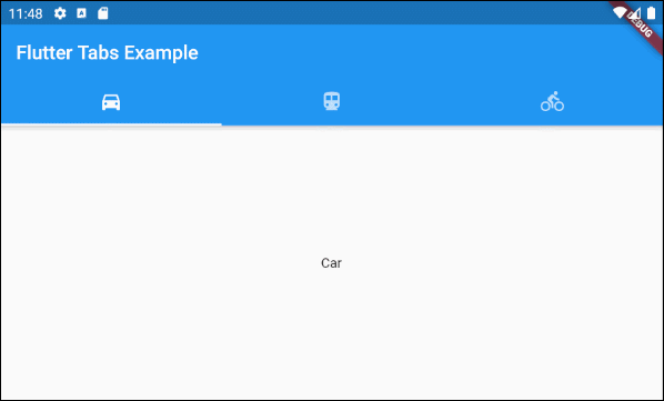
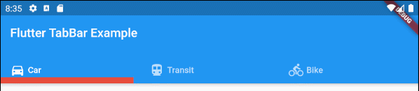
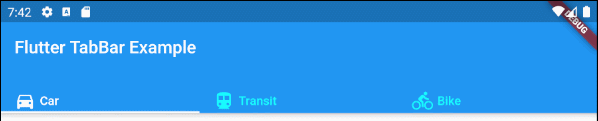
);2. TabBar example
main.dart (ex1)
import 'package:flutter/material.dart';

void main() {
  runApp(MyApp());
}

class MyApp extends StatelessWidget {
  // This widget is the root of your application.
  @override
  Widget build(BuildContext context) {
    return MaterialApp(
      title: 'Title of Application',
      theme: ThemeData(
        primarySwatch: Colors.blue,
        visualDensity: VisualDensity.adaptivePlatformDensity,
      ),
      home: MyHomePage(),
    );
  }
}

class MyHomePage extends StatelessWidget {
  MyHomePage({Key key}) : super(key: key);

  @override
  Widget build(BuildContext context) {
    return DefaultTabController(
        length: 3,
        child: Scaffold(
          appBar: AppBar(
            bottom: TabBar(
              tabs: [
                Tab(icon: Icon(Icons.directions_car)),
                Tab(icon: Icon(Icons.directions_transit)),
                Tab(icon: Icon(Icons.directions_bike)),
              ],
            ),
            title: Text('Flutter Tabs Example'),
          ),
          body: TabBarView(
            children: [
              Center(child: Text("Car")),
              Center(child: Text("Transit")),
              Center(child: Text("Bike"))
            ],
          ),
        )
    );
  }
}
3. TabController, TabBar ... Constructor
TabController Constructor
TabController Constructor
TabController(
    {int initialIndex: 0,
    @required int length,
    @required TickerProvider vsync}
)
DefaultTabController Constructor:
DefaultTabController Constructor
const DefaultTabController(
    {Key key,
    @required int length,
    int initialIndex: 0,
    @required Widget child}
)
TabBar Constructor:
TabBar Constructor
const TabBar(
    {Key key,
    @required List<Widget> tabs,
    TabController controller,
    bool isScrollable: false,
    Color indicatorColor,
    double indicatorWeight: 2.0,
    EdgeInsetsGeometry indicatorPadding: EdgeInsets.zero,
    Decoration indicator,
    TabBarIndicatorSize indicatorSize,
    Color labelColor,
    TextStyle labelStyle,
    EdgeInsetsGeometry labelPadding,
    Color unselectedLabelColor,
    TextStyle unselectedLabelStyle,
    DragStartBehavior dragStartBehavior: DragStartBehavior.start,
    MouseCursor mouseCursor,
    ValueChanged<int> onTap,
    ScrollPhysics physics}
)
TabBarView Constructor:
TabBarView Constructor
const TabBarView(
    {Key key,
    @required List<Widget> children,
    TabController controller,
    ScrollPhysics physics,
    DragStartBehavior dragStartBehavior: DragStartBehavior.start}
)
4. isScrollable
Wenn isScrollabletrue ist, wird jeder Tab die Breite haben, die seinen Inhalt passt und TabBar hat eine horizontales Scroll-leiste.
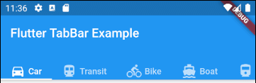
main.dart (isScrollable ex1)
import 'package:flutter/material.dart';
void main() {
runApp(MyApp());
}
class MyApp extends StatelessWidget {
// This widget is the root of your application.
@override
Widget build(BuildContext context) {
return MaterialApp(
title: 'Title of Application',
theme: ThemeData(
primarySwatch: Colors.blue,
visualDensity: VisualDensity.adaptivePlatformDensity,
),
home: MyHomePage(),
);
}
}
class MyHomePage extends StatelessWidget {
MyHomePage({Key key}) : super(key: key);
@override
Widget build(BuildContext context) {
EdgeInsets a2; EdgeInsetsDirectional a;
return DefaultTabController(
length: 6,
child: Scaffold(
appBar: AppBar(
bottom: createTabBar(),
title: Text('Flutter TabBar Example'),
),
body: TabBarView(
children: [
Center(child: Text("Car")),
Center(child: Text("Transit")),
Center(child: Text("Bike")),
Center(child: Text("Boat")),
Center(child: Text("Railway")),
Center(child: Text("Bus"))
],
),
)
);
}
TabBar createTabBar() {
return TabBar(
tabs: [
Row (children: [Icon(Icons.directions_car), SizedBox(width:5), Text("Car")]),
Row (children: [Icon(Icons.directions_transit), SizedBox(width:5), Text("Transit")]),
Row (children: [Icon(Icons.directions_bike), SizedBox(width:5), Text("Bike")]),
Row (children: [Icon(Icons.directions_boat), SizedBox(width:5), Text("Boat")]),
Row (children: [Icon(Icons.directions_railway), SizedBox(width:5), Text("Railway")]),
Row (children: [Icon(Icons.directions_bus), SizedBox(width:5), Text("Bus")]),
],
isScrollable: true,
);
}
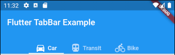
}Z.B: Richten Sie die Tab links aus, wenn TabBar.isScrollable = true ist.
main.dart (isScrollable ex2)
import 'package:flutter/material.dart';
void main() {
runApp(MyApp());
}
class MyApp extends StatelessWidget {
// This widget is the root of your application.
@override
Widget build(BuildContext context) {
return MaterialApp(
title: 'Title of Application',
theme: ThemeData(
primarySwatch: Colors.blue,
visualDensity: VisualDensity.adaptivePlatformDensity,
),
home: MyHomePage(),
);
}
}
class MyHomePage extends StatelessWidget {
MyHomePage({Key key}) : super(key: key);
@override
Widget build(BuildContext context) {
EdgeInsets a2; EdgeInsetsDirectional a;
return DefaultTabController(
length: 3,
child: Scaffold(
appBar: AppBar(
bottom: PreferredSize(
preferredSize: Size.fromHeight(40),
child: Align(
alignment: Alignment.centerLeft,
child: TabBar(
isScrollable: true,
tabs: [ Row (children: [Icon(Icons.directions_car), SizedBox(width:5), Text("Car")]),
Row (children: [Icon(Icons.directions_transit), SizedBox(width:5), Text("Transit")]),
Row (children: [Icon(Icons.directions_bike), SizedBox(width:5), Text("Bike")])],
),
),
),
title: Text('Flutter TabBar Example'),
),
body: TabBarView(
children: [
Center(child: Text("Car")),
Center(child: Text("Transit")),
Center(child: Text("Bike"))
],
),
)
);
}
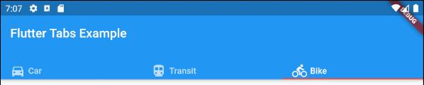
}5. indicatorColor
Mit dem Property indicatorColor können Sie die Farbe der Linie unter der aktuell ausgewählten Tab angeben. Dieser Property wird ignoriert, wenn indicator angegeben wird.
Color indicatorColorZ.B: Legen Sie die Farbe Rot für die Linie unter der aktuell ausgewählten Tab fest:
indicatorColor (ex1)
TabBar (
  tabs: [
    Row (children: [Icon(Icons.directions_car), SizedBox(width:5), Text("Car")]),
    Row (children: [Icon(Icons.directions_transit), SizedBox(width:5), Text("Transit")]),
    Row (children: [Icon(Icons.directions_bike), SizedBox(width:5), Text("Bike")]),
  ],
  indicatorColor: Color(0xffE74C3C),
);- Die Anleitung zu Flutter Color
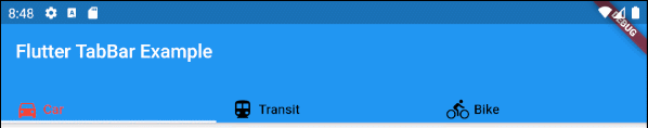
6. indicatorWeight
Die Property indicatorWeight wird verwendet, um die Dicke der Linie unter der aktuell ausgewählten Tab festzulegen. Der Wert ist größer als 0 und der Standardwert ist 2. Der Property wird ignoriert, wenn der Property indicator angegeben wird.
double indicatorWeight;Z.B: Legen Sie die Dicke der Linie unter der aktuell ausgewählten Tab fest.
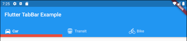
indicatorWeight (ex1)
TabBar(
  tabs: [
    Row (children: [Icon(Icons.directions_car), SizedBox(width:5), Text("Car")]),
    Row (children: [Icon(Icons.directions_transit), SizedBox(width:5), Text("Transit")]),
    Row (children: [Icon(Icons.directions_bike), SizedBox(width:5), Text("Bike")]),
  ],
  indicatorColor: Color(0xffE74C3C),
  indicatorWeight: 10
);
7. indicatorPadding
Der Property indicatorPadding gibt die horizontale padding für die Linie unter der aktuell ausgewählten Tab an.
EdgeInsetsGeometry indicatorPadding
Zum Beispiel:
indicatorPadding (ex1)
TabBar(
  tabs: [
    Row (children: [Icon(Icons.directions_car), SizedBox(width:5), Text("Car")]),
    Row (children: [Icon(Icons.directions_transit), SizedBox(width:5), Text("Transit")]),
    Row (children: [Icon(Icons.directions_bike), SizedBox(width:5), Text("Bike")]),
  ],
  indicatorColor: Color(0xffE74C3C),
  indicatorWeight: 10,
  indicatorPadding: EdgeInsets.only(right: 20),
);
8. indicator
Mit der Property indicator können Sie das Aussehen der aktuell ausgewählten Tab definieren. Wenn dieser Property verwendet wird, werden anderen Property wie indicatorColor, indicatorWeight und indicatorPadding ignoriert.
Decoration indicator;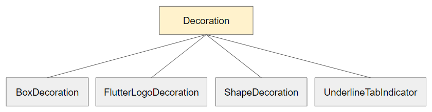
Zum Beispiel:
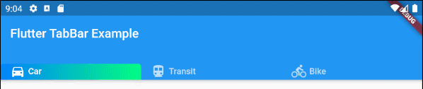
indicator (ex1)
TabBar(
  tabs: [
    Row (children: [Icon(Icons.directions_car), SizedBox(width:5), Text("Car")]),
    Row (children: [Icon(Icons.directions_transit), SizedBox(width:5), Text("Transit")]),
    Row (children: [Icon(Icons.directions_bike), SizedBox(width:5), Text("Bike")]),
  ],
  indicator: ShapeDecoration (
      shape: UnderlineInputBorder (
          borderSide: BorderSide(
              color: Colors.transparent,
              width: 0,
              style: BorderStyle.solid
          )
      ),
      gradient: LinearGradient(colors: [Color(0xff0081ff), Color(0xff01ff80)])
  )
);- Die Anleitung zu Flutter Decoration
9. labelColor
Die Property labelColor wird verwendet, um die Farbe für die Label der aktuell ausgewählten Tab anzugeben.
Color labelColor;Zum Beispiel:
TabBar(
    tabs: [
      Row (children: [Icon(Icons.directions_car), SizedBox(width:5), Text("Car")]),
      Row (children: [Icon(Icons.directions_transit), SizedBox(width:5), Text("Transit")]),
      Row (children: [Icon(Icons.directions_bike), SizedBox(width:5), Text("Bike")]),
    ],
    labelColor: Colors.red,
    unselectedLabelColor: Colors.black,
);
10. unselectedLabelColor
Die Property unselectedLabelColor wird verwendet um die Farbe von Laben von der nichtgewählten Tab anzugeben.
Color unselectedLabelColor;Zum Beispiel:
unselectedLabelColor (ex1)
TabBar(
  tabs: [
    Row (children: [Icon(Icons.directions_car), SizedBox(width:5), Text("Car")]),
    Row (children: [Icon(Icons.directions_transit), SizedBox(width:5), Text("Transit")]),
    Row (children: [Icon(Icons.directions_bike), SizedBox(width:5), Text("Bike")]),
  ],
  labelColor: Colors.white,
  unselectedLabelColor: Colors.cyanAccent,
);
11. labelPadding
Die Property labelPadding wird verwendet um Padding in jedem Laben von Tab einzufügen.
EdgeInsetsGeometry labelPadding;Zum Beispiel:
labelPadding (ex1)
TabBar(
  tabs: [
    Row (children: [Icon(Icons.directions_car), SizedBox(width:5), Text("Car")]),
    Row (children: [Icon(Icons.directions_transit), SizedBox(width:5), Text("Transit")]),
    Row (children: [Icon(Icons.directions_bike), SizedBox(width:5), Text("Bike")]),
  ],
  labelPadding: EdgeInsets.all( 20),
);
12. labelStyle
Die Property labelStyle wird verwendet, um den Textstil der Label von der aktuell ausgewählten Tab anzugeben.
TextStyle labelStyle;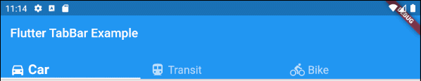
labelStyle (ex1)
TabBar(
  tabs: [
    Row (children: [Icon(Icons.directions_car), SizedBox(width:5), Text("Car")]),
    Row (children: [Icon(Icons.directions_transit), SizedBox(width:5), Text("Transit")]),
    Row (children: [Icon(Icons.directions_bike), SizedBox(width:5), Text("Bike")]),
  ],
  labelStyle: TextStyle(fontWeight: FontWeight.bold, fontSize: 22),
  unselectedLabelStyle: TextStyle(fontStyle: FontStyle.normal, fontSize: 18),
);- Die Anleitung zu Flutter TextStyle
13. unselectedLabelStyle
Die Property unselectedLabelStyle wird verwendet um das Textstil von Label der nichtgewählten Tab anzugeben.
TextStyle unselectedLabelStyle;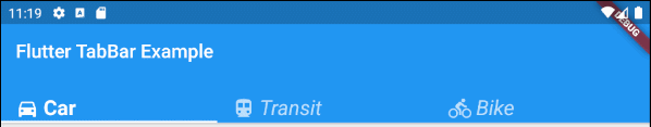
unselectedLabelStyle (ex1)
TabBar(
  tabs: [
    Row (children: [Icon(Icons.directions_car), SizedBox(width:5), Text("Car")]),
    Row (children: [Icon(Icons.directions_transit), SizedBox(width:5), Text("Transit")]),
    Row (children: [Icon(Icons.directions_bike), SizedBox(width:5), Text("Bike")]),
  ],
  labelStyle: TextStyle(fontWeight: FontWeight.bold, fontSize: 22),
  unselectedLabelStyle: TextStyle(fontStyle: FontStyle.italic),
);- Die Anleitung zu Flutter TextStyle
14. onTap
onTap ist eine Funktion callback, die angerufen wird, wenn der Benutzer ein Tab auf TabBar tippt.
ValueChanged<int> onTap;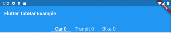
main.dart (onTap ex1)
import 'package:flutter/material.dart';

void main() {
  runApp(MyApp());
}

class MyApp extends StatelessWidget {
  // This widget is the root of your application.
  @override
  Widget build(BuildContext context) {
    return MaterialApp(
      title: 'Title of Application',
      theme: ThemeData(
        primarySwatch: Colors.blue,
        visualDensity: VisualDensity.adaptivePlatformDensity,
      ),
      home: MyHomePage(),
    );
  }
}

class MyHomePage extends StatefulWidget {
  MyHomePage({Key key}) : super(key: key);

  @override
  State<StatefulWidget> createState() {
    return MyHomePageState();
  }
}

class MyHomePageState extends State<MyHomePage> {
  int carClick = 0;
  int transitClick = 0;
  int bikeClick = 0;

  @override
  Widget build(BuildContext context) {
    return DefaultTabController(
        length: 3,
        child: Scaffold(
          appBar: AppBar(
            bottom: createTabBar(),
            title: Text('Flutter TabBar Example'),
          ),
          body: TabBarView(
            children: [
              Center(child: Text("Car")),
              Center(child: Text("Transit")),
              Center(child: Text("Bike"))
            ],
          ),
        )
    );
  }

  TabBar createTabBar()  {
    return TabBar(
        isScrollable: true,
        labelStyle: TextStyle(fontSize: 20),
        tabs: [
          Text("Car " + this.carClick.toString()),
          Text("Transit " + this.transitClick.toString()),
          Text("Bike " + this.bikeClick.toString())
        ],
        onTap: (index) {
          this.onTapHandler(index);
        }
    );
  }

  void onTapHandler(int index)  {
    setState(()  {
      switch(index){
        case 0:
          carClick++;
          break;
        case 1:
          transitClick++;
          break;
        case 2:
          bikeClick++;
          break;
      }
    });
  }

}No ADS
Anleitungen Flutter
- Die Anleitung zu Flutter Column
- Die Anleitung zu Flutter Stack
- Die Anleitung zu Flutter IndexedStack
- Die Anleitung zu Flutter Spacer
- Die Anleitung zu Flutter Expanded
- Die Anleitung zu Flutter SizedBox
- Die Anleitung zu Flutter Tween
- Installieren Sie das Flutter SDK unter Windows
- Installieren Sie das Flutter Plugin für Android Studio
- Erstellen Sie Ihre erste Flutter-Anwendung - Hello Flutter
- Die Anleitung zu Flutter Scaffold
- Die Anleitung zu Flutter AppBar
- Die Anleitung zu Flutter BottomAppBar
- Die Anleitung zu Flutter TextButton
- Die Anleitung zu Flutter ElevatedButton
- Die Anleitung zu Flutter EdgeInsetsGeometry
- Die Anleitung zu Flutter EdgeInsets
- Die Anleitung zu Flutter CircularProgressIndicator
- Die Anleitung zu Flutter LinearProgressIndicator
- Die Anleitung zu Flutter Center
- Die Anleitung zu Flutter Align
- Die Anleitung zu Flutter Row
- Die Anleitung zu Flutter SplashScreen
- Die Anleitung zu Flutter Alignment
- Die Anleitung zu Flutter Positioned
- Die Anleitung zu Flutter SimpleDialog
- Die Anleitung zu Flutter AlertDialog
- Die Anleitung zu Flutter Navigation und Routing
- Die Anleitung zu Flutter TabBar
- Die Anleitung zu Flutter Banner
- Die Anleitung zu Flutter BottomNavigationBar
- Die Anleitung zu Flutter FancyBottomNavigation
- Die Anleitung zu Flutter Card
- Die Anleitung zu Flutter Border
- Die Anleitung zu Flutter ContinuousRectangleBorder
- Die Anleitung zu Flutter RoundedRectangleBorder
- Die Anleitung zu Flutter CircleBorder
- Die Anleitung zu Flutter StadiumBorder
- Die Anleitung zu Flutter Container
- Die Anleitung zu Flutter RotatedBox
- Die Anleitung zu Flutter CircleAvatar
- Die Anleitung zu Flutter IconButton
- Die Anleitung zu Flutter FlatButton
- Die Anleitung zu Flutter SnackBar
Show More