Die Anleitung zu Flutter AlertDialog
1. AlertDialog
AlertDialog ist ein Dialogfeld, mit dem der Benutzer über einige Situationen informiert wird, in denen eine Bestätigung angefordert wird. Es enthält einen optionalen Titel, einen optionalen Inhalt und optionale Aktionsbutton unter dem Inhalt.
Wenn der Inhalt für den Bildschirm vertikal zu größ ist, können Sie ihn in eine SingleChildScrollView einschlißen um ein Überlaufen zu vermeiden. Aber Sie darauf achten sollen, dass AlertDialog versucht, sich anhand der Größe seiner untergeordneten Elemente zu dimensionieren. Daher sollten untergeordnete Widget wie ListView, GridView und CustomScrollView bei der Erstellung von Inhalten berücksichtigt werden.
Der Lazy Data Display Modus funktioniert in AlertDialog nicht. Wenn dies problematisch ist, können Sie die Klasse Dialog direkt verwenden, um mehr kreativen Raum zu erhalten.
- Die Anleitung zu Flutter Dialog
Wenn Sie einen einfachen Dialog mit nur einem Titel und einer Liste von Optionen wünschen, berücksichtigen Sie den SimpleDialog.
AlertDialog Constructor:
AlertDialog Constructor
const AlertDialog(
    {Key key,
    Widget title,
    Widget content,
    List<Widget> actions,
    ShapeBorder shape,
    double elevation,
    EdgeInsetsGeometry titlePadding,
    TextStyle titleTextStyle,
    EdgeInsetsGeometry contentPadding: const EdgeInsets.fromLTRB(24.0, 20.0, 24.0, 24.0),
    TextStyle contentTextStyle,
    EdgeInsetsGeometry actionsPadding: EdgeInsets.zero,
    VerticalDirection actionsOverflowDirection,
    double actionsOverflowButtonSpacing,
    EdgeInsetsGeometry buttonPadding,
    Color backgroundColor,
    String semanticLabel,
    EdgeInsets insetPadding: _defaultInsetPadding,
    Clip clipBehavior: Clip.none,
    bool scrollable: false}
)
2. Examples
Schauen Sie sich zunächst das einfache, aber vollständige Beispiel vom AlertDialog an. Es hilft Ihnen bei der Beantwortung der folgenden grundlegenden Fragen:
- So erstellen Sie einen AlertDialog.
- So erhalten Sie einen Wert von AlertDialog.
- Umgang mit dem zurückgegebenen Wert.
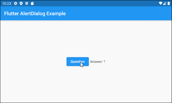
main.dart (ex1)
import 'package:flutter/material.dart';

void main() {
  runApp(MyApp());
}

class MyApp extends StatelessWidget {
  @override
  Widget build(BuildContext context) {
    return MaterialApp(
      title: 'o7planning.org',
      debugShowCheckedModeBanner: false,
      theme: ThemeData(
        primarySwatch: Colors.blue,
        visualDensity: VisualDensity.adaptivePlatformDensity,
      ),
      home: MyHomePage(),
    );
  }
}

class MyHomePage extends StatefulWidget {
  MyHomePage({Key key}) : super(key: key);

  @override
  State<StatefulWidget> createState() {
    return MyHomePageState();
  }
}

class MyHomePageState extends State<MyHomePage> {
  String answer = "?";

  @override
  Widget build(BuildContext context) {
    return Scaffold (
        appBar: AppBar(
            title: Text("Flutter AlertDialog Example")
        ),
        body: Center (
            child: Row (
                mainAxisAlignment: MainAxisAlignment.center,
                crossAxisAlignment: CrossAxisAlignment.center,
                children: [
                  ElevatedButton (
                    child: Text("Question"),
                    onPressed: () {
                      showMyAlertDialog(context);
                    },
                  ),
                  SizedBox(width:5, height:5),
                  Text("Answer: " + this.answer.toString())
                ]
            )
        )
    );
  }

  showMyAlertDialog(BuildContext context) {
    // Create AlertDialog
    AlertDialog dialog = AlertDialog(
      title: Text("Election 2020"),
      content: Text("Will you vote for Trump?"),
      actions: [
        ElevatedButton(
            child: Text("Yes"),
            onPressed: (){
              Navigator.of(context).pop("Yes, Of course!"); // Return value
            }
        ),
        ElevatedButton(
            child: Text("No"),
            onPressed: (){
              Navigator.of(context).pop("No, I will vote for Biden"); // Return value
            }
        ),
      ],
    );

    // Call showDialog function to show dialog.
    Future<String> futureValue = showDialog(
        context: context,
        builder: (BuildContext context) {
          return dialog;
        }
    );
    Stream<String> stream = futureValue.asStream();
    stream.listen((String data) {
      String answerValue = data;
      this.setState(() {
        this.answer = answerValue;
      });
    }, onDone : () {
      print("Done!");
    } , onError: (error) {
      print("Error! " + error.toString());
    });
  }

}- Dart Stream Tutorial with examples
3. shape
Mit dem Property shape wird die Rahmenform des AlertDialog definiert. Der Standardwert von shape ist ein RoundedRectangleBorder mit einem Radius von 4.0 pixel an den vier Ecken.
ShapeBorder shape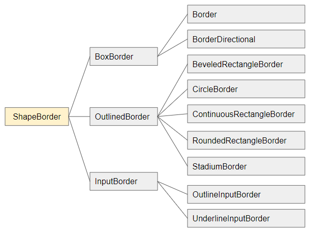
- Die Anleitung zu Flutter ShapeBorder
shape (ex1)
void openMyAlertDialog(BuildContext context)  {
  // Create a AlertDialog.
  AlertDialog dialog = AlertDialog(
    title: Text("Confirm"),
    content: Text("Are you sure to remove this item?"),
    shape: RoundedRectangleBorder(
        side:  BorderSide(color: Colors.green,width: 3),
        borderRadius: BorderRadius.all(Radius.circular(15))
    ),
    actions: [
      ElevatedButton(
          child: Text("Yes Delete"),
          onPressed: (){
            Navigator.of(context).pop(true); // Return true
          }
      ),
      ElevatedButton(
          child: Text("Cancel"),
          onPressed: (){
            Navigator.of(context).pop(false); // Return false
          }
      ),
    ],
  );

  // Call showDialog function.
  Future<bool> futureValue = showDialog(
      context: context,
      builder: (BuildContext context) {
        return dialog;
      }
  );
  futureValue.then( (value) {
    print("Return value: " + value.toString()); // true/false
  });
}
4. elevation
Das Property elevation definiert die Achse Z von AlertDialog. Der Standardwert ist 24.0 pixel.
double elevation5. title
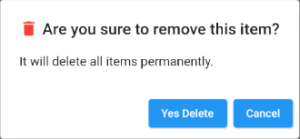
Das Property title ist ein Option zum Festlegen des Titels für AlertDialog. In den meisten Anwendungsfällen handelt es sich um ein Objekt Text.
Widget titleEin einfaches Beispiel mit title von einem Objekt Text:
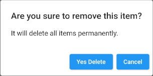
title (ex1)
void openMyAlertDialog(BuildContext context)  {
  // Create a AlertDialog.
  AlertDialog dialog = AlertDialog(
    title: Text("Are you sure to remove this item?"),
    content: Text("It will delete all items permanently."),
    actions: [
      ElevatedButton(
          child: Text("Yes Delete"),
          onPressed: (){
            Navigator.of(context).pop(true); // Return true
          }
      ),
      ElevatedButton(
          child: Text("Cancel"),
          onPressed: (){
            Navigator.of(context).pop(false); // Return false
          }
      ),
    ],
  );

  // Call showDialog function.
  Future<bool> futureValue = showDialog(
      context: context,
      builder: (BuildContext context) {
        return dialog;
      }
  );
  futureValue.then( (value) {
      print("Return value: " + value.toString()); // true/false
  });
}
Das ist ein weiteres Beispiel mit einem mehr komplizierten title
title (ex2)
void openMyAlertDialog(BuildContext context) {
// Create a AlertDialog.
AlertDialog dialog = AlertDialog(
title: Row (
children: [
Icon(Icons.delete, color: Colors.red),
SizedBox(width: 5, height: 5),
Text("Are you sure to remove this item?"),
]
),
content: Text("It will delete all items permanently."),
actions: [
ElevatedButton(
child: Text("Yes Delete"),
onPressed: (){
Navigator.of(context).pop(true); // Return true
}
),
ElevatedButton(
child: Text("Cancel"),
onPressed: (){
Navigator.of(context).pop(false); // Return false
}
),
],
);
// Call showDialog function.
Future<bool> futureValue = showDialog(
context: context,
builder: (BuildContext context) {
return dialog;
}
);
futureValue.then( (value) {
print("Return value: " + value.toString()); // true/false
});
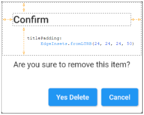
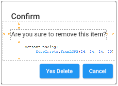
}6. titlePadding
Das Property titlePadding wird benutzt um einem Padding um Titel von AlertDialog einzufügen. Wenn titlenull ist, wird titlePadding nicht verwendet.
Standardmäßig bietet titlePadding oben, links und rechts vom Titel 24 Pixel. Es bietet auch 20 Pixel am unteren Rand des Titels, wenn contentnull ist.

EdgeInsetsGeometry titlePadding
Zum Beispiel:
titlePadding (ex1)
void openMyAlertDialog(BuildContext context)  {
  // Create a AlertDialog.
  AlertDialog dialog = AlertDialog(
    title: Text("Confirm"),
    titlePadding: EdgeInsets.fromLTRB(24, 24, 24, 50),
    content: Text("Are you sure to remove this item?"),
    actions: [
      ElevatedButton(
          child: Text("Yes Delete"),
          onPressed: (){
            Navigator.of(context).pop(true); // Return true
          }
      ),
      ElevatedButton(
          child: Text("Cancel"),
          onPressed: (){
            Navigator.of(context).pop(false); // Return false
          }
      ),
    ],
  );

  // Call showDialog function.
  Future<bool> futureValue = showDialog(
      context: context,
      builder: (BuildContext context) {
        return dialog;
      }
  );
  futureValue.then( (value) {
    print("Return value: " + value.toString()); // true/false
  });
}
7. titleTextStyle
Das Property titleTextStyle wird verwendet, um den Textstil des Bereichs title zu definieren.
TextStyle titleTextStyle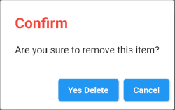
titleTextStyle (ex1)
void openMyAlertDialog(BuildContext context)  {
  // Create a AlertDialog.
  AlertDialog dialog = AlertDialog(
    title: Text("Confirm"),
    titleTextStyle: TextStyle(color: Colors.red, fontSize: 24),
    content: Text("Are you sure to remove this item?"),
    actions: [
      ElevatedButton(
          child: Text("Yes Delete"),
          onPressed: (){
            Navigator.of(context).pop(true); // Return true
          }
      ),
      ElevatedButton(
          child: Text("Cancel"),
          onPressed: (){
            Navigator.of(context).pop(false); // Return false
          }
      ),
    ],
  );

  // Call showDialog function.
  Future<bool> futureValue = showDialog(
      context: context,
      builder: (BuildContext context) {
        return dialog;
      }
  );
  futureValue.then( (value) {
    print("Return value: " + value.toString()); // true/false
  });
}
8. content
Das Property content ist eine Option zum Definieren eines Inhalts, der in der Mitte von AlertDialog angezeigt werden soll. Es sollte ein Objekt SingleChildScrollView sein, wenn der Inhalt lang ist.
Widget content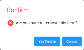
content (ex1)
void openMyAlertDialog(BuildContext context)  {
  // Create a AlertDialog.
  AlertDialog dialog = AlertDialog(
    title: Text("Confirm"),
    titleTextStyle: TextStyle(color: Colors.red, fontSize: 24),
    content: Row (
        children: [
          Icon(Icons.dangerous, size: 30, color: Colors.red),
          SizedBox(width:5, height:5),
          Text("Are you sure to remove this item?")
        ]
    ),
    actions: [
      ElevatedButton(
          child: Text("Yes Delete"),
          onPressed: (){
            Navigator.of(context).pop(true); // Return true
          }
      ),
      ElevatedButton(
          child: Text("Cancel"),
          onPressed: () {
            Navigator.of(context).pop(false); // Return false
          }
      ),
    ],
  );

  // Call showDialog function.
  Future<bool> futureValue = showDialog(
      context: context,
      builder: (BuildContext context) {
        return dialog;
      }
  );
  futureValue.then( (value) {
    print("Return value: " + value.toString()); // true/false
  });
}- Die Anleitung zu Flutter SingleChildScrollView
9. contentPadding
Das Property contentPadding wird benutzt um einen Padding um content von AlertDialog einzufügen. Wenn contentnull ist, wird contentPadding nicht benutzt.
Standardmäßig bietet contentPadding 20 pixel oben im content, 24 pixel links, rechts und unten content.
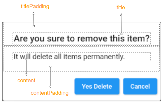
EdgeInsetsGeometry contentPadding: const EdgeInsets.fromLTRB(24.0, 20.0, 24.0, 24.0)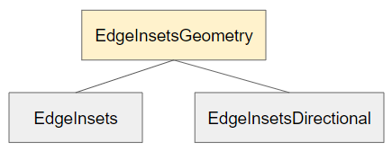
contentPadding (ex1)
void openMyAlertDialog(BuildContext context)  {
  // Create a AlertDialog.
  AlertDialog dialog = AlertDialog(
    title: Text("Confirm"),
    content: Text("Are you sure to remove this item?"),
    contentPadding: EdgeInsets.fromLTRB(24, 24, 24, 50),
    actions: [
      ElevatedButton(
          child: Text("Yes Delete"),
          onPressed: (){
            Navigator.of(context).pop(true); // Return true
          }
      ),
      ElevatedButton(
          child: Text("Cancel"),
          onPressed: (){
            Navigator.of(context).pop(false); // Return false
          }
      ),
    ],
  );

  // Call showDialog function.
  Future<bool> futureValue = showDialog(
      context: context,
      builder: (BuildContext context) {
        return dialog;
      }
  );
  futureValue.then( (value) {
    print("Return value: " + value.toString()); // true/false
  });
}
10. contentTextStyle
Das Property contentTextStyle wird benutzt um den Textstil des Bereichs content zu definieren.
TextStyle contentTextStyle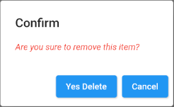
contentTextStyle (ex1)
void openMyAlertDialog(BuildContext context)  {
  // Create a AlertDialog.
  AlertDialog dialog = AlertDialog(
    title: Text("Confirm"),
    content: Text("Are you sure to remove this item?"),
    contentTextStyle: TextStyle(color: Colors.red, fontStyle: FontStyle.italic),
    actions: [
      ElevatedButton(
          child: Text("Yes Delete"),
          onPressed: (){
            Navigator.of(context).pop(true); // Return true
          }
      ),
      ElevatedButton(
          child: Text("Cancel"),
          onPressed: (){
            Navigator.of(context).pop(false); // Return false
          }
      ),
    ],
  );

  // Call showDialog function.
  Future<bool> futureValue = showDialog(
      context: context,
      builder: (BuildContext context) {
        return dialog;
      }
  );
  futureValue.then( (value) {
    print("Return value: " + value.toString()); // true/false
  });
}
11. actions
Das Property actions ist ein Option zum Definieren von Aktionsbutton am unteren Rand vom AlertDialog. Insbesondere handelt es sich um eine Liste von TextButton oder ElevatedButton, die in einem ButtonBar eingeschlossen sind.
List<Widget> actions- Die Anleitung zu Flutter ButtonBar
12. actionsPadding
Das Property actionsPadding wird benutzt, um einen Padding um ButtonBar von AlertDialog hinzuzufügen. Wenn actionsnull ist, wird actionsPadding nicht verwendet. Der Standardwert von actionsPadding ist EdgeInsets.zero (0,0,0,0).
Anstatt das Property actionsPadding zu verwenden, können Sie das Property buttonPadding verwenden, um die Padding um jede Button zu erstellen.
EdgeInsetsGeometry actionsPadding: EdgeInsets.zero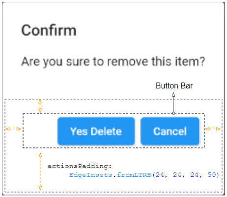
actionsPadding (ex1)
void openMyAlertDialog(BuildContext context)  {
  // Create a AlertDialog.
  AlertDialog dialog = AlertDialog(
    title: Text("Confirm"),
    content: Text("Are you sure to remove this item?"),
    actions: [
      ElevatedButton(
          child: Text("Yes Delete"),
          onPressed: (){
            Navigator.of(context).pop(true); // Return true
          }
      ),
      ElevatedButton(
          child: Text("Cancel"),
          onPressed: (){
            Navigator.of(context).pop(false); // Return false
          }
      )
    ],
    actionsPadding: EdgeInsets.fromLTRB(24, 24, 24, 50),
  );

  // Call showDialog function.
  Future<bool> futureValue = showDialog(
      context: context,
      builder: (BuildContext context) {
        return dialog;
      }
  );
  futureValue.then( (value) {
    print("Return value: " + value.toString()); // true/false
  });
}
13. actionsOverflowDirection
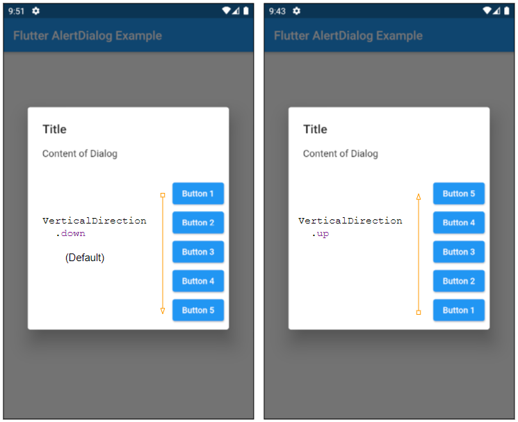
Die actions werden normalerweise in einer Reihe platziert. Wenn der horizontale Abstand jedoch nicht ausreicht, werden sie auf einer Spalte platziert. Das Property actionsOverflowDirection gibt an, wie sie in einer Spalte von oben nach unter (Standard) oder von unter nach oben angeordnet werden sollen.
VerticalDirection actionsOverflowDirection

// enum VerticalDirection

    VerticalDirection.up
    VerticalDirection.down  (Default)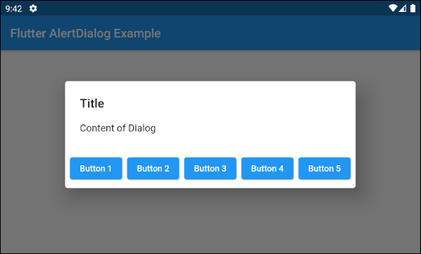
- actionsOverflowDirection: VerticalDirection.up
- actionsOverflowDirection: VerticalDirection.down (Default)
14. actionsOverflowButtonSpacing
Die actions werden normalerweise in einer Reihe platziert. Wenn der horizontale Abstand aber nicht ausreicht, werden sie auf einer Spalte platziert. Das Property actionsOverflowButtonSpacing gibt den Abstand zwischen den actions in vertikalen Richtung an.
double actionsOverflowButtonSpacing16. backgroundColor
Das Property backgroundColor wird verwendet um die HIntergrundsfarbe von AlertDialog anzugeben.
Color backgroundColor19. semanticLabel
semanticLabel ist ein beschreibender Text von AlertDialog, der auf der Benutzerinterface nicht sichtbar ist. Wenn der Benutzer den AlertDialog öffnet oder schließt, liest das System dem Benutzer diese Beschreibung vor, wenn der Eingabehilfenmodus (accessibility mode) aktiviert ist.
String semanticLabel20. scrollable
Das Property scrollable ist veraltet und nicht mehr verwendet.
@Deprecated(
 'Set scrollable to `true`. This parameter will be removed and '
 'was introduced to migrate AlertDialog to be scrollable by '
 'default. For more information, see '
 'https://flutter.dev/docs/release/breaking-changes/scrollable_alert_dialog. '
 'This feature was deprecated after v1.13.2.'
)
bool scrollable: false
Anleitungen Flutter
- Die Anleitung zu Flutter Column
- Die Anleitung zu Flutter Stack
- Die Anleitung zu Flutter IndexedStack
- Die Anleitung zu Flutter Spacer
- Die Anleitung zu Flutter Expanded
- Die Anleitung zu Flutter SizedBox
- Die Anleitung zu Flutter Tween
- Installieren Sie das Flutter SDK unter Windows
- Installieren Sie das Flutter Plugin für Android Studio
- Erstellen Sie Ihre erste Flutter-Anwendung - Hello Flutter
- Die Anleitung zu Flutter Scaffold
- Die Anleitung zu Flutter AppBar
- Die Anleitung zu Flutter BottomAppBar
- Die Anleitung zu Flutter TextButton
- Die Anleitung zu Flutter ElevatedButton
- Die Anleitung zu Flutter EdgeInsetsGeometry
- Die Anleitung zu Flutter EdgeInsets
- Die Anleitung zu Flutter CircularProgressIndicator
- Die Anleitung zu Flutter LinearProgressIndicator
- Die Anleitung zu Flutter Center
- Die Anleitung zu Flutter Align
- Die Anleitung zu Flutter Row
- Die Anleitung zu Flutter SplashScreen
- Die Anleitung zu Flutter Alignment
- Die Anleitung zu Flutter Positioned
- Die Anleitung zu Flutter SimpleDialog
- Die Anleitung zu Flutter AlertDialog
- Die Anleitung zu Flutter Navigation und Routing
- Die Anleitung zu Flutter TabBar
- Die Anleitung zu Flutter Banner
- Die Anleitung zu Flutter BottomNavigationBar
- Die Anleitung zu Flutter FancyBottomNavigation
- Die Anleitung zu Flutter Card
- Die Anleitung zu Flutter Border
- Die Anleitung zu Flutter ContinuousRectangleBorder
- Die Anleitung zu Flutter RoundedRectangleBorder
- Die Anleitung zu Flutter CircleBorder
- Die Anleitung zu Flutter StadiumBorder
- Die Anleitung zu Flutter Container
- Die Anleitung zu Flutter RotatedBox
- Die Anleitung zu Flutter CircleAvatar
- Die Anleitung zu Flutter IconButton
- Die Anleitung zu Flutter FlatButton
- Die Anleitung zu Flutter SnackBar
Show More