Die Anleitung zu Flutter BottomNavigationBar
1. BottomNavigationBar
Eine untere Navigationbar ist ein traditioneller Stil von der Anwendungen iOS. In Flutter können Sie dies mit BottomNavigationBar tun. Außerdem verfügt die BottomNavigationBar über eine praktische Funktion, mit der Sie einen FloatingActionButton anhängen können.
BottomNavigationBar Constructor:
BottomNavigationBar Constructor
BottomNavigationBar(
    {Key key,
    @required List<BottomNavigationBarItem> items,
    ValueChanged<int> onTap,
    int currentIndex: 0,
    double elevation,
    BottomNavigationBarType type,
    Color fixedColor,
    Color backgroundColor,
    double iconSize: 24.0,
    Color selectedItemColor,
    Color unselectedItemColor,
    IconThemeData selectedIconTheme,
    IconThemeData unselectedIconTheme,
    double selectedFontSize: 14.0,
    double unselectedFontSize: 12.0,
    TextStyle selectedLabelStyle,
    TextStyle unselectedLabelStyle,
    bool showSelectedLabels: true,
    bool showUnselectedLabels,
    MouseCursor mouseCursor}
)
BottomNavigationBar wird normaerweise über die Property AppBar.bottomNavigationBar in einem Scaffold platziert und am unteren Rand vom Scaffold angezeigt.

BottomNavigationBar ist ziemlich ähnlich wie BottomAppBar auf die Nutzung. BottomNavigationBar bietet eine Vorlage für eine Navigationsbar, sodass sie einfach und benutzerfreundlich ist. Wenn Sie Ihre Kreativität auslösen möchten, verwenden Sie BottomAppBar.
2. Example
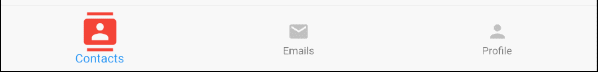
Beginnen wir mit einem vollständigen Beispiel für BottomNavigationBar, damit Sie verstehen kann, wie dieses Widget funktioniert.
main.dart (ex1)
import 'package:flutter/material.dart';
void main() {
runApp(MyApp());
}
class MyApp extends StatelessWidget {
@override
Widget build(BuildContext context) {
return MaterialApp(
title: 'Title of Application',
theme: ThemeData(
primarySwatch: Colors.blue,
visualDensity: VisualDensity.adaptivePlatformDensity,
),
home: MyHomePage(),
);
}
}
class MyHomePage extends StatefulWidget {
MyHomePage({Key key}) : super(key: key);
@override
State<StatefulWidget> createState() {
return MyHomePageState();
}
}
class MyHomePageState extends State<MyHomePage> {
int selectedIndex = 0;
Widget _myContacts = MyContacts();
Widget _myEmails = MyEmails();
Widget _myProfile = MyProfile();
@override
Widget build(BuildContext context) {
return Scaffold(
appBar: AppBar(
title: Text("BottomNavigationBar Example"),
),
body: this.getBody(),
bottomNavigationBar: BottomNavigationBar(
type: BottomNavigationBarType.fixed,
currentIndex: this.selectedIndex,
items: [
BottomNavigationBarItem(
icon: Icon(Icons.contacts),
title: Text("Contacts"),
),
BottomNavigationBarItem(
icon: Icon(Icons.mail),
title: Text("Emails"),
),
BottomNavigationBarItem(
icon: Icon(Icons.person),
title: Text("Profile"),
)
],
onTap: (int index) {
this.onTapHandler(index);
},
),
);
}
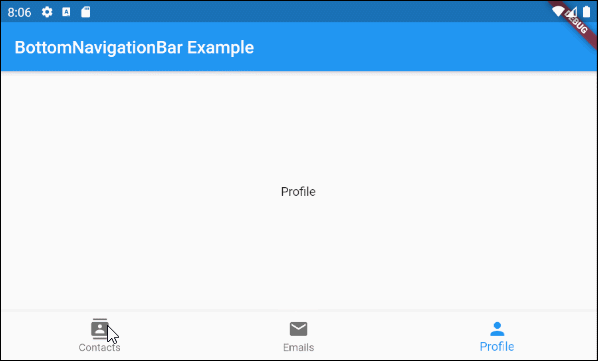
Widget getBody( ) {
if(this.selectedIndex == 0) {
return this._myContacts;
} else if(this.selectedIndex==1) {
return this._myEmails;
} else {
return this._myProfile;
}
}
void onTapHandler(int index) {
this.setState(() {
this.selectedIndex = index;
});
}
}
class MyContacts extends StatelessWidget {
@override
Widget build(BuildContext context) {
return Center(child: Text("Contacts"));
}
}
class MyEmails extends StatelessWidget {
@override
Widget build(BuildContext context) {
return Center(child: Text("Emails"));
}
}
class MyProfile extends StatelessWidget {
@override
Widget build(BuildContext context) {
return Center(child: Text("Profile"));
}
}3. items
Die Property items wird verwendet, um die Liste der Elemente von BottomNavigationBar festzulegen. Diese Property ist erforderlich und die Anzahl der Elemente muss größer oder gleich 2 sein. Andernfalls wird eine Fehlermeldung angezeigt.
@required List<BottomNavigationBarItem> itemsBottomNavigationBarItem Constructor:
BottomNavigationBarItem Constructor
const BottomNavigationBarItem(
    {@required Widget icon,
    Widget title,
    Widget activeIcon,
    Color backgroundColor}
)
Zum Beispiel:
main.dart (items ex1)
import 'package:flutter/material.dart';
void main() {
runApp(MyApp());
}
class MyApp extends StatelessWidget {
// This widget is the root of your application.
@override
Widget build(BuildContext context) {
return MaterialApp(
title: 'Title of Application',
theme: ThemeData(
primarySwatch: Colors.blue,
visualDensity: VisualDensity.adaptivePlatformDensity,
),
home: MyHomePage(),
);
}
}
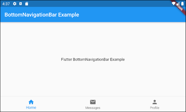
class MyHomePage extends StatelessWidget {
MyHomePage({Key key}) : super(key: key);
@override
Widget build(BuildContext context) {
return Scaffold(
appBar: AppBar(
title: Text("BottomNavigationBar Example"),
),
body: Center(
child: Text(
'Flutter BottomNavigationBar Example',
)
),
bottomNavigationBar: BottomNavigationBar(
items: [
BottomNavigationBarItem(
icon: Icon(Icons.home),
title: Text("Home"),
),
BottomNavigationBarItem(
icon: Icon(Icons.mail),
title: Text("Messages"),
),
BottomNavigationBarItem(
icon: Icon(Icons.person),
title: Text("Profile"),
)
],
),
);
}
}4. onTap
onTap ist eine Funktion callback. Es wird aufgerufen, wenn der Benutzer auf ein Element von BottomNavigationBar tippt.
ValueChanged<int> onTap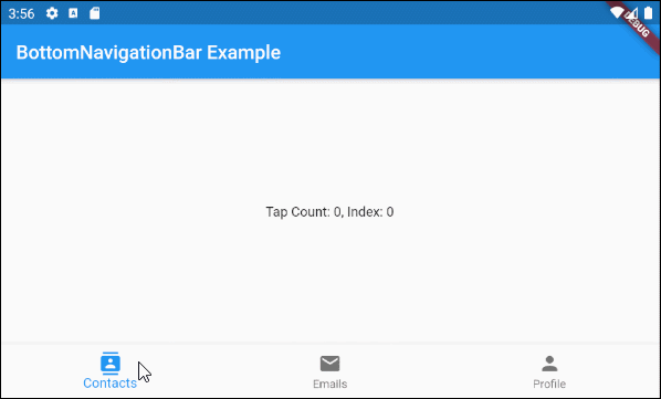
main.dart (onTab ex1)
import 'package:flutter/material.dart';

void main() {
  runApp(MyApp());
}

class MyApp extends StatelessWidget {
  @override
  Widget build(BuildContext context) {
    return MaterialApp(
      title: 'Title of Application',
      theme: ThemeData(
        primarySwatch: Colors.blue,
        visualDensity: VisualDensity.adaptivePlatformDensity,
      ),
      home: MyHomePage(),
    );
  }
}

class MyHomePage extends StatefulWidget {
  MyHomePage({Key key}) : super(key: key);

  @override
  State<StatefulWidget> createState() {
    return MyHomePageState();
  }

}

class MyHomePageState extends State<MyHomePage> {
  int tapCount = 0;
  int selectedIndex = 0;

  @override
  Widget build(BuildContext context) {
    return Scaffold(
      appBar: AppBar(
        title: Text("BottomNavigationBar Example"),
      ),
      body: Center(
          child: Text("Tap Count: " + this.tapCount.toString()
                       + ", Index: " + this.selectedIndex.toString())
      ),
      bottomNavigationBar: BottomNavigationBar(
        currentIndex: this.selectedIndex,
        items: [
          BottomNavigationBarItem(
            icon: Icon(Icons.contacts),
            title: Text("Contacts"),
          ),
          BottomNavigationBarItem(
            icon: Icon(Icons.mail),
            title: Text("Emails"),
          ),
          BottomNavigationBarItem(
            icon: Icon(Icons.person),
            title: Text("Profile"),
          )
        ],
        onTap: (int index) {
          this.onTapHandler(index);
        },
      ),
    );
  }

  void onTapHandler(int index)  {
    this.setState(() {
      this.tapCount++;
      this.selectedIndex = index;
    });
  }
}
5. currentIndex
currentIndex ist der Index vom aktuell ausgewählten Element BottomNavigationBar. Der Standardwert ist 0, was dem ersten Element entspricht.
int currentIndex: 07. iconSize
Die Property iconSize wird benutzt um die Größe von Symbol allerBottomNavigationBarItem festzulegen.
double iconSize: 24.0
iconSize (ex1)
BottomNavigationBar(
  currentIndex: this.selectedIndex,
  iconSize: 48,
  items: [
    BottomNavigationBarItem(
      icon: Icon(Icons.contacts),
      title: Text("Contacts"),
    ),
    BottomNavigationBarItem(
      icon: Icon(Icons.mail),
      title: Text("Emails"),
    ),
    BottomNavigationBarItem(
      icon: Icon(Icons.person),
      title: Text("Profile"),
    )
  ],
  onTap: (int index) {
    this.setState(() {
      this.selectedIndex = index;
    });
  },
),
8. selectedIconTheme
Der Property selectedIconTheme wird benutzt um die Größe, die Farbe und die Deckkraft für das ausgewählte Symbol BottomNavigationBarItem .
IconThemeData selectedIconThemeIconThemeData Constructor
const IconThemeData (
    {Color color,
    double opacity,
    double size}
)
Wenn die Property selectedIconTheme benutzt wird, sollten Sie einen Wert für die Property unselectedIconTheme angeben. Andernfalls werden auf den nichtausgewählten BottomNavigationBarItem keine Symbole angezeigt.

selectedIconTheme (ex1)
BottomNavigationBar(
  currentIndex: this.selectedIndex,
  selectedIconTheme: IconThemeData (
      color: Colors.red,
      opacity: 1.0,
      size: 30
  ),
  items: [
    BottomNavigationBarItem(
      icon: Icon(Icons.contacts),
      title: Text("Contacts"),
    ),
    BottomNavigationBarItem(
      icon: Icon(Icons.mail),
      title: Text("Emails"),
    ),
    BottomNavigationBarItem(
      icon: Icon(Icons.person),
      title: Text("Profile"),
    )
  ],
  onTap: (int index) {
    this.setState(() {
      this.selectedIndex = index;
    });
  },
)
9. unselectedIconTheme
Die Property unselectedIconTheme wird benutzt um die Größe, die Farbe und die Deckkraft für die Symbole von nichtausgewählten BottomNavigationBarItem anzugeben.
IconThemeData unselectedIconThemeIconThemeData constructor
const IconThemeData (
    {Color color,
    double opacity,
    double size}
)
Wenn die Property unselectedIconTheme wird verwendet, sollten Sie einen Wert für Property selectedIconTheme angeben.Wenn nicht, wird das Symbol auf das ausgewählte BottomNavigationBarItem nicht angezeigt.
unselectedIconTheme (ex1)
BottomNavigationBar(
  currentIndex: this.selectedIndex,
  selectedIconTheme: IconThemeData (
      color: Colors.red,
      opacity: 1.0,
      size: 45
  ),
  unselectedIconTheme: IconThemeData (
      color: Colors.black45,
      opacity: 0.5,
      size: 25
  ),
  items: [
    BottomNavigationBarItem(
      icon: Icon(Icons.contacts),
      title: Text("Contacts"),
    ),
    BottomNavigationBarItem(
      icon: Icon(Icons.mail),
      title: Text("Emails"),
    ),
    BottomNavigationBarItem(
      icon: Icon(Icons.person),
      title: Text("Profile"),
    )
  ],
  onTap: (int index) {
    this.setState(() {
      this.selectedIndex = index;
    });
  },
),
10. selectedLabelStyle
Mit der Property selectedLabelStyle wird der Textstil auf der Beschriftung des ausgewählten BottomNavigationBarItem angegeben.
TextStyle selectedLabelStyle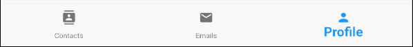
selectedLabelStyle (ex1)
BottomNavigationBar(
  currentIndex: this.selectedIndex,
  selectedLabelStyle: TextStyle(fontWeight: FontWeight.bold, fontSize: 22),
  items: [
    BottomNavigationBarItem(
      icon: Icon(Icons.contacts),
      title: Text("Contacts"),
    ),
    BottomNavigationBarItem(
      icon: Icon(Icons.mail),
      title: Text("Emails"),
    ),
    BottomNavigationBarItem(
      icon: Icon(Icons.person),
      title: Text("Profile"),
    )
  ],
  onTap: (int index) {
    this.setState(() {
      this.selectedIndex = index;
    });
  },
)
11. unselectedLabelStyle
Die Property unselectedLabelStyle wird verwendet um den Textstil auf der Beschrigtung der nicht ausgwählten BottomNavigationBarItem anzugeben.
TextStyle unselectedLabelStyle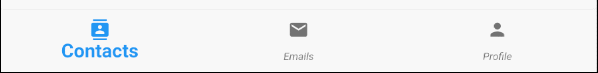
unselectedLabelStyle (ex1)
BottomNavigationBar(
  currentIndex: this.selectedIndex,
  selectedLabelStyle: TextStyle(fontWeight: FontWeight.bold, fontSize: 22),
  unselectedLabelStyle: TextStyle(fontStyle: FontStyle.italic),
  items: [
    BottomNavigationBarItem(
      icon: Icon(Icons.contacts),
      title: Text("Contacts"),
    ),
    BottomNavigationBarItem(
      icon: Icon(Icons.mail),
      title: Text("Emails"),
    ),
    BottomNavigationBarItem(
      icon: Icon(Icons.person),
      title: Text("Profile"),
    )
  ],
  onTap: (int index) {
    this.setState(() {
      this.selectedIndex = index;
    });
  },
)
12. showSelectedLabels
Die Property showSelectedLabels wird verwendet, um die Anzeige von Bechrigtungen im ausgewählten BottomNavigationBarItem zuzulassen oder nicht zuzulassen. Der Standardwert ist true.
bool showSelectedLabels: true
showSelectedLabels (ex1)
BottomNavigationBar(
  currentIndex: this.selectedIndex,
  showSelectedLabels: false,
  items: [
    BottomNavigationBarItem(
      icon: Icon(Icons.contacts),
      title: Text("Contacts"),
    ),
    BottomNavigationBarItem(
      icon: Icon(Icons.mail),
      title: Text("Emails"),
    ),
    BottomNavigationBarItem(
      icon: Icon(Icons.person),
      title: Text("Profile"),
    )
  ],
  onTap: (int index) {
    this.setState(() {
      this.selectedIndex = index;
    });
  },
)
13. showUnselectedLabels
Die Property showUnselectedLabels wird verwendet, um die Anzeige von Labels im nicht ausgewählten BottomNavigationBarItem zuzulassen oder nicht zuzulassen- Der Standardwert ist true.
bool showUnselectedLabels
showUnselectedLabels (ex1)
BottomNavigationBar(
  currentIndex: this.selectedIndex,
  showUnselectedLabels: false,
  items: [
    BottomNavigationBarItem(
      icon: Icon(Icons.contacts),
      title: Text("Contacts"),
    ),
    BottomNavigationBarItem(
      icon: Icon(Icons.mail),
      title: Text("Emails"),
    ),
    BottomNavigationBarItem(
      icon: Icon(Icons.person),
      title: Text("Profile"),
    )
  ],
  onTap: (int index) {
    this.setState(() {
      this.selectedIndex = index;
    });
  },
)
14. selectedFontSize
Mit der Property selectedFontSize wird die Schriftgröße des ausgewählten BottomNavigationBarItem angegeben. Der Standardwert ist 14.
double selectedFontSize: 14.0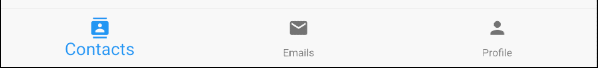
selectedFontSize (ex1)
BottomNavigationBar(
  currentIndex: this.selectedIndex,
  selectedFontSize: 20,
  items: [
    BottomNavigationBarItem(
      icon: Icon(Icons.contacts),
      title: Text("Contacts"),
    ),
    BottomNavigationBarItem(
      icon: Icon(Icons.mail),
      title: Text("Emails"),
    ),
    BottomNavigationBarItem(
      icon: Icon(Icons.person),
      title: Text("Profile"),
    )
  ],
  onTap: (int index) {
    this.setState(() {
      this.selectedIndex = index;
    });
  },
)
15. unselectedFontSize
Mit der Property selectedFontSize wird die Schriftgröße für das nicht ausgewählte BottomNavigationBarItem angegeben. Der Standardwert ist 12.
double unselectedFontSize: 12.0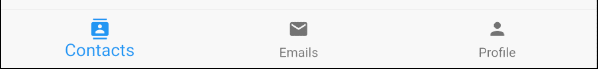
unselectedFontSize (ex1)
BottomNavigationBar(
  currentIndex: this.selectedIndex,
  selectedFontSize: 20,
  unselectedFontSize: 15,
  items: [
    BottomNavigationBarItem(
      icon: Icon(Icons.contacts),
      title: Text("Contacts"),
    ),
    BottomNavigationBarItem(
      icon: Icon(Icons.mail),
      title: Text("Emails"),
    ),
    BottomNavigationBarItem(
      icon: Icon(Icons.person),
      title: Text("Profile"),
    )
  ],
  onTap: (int index) {
    this.setState(() {
      this.selectedIndex = index;
    });
  },
)
16. backgroundColor
Mit der Property backgroundColor wird die Hintergrundfarbe der BottomNavigationBar angegeben.
Color backgroundColor
backgroundColor (ex1)
BottomNavigationBar(
  currentIndex: this.selectedIndex,
  backgroundColor : Colors.greenAccent,
  items: [
    BottomNavigationBarItem(
      icon: Icon(Icons.contacts),
      title: Text("Contacts"),
    ),
    BottomNavigationBarItem(
      icon: Icon(Icons.mail),
      title: Text("Emails"),
    ),
    BottomNavigationBarItem(
      icon: Icon(Icons.person),
      title: Text("Profile"),
    )
  ],
  onTap: (int index) {
    this.setState(() {
      this.selectedIndex = index;
    });
  },
)
17. selectedItemColor
Mit der Property selectedItemColor wird die Farbe des ausgewählten BottomNavigationBarItem angegeben, das für das Symbol und die Beschriftung funktioniert.
Achtung: Der Property selectedItemColor ist ähnlich wie fixedColor, für die Sie nur eine dieser beiden Property verwenden dürfen.
Color selectedItemColor
selectedItemColor (ex1)
BottomNavigationBar(
  currentIndex: this.selectedIndex,
  selectedItemColor : Colors.red,
  items: [
    BottomNavigationBarItem(
      icon: Icon(Icons.contacts),
      title: Text("Contacts"),
    ),
    BottomNavigationBarItem(
      icon: Icon(Icons.mail),
      title: Text("Emails"),
    ),
    BottomNavigationBarItem(
      icon: Icon(Icons.person),
      title: Text("Profile"),
    )
  ],
  onTap: (int index) {
    this.setState(() {
      this.selectedIndex = index;
    });
  },
)
18. unselectedItemColor
Die Property unselectedItemColor wird verwendet um die Farbe von nicht ausgewählten BottomNavigationBarItem anzugeben, das für das Symbol und die Beschriftung funktioniert.
Color unselectedItemColor
unselectedItemColor (ex1)
BottomNavigationBar(
  currentIndex: this.selectedIndex,
  selectedItemColor : Colors.red,
  unselectedItemColor: Colors.cyan,
  items: [
    BottomNavigationBarItem(
      icon: Icon(Icons.contacts),
      title: Text("Contacts"),
    ),
    BottomNavigationBarItem(
      icon: Icon(Icons.mail),
      title: Text("Emails"),
    ),
    BottomNavigationBarItem(
      icon: Icon(Icons.person),
      title: Text("Profile"),
    )
  ],
  onTap: (int index) {
    this.setState(() {
      this.selectedIndex = index;
    });
  },
)
19. fixedColor
Die Property fixedColor ähnelt der Property selectedItemColor. Beide werden verwendet, um die Farbe des ausgewählten BottomNavigationBarItem anzugeben. Es funktioniert für das Symbol und die Beschriftung.
Hinweis: fixedColor ist ein alter Name, der aus Gründen der Abwärtskompatibilität (backwards compatibility) weiterhin verfügbar ist. Sie sollten die Property selectedItemColor verwenden und nicht beide gleichzeitig verwenden dürfen.
Color fixedColor
fixedColor (ex1)
BottomNavigationBar(
  currentIndex: this.selectedIndex,
  fixedColor: Colors.red,
  items: [
    BottomNavigationBarItem(
      icon: Icon(Icons.contacts),
      title: Text("Contacts"),
    ),
    BottomNavigationBarItem(
      icon: Icon(Icons.mail),
      title: Text("Emails"),
    ),
    BottomNavigationBarItem(
      icon: Icon(Icons.person),
      title: Text("Profile"),
    )
  ],
  onTap: (int index) {
    this.setState(() {
      this.selectedIndex = index;
    });
  },
)No ADS
Anleitungen Flutter
- Die Anleitung zu Flutter Column
- Die Anleitung zu Flutter Stack
- Die Anleitung zu Flutter IndexedStack
- Die Anleitung zu Flutter Spacer
- Die Anleitung zu Flutter Expanded
- Die Anleitung zu Flutter SizedBox
- Die Anleitung zu Flutter Tween
- Installieren Sie das Flutter SDK unter Windows
- Installieren Sie das Flutter Plugin für Android Studio
- Erstellen Sie Ihre erste Flutter-Anwendung - Hello Flutter
- Die Anleitung zu Flutter Scaffold
- Die Anleitung zu Flutter AppBar
- Die Anleitung zu Flutter BottomAppBar
- Die Anleitung zu Flutter TextButton
- Die Anleitung zu Flutter ElevatedButton
- Die Anleitung zu Flutter EdgeInsetsGeometry
- Die Anleitung zu Flutter EdgeInsets
- Die Anleitung zu Flutter CircularProgressIndicator
- Die Anleitung zu Flutter LinearProgressIndicator
- Die Anleitung zu Flutter Center
- Die Anleitung zu Flutter Align
- Die Anleitung zu Flutter Row
- Die Anleitung zu Flutter SplashScreen
- Die Anleitung zu Flutter Alignment
- Die Anleitung zu Flutter Positioned
- Die Anleitung zu Flutter SimpleDialog
- Die Anleitung zu Flutter AlertDialog
- Die Anleitung zu Flutter Navigation und Routing
- Die Anleitung zu Flutter TabBar
- Die Anleitung zu Flutter Banner
- Die Anleitung zu Flutter BottomNavigationBar
- Die Anleitung zu Flutter FancyBottomNavigation
- Die Anleitung zu Flutter Card
- Die Anleitung zu Flutter Border
- Die Anleitung zu Flutter ContinuousRectangleBorder
- Die Anleitung zu Flutter RoundedRectangleBorder
- Die Anleitung zu Flutter CircleBorder
- Die Anleitung zu Flutter StadiumBorder
- Die Anleitung zu Flutter Container
- Die Anleitung zu Flutter RotatedBox
- Die Anleitung zu Flutter CircleAvatar
- Die Anleitung zu Flutter IconButton
- Die Anleitung zu Flutter FlatButton
- Die Anleitung zu Flutter SnackBar
Show More