Die Anleitung zu Flutter AppBar
1. AppBar
In Flutter besteht AppBar aus einer Toolbar und der potenziellen Widget. Insbesondere ist AppBar in fünft Bereiche unterteilt. Das sind leading, title, Tool Bar (actions), flexiableSpace, bottom.

AppBar Constructor:
AppBar Constructor
AppBar( {Key key,
    Widget leading,
    bool automaticallyImplyLeading: true,
    Widget title,
    List<Widget> actions,
    Widget flexibleSpace,
    PreferredSizeWidget bottom,
    double elevation,
    Color shadowColor,
    ShapeBorder shape,
    Color backgroundColor,
    Brightness brightness,
    IconThemeData iconTheme,
    IconThemeData actionsIconTheme,
    TextTheme textTheme,
    bool primary: true,
    bool centerTitle,
    bool excludeHeaderSemantics: false,
    double titleSpacing: NavigationToolbar.kMiddleSpacing,
    double toolbarOpacity: 1.0,
    double bottomOpacity: 1.0,
    double toolbarHeight
  }
)
AppBar ist normalerweise in ein Scaffold über die Property Scaffold.appBar eingefügt. AppBar hat eine feste Höhe und wird oben auf Scaffbar angezeigt. Wenn Sie eine scrollbare App-Leiste möchten, verwenden Sie SliverAppBar.
- SliverAppBar
- Scaffold
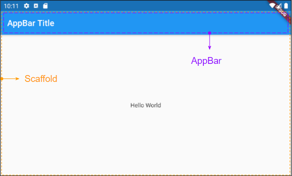
2. title
Widget title;Zum Beispiel: Eine einfache AppBar besteht aus einem Titel, der in ein Scaffold eingefügt wird. Es wird oben auf Scaffold angezeigt.
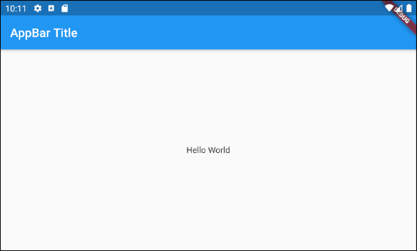
main.dart (title ex1)
import 'package:flutter/material.dart';
void main() {
runApp(MyApp());
}
class MyApp extends StatelessWidget {
// This widget is the root of your application.
@override
Widget build(BuildContext context) {
return MaterialApp(
title: 'Title of Application',
theme: ThemeData(
primarySwatch: Colors.blue,
visualDensity: VisualDensity.adaptivePlatformDensity,
),
home: MyHomePage(),
);
}
}
class MyHomePage extends StatelessWidget {
MyHomePage({Key key}) : super(key: key);
@override
Widget build(BuildContext context) {
return Scaffold(
appBar: AppBar(
title: Text("AppBar Title"),
),
body: Center(
child: Text(
'Hello World',
)
),
);
}
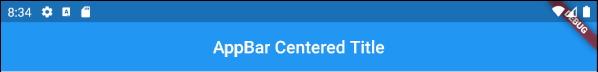
}Z.B: Eine AppBar mit zentriertem oder rechtsbündigem Titel:
AppBar(
title: Align (
child: Text("AppBar Centered Title"),
alignment: Alignment.center
)
);
AppBar(
title: Align (
child: Text("AppBar Right Title"),
alignment: Alignment.centerRight
)
);
AppBar(
title: Text("AppBar Centered Title"),
centerTitle: true,
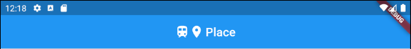
);Ein Beispiel für die Erstellung eines "Title Widget" , das aus Symbolen und Text besteht.
main.dart (title ex3)
import 'package:flutter/material.dart';

void main() {
  runApp(MyApp());
}

class MyApp extends StatelessWidget {

  @override
  Widget build(BuildContext context) {
    return MaterialApp(
      title: 'Title of Application',
      theme: ThemeData(
        primarySwatch: Colors.blue,
        visualDensity: VisualDensity.adaptivePlatformDensity,
      ),
      home: MyHomePage(),
    );
  }
}

class MyHomePage extends StatelessWidget {
  MyHomePage({Key key}) : super(key: key);

  @override
  Widget build(BuildContext context) {
    return Scaffold(
      appBar: AppBar(
          title: IconTitleWidget()
      ),
      body: Center(
          child: Text(
            'Flutter AppBar Tutorial',
          )
      ),
    );
  }
}

class IconTitleWidget extends StatelessWidget {

  @override
  Widget build(BuildContext context) {
    imageCache.clear();
    return Row (
      mainAxisAlignment: MainAxisAlignment.center, // Centers horizontally
      crossAxisAlignment: CrossAxisAlignment.center, // Centers vertically
      children: <Widget>[
        Icon(Icons.train),
        Icon(Icons.place),
        // The SizedBox provides an immediate spacing between the widgets
        SizedBox (
          width: 3,
        ),
        Text(
          "Place",
        )
      ],
    );
  }
}
3. leading
leading ist ein Widget , das vor dem Bereich title platziert wird. Es ist normalerweise ein Icon oder IconButton.
Widget leading;Z.B: leading ist ein IconButton. Wenn der Benutzer auf IconButton klickt, wird eine Aktion durchgeführt.
// Example: leading is an IconButton
appBar: AppBar(
    title: Text("AppBar Title"),
    leading: IconButton(
        icon: Icon(Icons.notifications_active),
        onPressed: () {
             // Do something.
        }
    )
)

// Example: leading is an Icon
appBar: AppBar(
    title: Text("AppBar Title"),
    leading: Icon(Icons.notifications_active)
)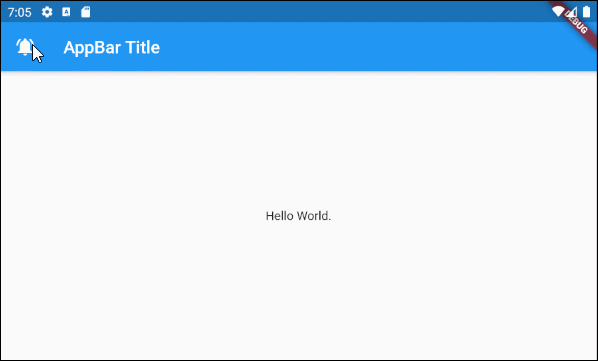
main.dart (leading ex1)
import 'package:flutter/material.dart';

void main() {
  runApp(MyApp());
}

class MyApp extends StatelessWidget {
  // This widget is the root of your application.
  @override
  Widget build(BuildContext context) {
    return MaterialApp(
      title: 'Title of Application',
      theme: ThemeData(
        primarySwatch: Colors.blue,
        visualDensity: VisualDensity.adaptivePlatformDensity,
      ),
      home: MyHomePage(),
    );
  }
}

class MyHomePage extends StatelessWidget {
  MyHomePage({Key key}) : super(key: key);

  @override
  Widget build(BuildContext context) {
    return Scaffold(
      appBar: AppBar(
          title: Text("AppBar Title"),
          leading: IconButton(
              icon: Icon(Icons.notifications_active),
              onPressed: () {
                showAlert(context);
              }
          )
      ),
      body: Center(
          child:  Text("Hello World.")
      ),
    );
  }

  void showAlert(BuildContext context) {
    showDialog(
        context: context,
        builder: (context) => AlertDialog(
          content: Text("Hi"),
        ));
  }
}
Zum Beispiel:

main.dart (leading ex2)
import 'package:flutter/material.dart';

void main() {
  runApp(MyApp());
}

class MyApp extends StatelessWidget {
  // This widget is the root of your application.
  @override
  Widget build(BuildContext context) {
    return MaterialApp(
      title: 'Title of Application',
      theme: ThemeData(
        primarySwatch: Colors.blue,
        visualDensity: VisualDensity.adaptivePlatformDensity,
      ),
      home: MyHomePage(),
    );
  }
}

class MyHomePage extends StatelessWidget {
  MyHomePage({Key key}) : super(key: key);

  @override
  Widget build(BuildContext context) {
    return Scaffold(
      appBar: AppBar(
          title: Text("AppBar Title"),
          leading: MyVolumeButton()
      ),
      body: Center(
          child:  Text("Hello World.")
      ),
    );
  }

}

class MyVolumeButton extends StatefulWidget {
  MyVolumeButton({Key key}) : super(key: key);

  @override
  State<StatefulWidget> createState() {
    return MyVolumeButtonState();
  }
}

class MyVolumeButtonState extends State<MyVolumeButton> {
  bool volumeOn = true;

  @override
  Widget build(BuildContext context) {
    return IconButton(
        icon: this.volumeOn? Icon(Icons.volume_up):Icon(Icons.volume_mute),
        onPressed: () {
          // Set new State
          setState(() => this.volumeOn = !this.volumeOn);
        }
    );
  }
}
4. automaticallyImplyLeading
bool automaticallyImplyLeading: true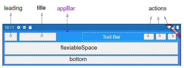
automaticallyImplyLeading ist ein optionale Property von AppBar, deren Standardwert true ist.Wenn Sie kein Widget im Bereich leading platzieren, wird ein entsprechendes Widget automatisch in den Kontext eingefügt.
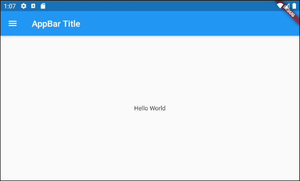
Fall 1: Ein IconButton wird automatisch im Bereich leading von AppBar hinzugefügt, um das Öffnen eines Drawer zu unterstützen wenn die folgenden Bedingungen erfüllt sind:
- Der Bereich leading von AppBar ist leer.
- AppBar.automaticallyImplyLeading : true.
- AppBar wird in ein Scaffold platziert.
- Scaffold besteht einen Drawer (Scaffold.drawer wird spezifiziert).
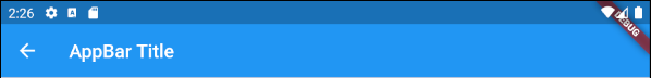
Fall 2: Ein IconButton - "BACK" wird automatisch zum Bereich leading einer AppBar hinzugefügt, damit Sie zum vorherigen Bildschirm zurückkehren können, wenn die folgenden Bedingungen erfüllt sind:
- Der Bereich leading vom AppBar ist leer.
- AppBar.automaticallyImplyLeading : true.
- AppBar.drawer : null
- Sie sind von einem vorherigen Bildschirm zum aktuellen Bildschirm gesprungen.
main.dart (automaticallyImplyLeading : true)
import 'package:flutter/material.dart';

void main() {
  runApp(MyApp());
}

class MyApp extends StatelessWidget {
  // This widget is the root of your application.
  @override
  Widget build(BuildContext context) {
    return MaterialApp(
      title: 'Title of Application',
      theme: ThemeData(
        primarySwatch: Colors.blue,
        visualDensity: VisualDensity.adaptivePlatformDensity,
      ),
      home: MyHomePage(),
    );
  }
}

class MyHomePage extends StatelessWidget {
  MyHomePage({Key key}) : super(key: key);

  @override
  Widget build(BuildContext context) {
    return Scaffold(
      // AppBar with automaticallyImplyLeading = "true" (Default)
      appBar: AppBar(
          title: Text("AppBar Title"),
          automaticallyImplyLeading: true
      ),
      body: Center(
          child:  Text("Hello World.")
      ),
      drawer: Drawer(
        child: ListView(
          children: const <Widget> [
            DrawerHeader(
              decoration: BoxDecoration(
                color: Colors.green,
              ),
              child: Text(
                'My Drawer',
                style: TextStyle(
                  color: Colors.green,
                  fontSize: 24,
                ),
              ),
            ),
            ListTile(
              title: Text('Gallery'),
            ),
            ListTile(
              title: Text('Slideshow'),
            ),
          ],
        ),
      ),
    );
  }
}
5. actions
Mit der Property actions können Sie die action in der Toolbar von AppBar hinzufügen. Normalerweise wird IconButton für jede gemeinsame action verwendet. Bei weniger häufigen action sollten Sie die Verwendung von PopupMenuButton überlegen.
List<Widget> actions
Das Beispiel vom Hinzufügen der action zur Toolbar vom AppBar.
main.dart (actions ex1)
import 'package:flutter/material.dart';
void main() {
runApp(MyApp());
}
class MyApp extends StatelessWidget {
@override
Widget build(BuildContext context) {
return MaterialApp(
title: 'Title of Application',
theme: ThemeData(
primarySwatch: Colors.blue,
visualDensity: VisualDensity.adaptivePlatformDensity,
),
home: MyHomePage(),
);
}
}
class MyHomePage extends StatelessWidget {
MyHomePage({Key key}) : super(key: key);
@override
Widget build(BuildContext context) {
return Scaffold(
appBar: AppBar(
title: Text("AppBar Title"),
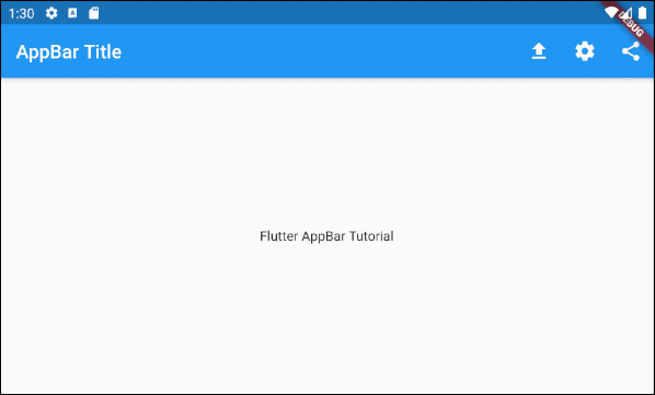
actions: <Widget> [
IconButton(
icon: Icon(Icons.file_upload),
onPressed: () => {
print("Click on upload button")
},
),
IconButton(
icon: Icon(Icons.settings),
onPressed: () => {
print("Click on settings button")
}
),
PopupMenuButton(
icon: Icon(Icons.share),
itemBuilder: (context) => [
PopupMenuItem(
value: 1,
child: Text("Facebook"),
),
PopupMenuItem(
value: 2,
child: Text("Instagram"),
),
],
)
]
),
body: Center(
child: Text(
'Flutter AppBar Tutorial',
)
),
);
}
}Hinweise: Die Höhe der action ist durch die Höhe der Toolbar begrenzt. Sie können die Höhe der Toolbar jedoch mithilfe der Property toolbarHeight festlegen.
- Die Anleitung zu Flutter IconButton
- Die Anleitung zu Flutter PopupMenuButton
6. bottom
Die Bereich bottom vom AppBar wird benutzt, um ein TabBar zu enthalten.
PreferredSizeWidget bottom;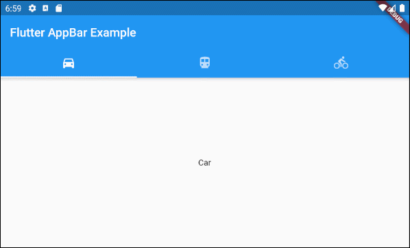
main.dart (bottom ex1)
import 'package:flutter/material.dart';

void main() {
  runApp(MyApp());
}

class MyApp extends StatelessWidget {
  // This widget is the root of your application.
  @override
  Widget build(BuildContext context) {
    return MaterialApp(
      title: 'Title of Application',
      theme: ThemeData(
        primarySwatch: Colors.blue,
        visualDensity: VisualDensity.adaptivePlatformDensity,
      ),
      home: MyHomePage(),
    );
  }
}

class MyHomePage extends StatelessWidget {
  MyHomePage({Key key}) : super(key: key);

  @override
  Widget build(BuildContext context) {
    return DefaultTabController(
        length: 3,
        child: Scaffold(
          appBar: AppBar(
            bottom: TabBar(
              tabs: [
                Tab(icon: Icon(Icons.directions_car)),
                Tab(icon: Icon(Icons.directions_transit)),
                Tab(icon: Icon(Icons.directions_bike)),
              ],
            ),
            title: Text('Flutter AppBar Example'),
          ),
          body: TabBarView (
            children: [
              Center(child: Text("Car")),
              Center(child: Text("Transit")),
              Center(child: Text("Bike"))
            ],
          ),
        )
    );
  }
}Anleitungen Flutter
- Die Anleitung zu Flutter Column
- Die Anleitung zu Flutter Stack
- Die Anleitung zu Flutter IndexedStack
- Die Anleitung zu Flutter Spacer
- Die Anleitung zu Flutter Expanded
- Die Anleitung zu Flutter SizedBox
- Die Anleitung zu Flutter Tween
- Installieren Sie das Flutter SDK unter Windows
- Installieren Sie das Flutter Plugin für Android Studio
- Erstellen Sie Ihre erste Flutter-Anwendung - Hello Flutter
- Die Anleitung zu Flutter Scaffold
- Die Anleitung zu Flutter AppBar
- Die Anleitung zu Flutter BottomAppBar
- Die Anleitung zu Flutter TextButton
- Die Anleitung zu Flutter ElevatedButton
- Die Anleitung zu Flutter EdgeInsetsGeometry
- Die Anleitung zu Flutter EdgeInsets
- Die Anleitung zu Flutter CircularProgressIndicator
- Die Anleitung zu Flutter LinearProgressIndicator
- Die Anleitung zu Flutter Center
- Die Anleitung zu Flutter Align
- Die Anleitung zu Flutter Row
- Die Anleitung zu Flutter SplashScreen
- Die Anleitung zu Flutter Alignment
- Die Anleitung zu Flutter Positioned
- Die Anleitung zu Flutter SimpleDialog
- Die Anleitung zu Flutter AlertDialog
- Die Anleitung zu Flutter Navigation und Routing
- Die Anleitung zu Flutter TabBar
- Die Anleitung zu Flutter Banner
- Die Anleitung zu Flutter BottomNavigationBar
- Die Anleitung zu Flutter FancyBottomNavigation
- Die Anleitung zu Flutter Card
- Die Anleitung zu Flutter Border
- Die Anleitung zu Flutter ContinuousRectangleBorder
- Die Anleitung zu Flutter RoundedRectangleBorder
- Die Anleitung zu Flutter CircleBorder
- Die Anleitung zu Flutter StadiumBorder
- Die Anleitung zu Flutter Container
- Die Anleitung zu Flutter RotatedBox
- Die Anleitung zu Flutter CircleAvatar
- Die Anleitung zu Flutter IconButton
- Die Anleitung zu Flutter FlatButton
- Die Anleitung zu Flutter SnackBar
Show More