Die Anleitung zu Android Switch
1. Android Switch
In Android ist Switch eine Benutzerinterface (user interface control) mit den beiden Zuständen ON/OFF. Die Funktionen sind zwar mit CheckBox, ToggleButton ziemlich ähnlich, unterscheiden sich jedoch in die Interface.

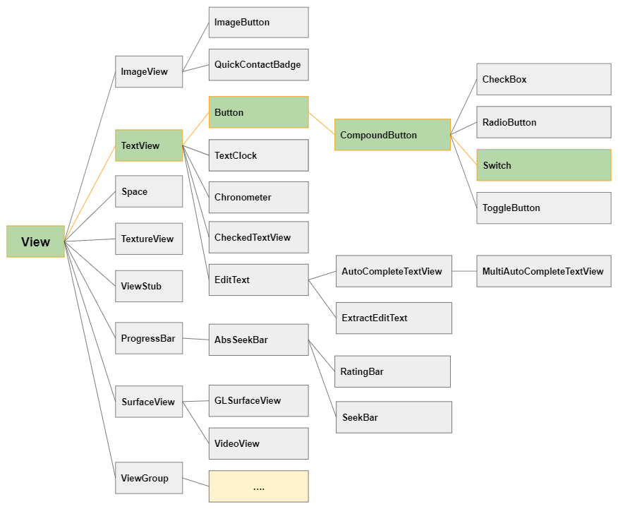
Switch ähnelt CheckBox, ToggleButton in Bezug auf Funktionen und Verwendung. Alle drei Klassen sind Unterklassen von CompoundButton,und der Unterschied liegt in ihrer Interface.
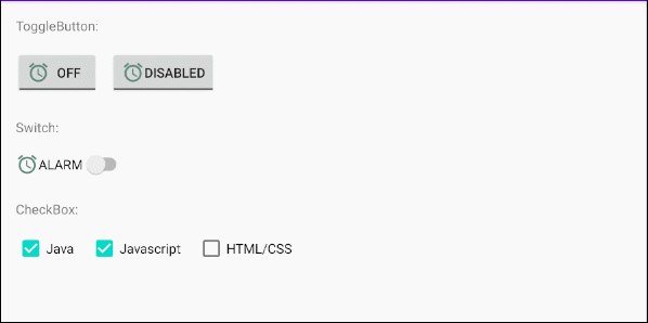
Image (Icon)
Switch Ist eine Unterklasse von Button, sodass Sie maximal vier Symbole in der Nähe der vier Kanten anzeigen können, indem Sie die Attribute android:drawableLeft, android:drawableTop, android:drawableRight, android:drawableBottom, android:drawableStart, android:drawableEnd benutzen.
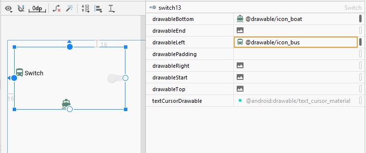
<Switch
    android:id="@+id/switch13"
    android:drawableLeft="@drawable/icon_bus"
    android:drawableTop="@drawable/icon_car"
    android:drawableBottom="@drawable/icon_boat"
    android:text="Switch"
    ... />
android:gravity
Das Attribut android:gravity wird verwendet, um die Textanzeigeposition vom Switch festzulegen. Sein Wert ist eine Kombination der folgenden Werten:
Constant in Java | Value | Description |
Gravity.LEFT | left | |
Gravity.CENTER_HORIZONTAL | center_horizontal | |
Gravity.RIGHT | right | |
Gravity.TOP | top | |
Gravity.CENTER_VERTICAL | center_vertical | |
Gravity.BOTTOM | bottom | |
Gravity.START | start | |
Gravity.END | end | |
Gravity.CENTER | center | |
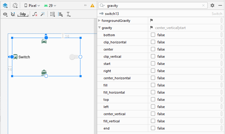
<Switch
    android:id="@+id/switch13"
    android:text="Switch"
    android:gravity="bottom|center"
    ... />
android:switchPadding
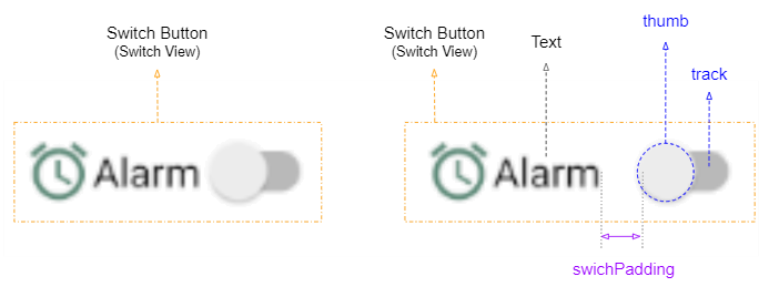
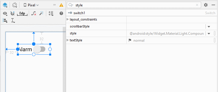
Mit dem Attribut android:switchPaddiing können Sie den Abstand zwischen track und text vom Switch.
<Switch
android:id="@+id/switch1"
android:drawableLeft="@drawable/icon_alarm"
android:switchPadding="10dp"
android:text="Alarm"
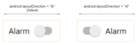
... />android:layoutDirection = "rtl"
Das Attribut android:layoutDirection wird von Android 4.2 (API Level 17) unterstützt, mit dem Sie die Layout-Richtung (Layout direction) eines View festlegen können. Standardmäßig ist der Wert dieses Attribut "ltr" (Left to Right).
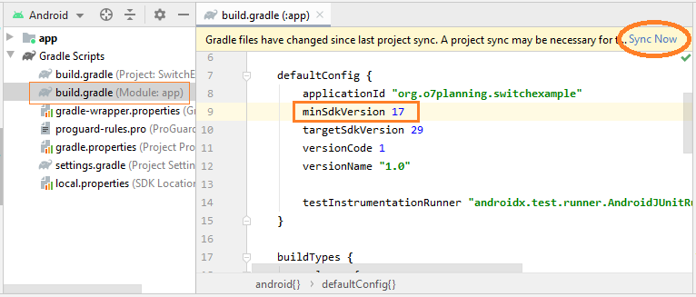
Um das Attribut android:layoutDirection verwenden zu können, müssen Sie die Datei build.gradle (Module: app) öffnen und den Wert von minSdkVersion ändern und sicherstellen, dass der neue Wert gleich oder größer als 17 ist.
<!-- Layout Direction Default: Left to Right -->
<Switch
    android:id="@+id/switch41"
    android:switchPadding="5dp"
    android:text="Alarm"
    ... />

<!-- Layout Direction: Right to Left -->
<Switch
    android:id="@+id/switch42"
    android:layoutDirection="rtl"
    android:switchPadding="5dp"
    android:text="Alarm"
    ... />
textOn/textOff
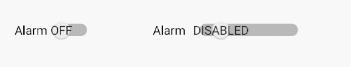
Mit Android 5.0 (API Level 21) kann textOn/textOff entsprechend den Zuständen ON/OFF vom Switch angezeigt werden.
<!-- textOn/textOff = ON/OFF (Default) -->
<Switch
    android:id="@+id/switch51"
    android:text="Alarm"

    android:showText="true"
    ... />


<!-- textOn/textOff = Enabled/Disabled -->
<Switch
    android:id="@+id/switch52"
    android:text="Alarm"

    android:showText="true"
    android:textOff="Disabled"
    android:textOn="Enabled"
    ... />
toggle()
Alle 4 Klassen von ToggleButton, CheckBox, RadioButton, Switch sind die Unterklassen von CompoundButton, daher erben Sie die Methode toggle(), die häufig verwendet wird, um ihren Status von ON (Checked) auf OFF (Unchecked) und umgekehrt zu wechseln.
CompoundButton button = (Switch) findViewById(R.id.switch);

button.toggle();
2. Switch Styles
Das Attribut style ist eine Option vom Switch, mit der Sie den Stil für Switch festlegen können. In der Bibliothek vom Android stehen verschiedene Stile zur Verfügung, die Sie bereits benutzen können.
Hinweis: Derzeit sind nicht viele style in der Bibliothek verfügbar, und sie unterscheiden sich nicht von den Standardstilen. Das ist so eine enttäuschende Sache.
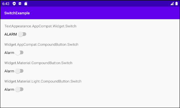
Switch Styles Example
<?xml version="1.0" encoding="utf-8"?>
<androidx.constraintlayout.widget.ConstraintLayout
    xmlns:android="http://schemas.android.com/apk/res/android"
    xmlns:app="http://schemas.android.com/apk/res-auto"
    xmlns:tools="http://schemas.android.com/tools"
    android:layout_width="match_parent"
    android:layout_height="match_parent"
    tools:context=".MainActivity">

    <TextView
        android:id="@+id/textView61"
        android:layout_width="0dp"
        android:layout_height="wrap_content"
        android:layout_marginStart="16dp"
        android:layout_marginTop="16dp"
        android:layout_marginEnd="16dp"
        android:text="TextAppearance.AppCompat.Widget.Switch"
        app:layout_constraintEnd_toEndOf="parent"
        app:layout_constraintStart_toStartOf="parent"
        app:layout_constraintTop_toTopOf="parent" />

    <Switch
        android:id="@+id/switch61"
        style="@style/TextAppearance.AppCompat.Widget.Switch"
        android:layout_width="wrap_content"
        android:layout_height="wrap_content"
        android:layout_marginStart="16dp"
        android:layout_marginTop="8dp"
        android:showText="false"
        android:text="Alarm"
        app:layout_constraintStart_toStartOf="parent"
        app:layout_constraintTop_toBottomOf="@+id/textView61" />

    <TextView
        android:id="@+id/textView62"
        android:layout_width="0dp"
        android:layout_height="wrap_content"
        android:layout_marginStart="16dp"
        android:layout_marginTop="16dp"
        android:layout_marginEnd="16dp"
        android:text="Widget.AppCompat.CompoundButton.Switch"
        app:layout_constraintEnd_toEndOf="parent"
        app:layout_constraintStart_toStartOf="parent"
        app:layout_constraintTop_toBottomOf="@+id/switch61" />

    <Switch
        android:id="@+id/switch62"
        style="@style/Widget.AppCompat.CompoundButton.Switch"
        android:layout_width="wrap_content"
        android:layout_height="wrap_content"
        android:layout_marginStart="16dp"
        android:layout_marginTop="8dp"
        android:showText="false"
        android:text="Alarm"
        app:layout_constraintStart_toStartOf="parent"
        app:layout_constraintTop_toBottomOf="@+id/textView62" />

    <TextView
        android:id="@+id/textView63"
        android:layout_width="0dp"
        android:layout_height="wrap_content"
        android:layout_marginStart="16dp"
        android:layout_marginTop="16dp"
        android:layout_marginEnd="16dp"
        android:text="Widget.Material.CompoundButton.Switch"
        app:layout_constraintEnd_toEndOf="parent"
        app:layout_constraintStart_toStartOf="parent"
        app:layout_constraintTop_toBottomOf="@+id/switch62" />

    <Switch
        android:id="@+id/switch63"
        style="@android:style/Widget.Material.CompoundButton.Switch"
        android:layout_width="wrap_content"
        android:layout_height="wrap_content"
        android:layout_marginStart="16dp"
        android:layout_marginTop="8dp"
        android:showText="false"
        android:text="Alarm"
        app:layout_constraintStart_toStartOf="parent"
        app:layout_constraintTop_toBottomOf="@+id/textView63" />

    <TextView
        android:id="@+id/textView64"
        android:layout_width="0dp"
        android:layout_height="wrap_content"
        android:layout_marginStart="16dp"
        android:layout_marginTop="16dp"
        android:layout_marginEnd="16dp"
        android:text="Widget.Material.Light.CompoundButton.Switch"
        app:layout_constraintEnd_toEndOf="parent"
        app:layout_constraintStart_toStartOf="parent"
        app:layout_constraintTop_toBottomOf="@+id/switch63" />

    <Switch
        android:id="@+id/switch64"
        style="@android:style/Widget.Material.Light.CompoundButton.Switch"
        android:layout_width="wrap_content"
        android:layout_height="wrap_content"
        android:layout_marginStart="16dp"
        android:layout_marginTop="8dp"
        android:showText="false"
        android:text="Alarm"
        app:layout_constraintStart_toStartOf="parent"
        app:layout_constraintTop_toBottomOf="@+id/textView64" />

</androidx.constraintlayout.widget.ConstraintLayout>
3. Switch Events
Es gibt einige Ereignisse im Zusammenhang mit einem Switch. Aber die folgenden zwei Ereignisse werden am häufigsten verwendet:
- setOnClickListener(View.OnClickListener)
- setOnCheckedChangeListener(CompoundButton.OnCheckedChangeListener)
On Click Event:
Das Ereignis tritt ein, wenn der Benutzer auf Switch klickt. Dies entspricht der Aktion vom Benutzer, der auf eine Button klickt.
Switch switch1 = (Switch) findViewById(R.id.switch1);

switch1.setOnClickListener(new View.OnClickListener() {
    @Override
    public void onClick(View v) {
        boolean checked = ((Switch) v).isChecked();
        if (checked){
            // Your code
        }
        else{
            // Your code
        }
    }
});
On Checked Change Event:
Das Ereignis tritt auf, wenn der Switch seinen Status aufgrund der Aktion des Benutzers oder der Auswirkung des Aufrufs der Methode setChecked(newState), ..
Switch switch1 = (ToggleButton) findViewById(R.id.switch1);

switch1.setOnCheckedChangeListener(new CompoundButton.OnCheckedChangeListener() {
    @Override
    public void onCheckedChanged(CompoundButton buttonView, boolean isChecked) {
        if(isChecked)  {
           // Your code
        } else {
           // Your code
        }
    }
});
Anleitungen Android
- Konfigurieren Sie Android Emulator in Android Studio
- Die Anleitung zu Android ToggleButton
- Erstellen Sie einen einfachen File Finder Dialog in Android
- Die Anleitung zu Android TimePickerDialog
- Die Anleitung zu Android DatePickerDialog
- Was ist erforderlich, um mit Android zu beginnen?
- Installieren Sie Android Studio unter Windows
- Installieren Sie Intel® HAXM für Android Studio
- Die Anleitung zu Android AsyncTask
- Die Anleitung zu Android AsyncTaskLoader
- Die Anleitung zum Android für den Anfänger - Grundlegende Beispiele
- Woher weiß man die Telefonnummer von Android Emulator und ändere es
- Die Anleitung zu Android TextInputLayout
- Die Anleitung zu Android CardView
- Die Anleitung zu Android ViewPager2
- Holen Sie sich die Telefonnummer in Android mit TelephonyManager
- Die Anleitung zu Android Phone Calls
- Die Anleitung zu Android Wifi Scanning
- Die Anleitung zum Android 2D Game für den Anfänger
- Die Anleitung zu Android DialogFragment
- Die Anleitung zu Android CharacterPickerDialog
- Die Anleitung zum Android für den Anfänger - Hello Android
- Verwenden des Android Device File Explorer
- Aktivieren Sie USB Debugging auf einem Android-Gerät
- Die Anleitung zu Android UI Layouts
- Die Anleitung zu Android SMS
- Die Anleitung zu Android SQLite Database
- Die Anleitung zu Google Maps Android API
- Text zu Sprache in Android
- Die Anleitung zu Android Space
- Die Anleitung zu Android Toast
- Erstellen Sie einen benutzerdefinierten Android Toast
- Die Anleitung zu Android SnackBar
- Die Anleitung zu Android TextView
- Die Anleitung zu Android TextClock
- Die Anleitung zu Android EditText
- Die Anleitung zu Android TextWatcher
- Formatieren Sie die Kreditkartennummer mit Android TextWatcher
- Die Anleitung zu Android Clipboard
- Erstellen Sie einen einfachen File Chooser in Android
- Die Anleitung zu Android AutoCompleteTextView und MultiAutoCompleteTextView
- Die Anleitung zu Android ImageView
- Die Anleitung zu Android ImageSwitcher
- Die Anleitung zu Android ScrollView und HorizontalScrollView
- Die Anleitung zu Android WebView
- Die Anleitung zu Android SeekBar
- Die Anleitung zu Android Dialog
- Die Anleitung zu Android AlertDialog
- Die Anleitung zu Android RatingBar
- Die Anleitung zu Android ProgressBar
- Die Anleitung zu Android Spinner
- Die Anleitung zu Android Button
- Die Anleitung zu Android Switch
- Die Anleitung zu Android ImageButton
- Die Anleitung zu Android FloatingActionButton
- Die Anleitung zu Android CheckBox
- Die Anleitung zu Android RadioGroup und RadioButton
- Die Anleitung zu Android Chip und ChipGroup
- Verwenden Sie Image Asset und Icon Asset von Android Studio
- Richten Sie die SDCard für den Emulator ein
- ChipGroup und Chip Entry Beispiel
- Hinzufügen externer Bibliotheken zu Android Project in Android Studio
- Wie deaktiviere ich die Berechtigungen, die der Android-Anwendung bereits erteilt wurden?
- Wie entferne ich Anwendungen aus dem Android Emulator?
- Die Anleitung zu Android LinearLayout
- Die Anleitung zu Android TableLayout
- Die Anleitung zu Android FrameLayout
- Die Anleitung zu Android QuickContactBadge
- Die Anleitung zu Android StackView
- Die Anleitung zu Android Camera
- Die Anleitung zu Android MediaPlayer
- Die Anleitung zu Android VideoView
- Spielen Sie Sound-Effekte in Android mit SoundPool
- Die Anleitung zu Android Networking
- Die Anleitung zu Android JSON Parser
- Die Anleitung zu Android SharedPreferences
- Die Anleitung zu Android Internal Storage
- Die Anleitung zu Android External Storage
- Die Anleitung zu Android Intents
- Beispiel für eine explizite Android Intent, nennen Sie eine andere Intent
- Beispiel für implizite Android Intent, Öffnen Sie eine URL, senden Sie eine Email
- Die Anleitung zu Android Services
- Die Anleitung zu Android Notifications
- Die Anleitung zu Android DatePicker
- Die Anleitung zu Android TimePicker
- Die Anleitung zu Android Chronometer
- Die Anleitung zu Android OptionMenu
- Die Anleitung zu Android ContextMenu
- Die Anleitung zu Android PopupMenu
- Die Anleitung zu Android Fragment
- Die Anleitung zu Android ListView
- Android ListView mit Checkbox verwenden ArrayAdapter
- Die Anleitung zu Android GridView
Show More